Allison Kennedy
I fell in love with web design when I was 11 years old. Changing the visual appearance of a webpage by using precise, technical code thrills me. My most rewarding project so far has been working on the team that built this website from start to finish. In the VisCom program, I've also developed a passion for publication design and branding. I have never been able to decide if I was "right-brained" or "left-brained.” I've always been both!kennedy@spu.edu |
206.290.8494 |
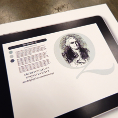
Baskerville Microsite
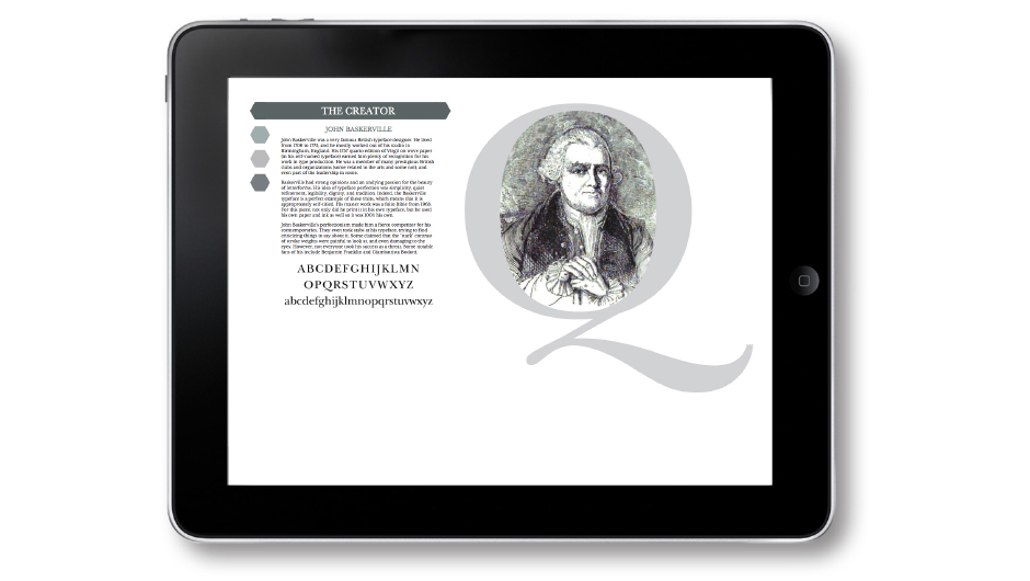
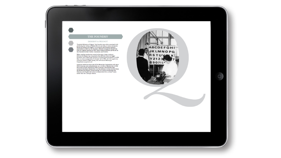
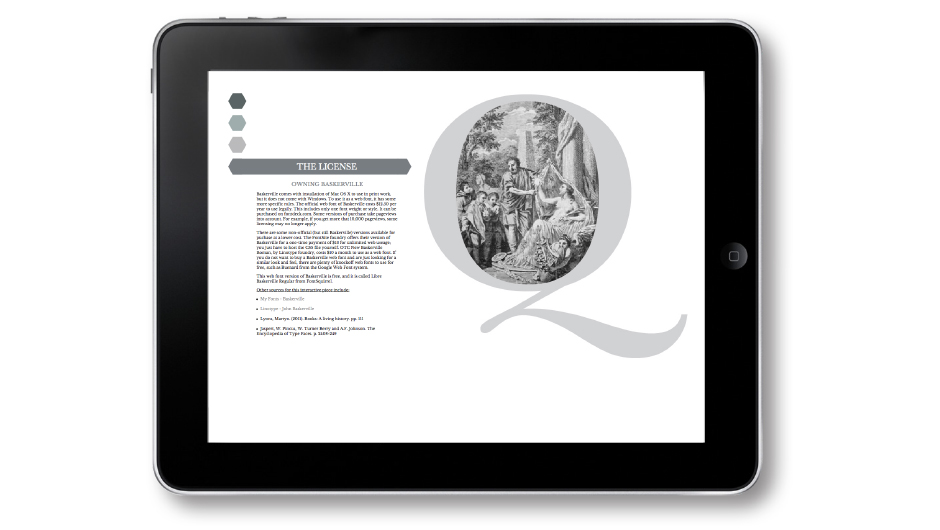
This microsite was inspired by the Baskerville typeface. It is an informative, interactive piece that educates visitors about Baskerville. I researched its creator, the foundry that distributed it, its original intended purpose, and licensing information. I drew color palette and imagery inspiration from the year 1757, when Baskerville was first designed.
back to top
back to top
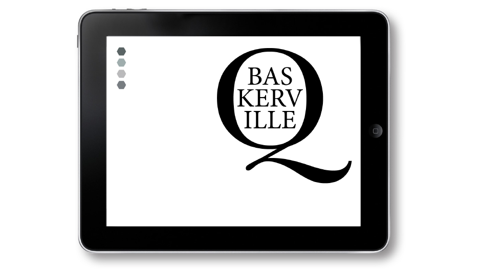
The landing page highlights the beautiful capital “Q” of the Baskerville typeface.
Addiction Posters
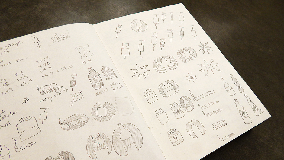
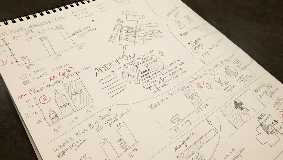
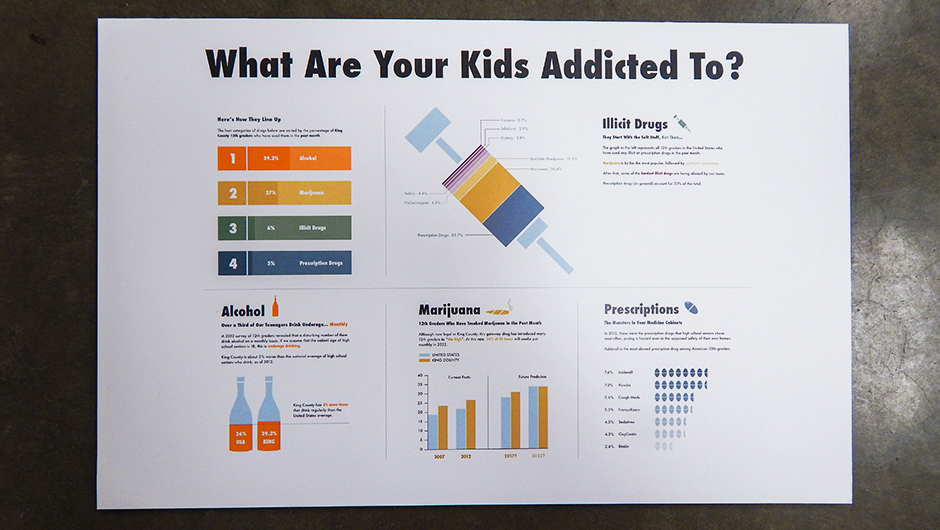
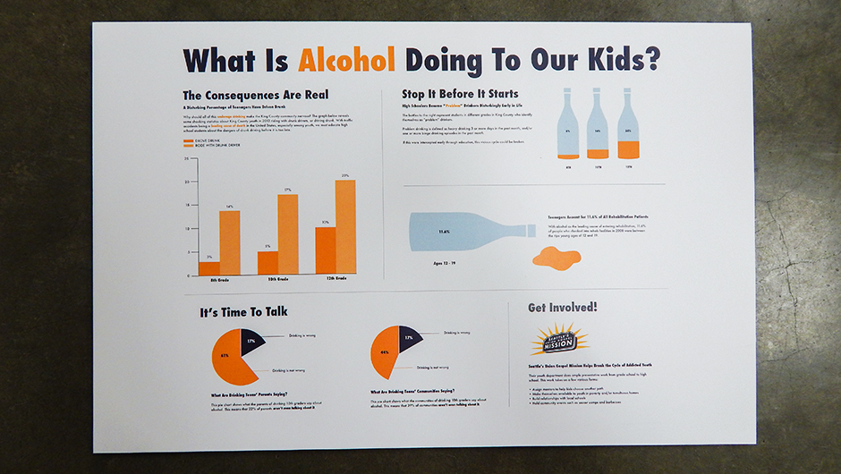
This project was the result of 10 weeks of extensive research, sketching, and digital comps. I worked with Seattle's Union Gospel Mission to create two posters that inform the King County population about addiction. I chose to focus my research and infographics specifically on the troubling subject of addicted youth.
back to top
back to top
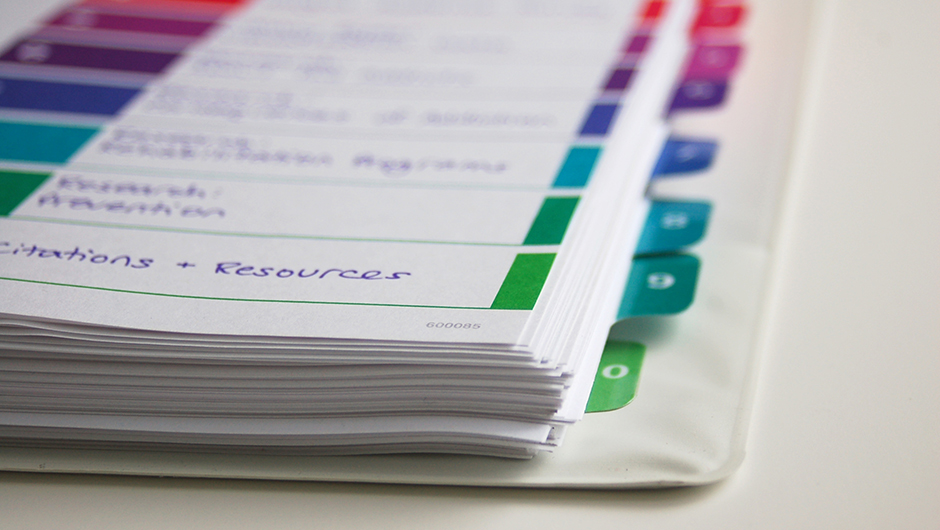
My team and I assembled a binder of helpful research about addiction in King County.
Virtuous Circle Brand Identity
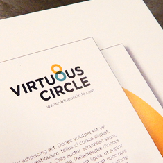
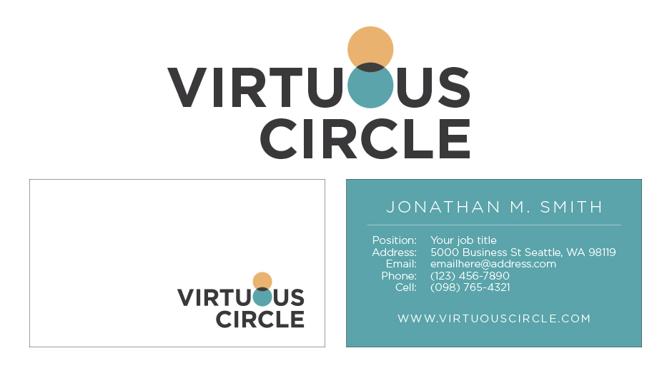
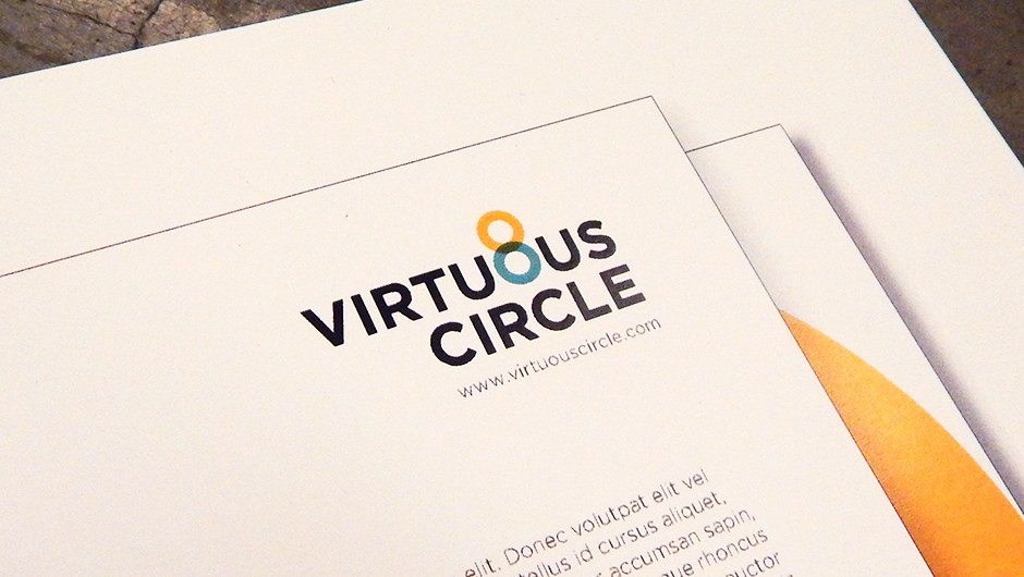
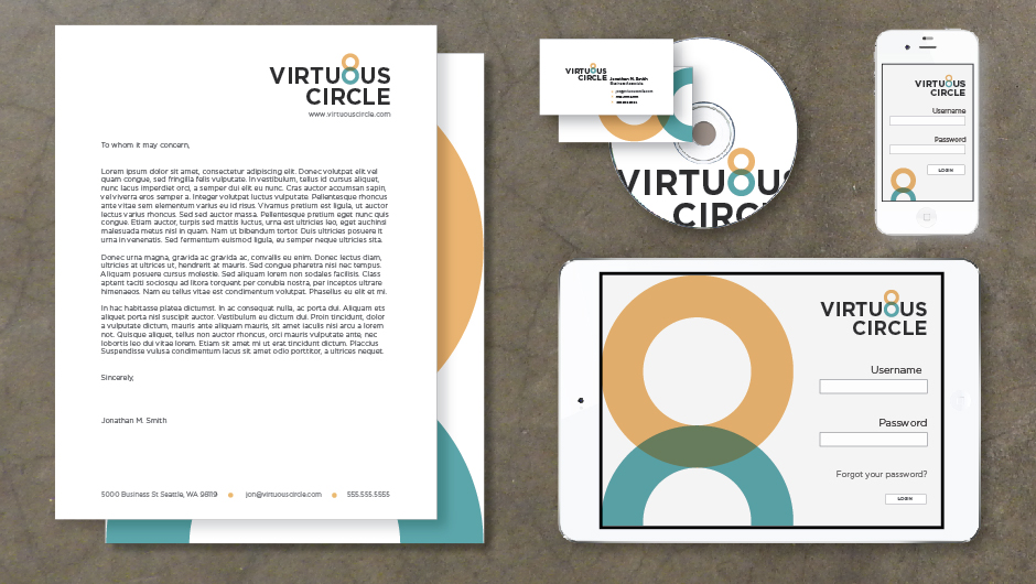
This project was a collaboration between myself, Anna Martell, and Hayley McNeil to create a brand identity system for a new financial aid organization called Virtuous Circle. We developed a logo mark, color palette, business papers, app design, and an overall visual system for the client.
back to top
back to top
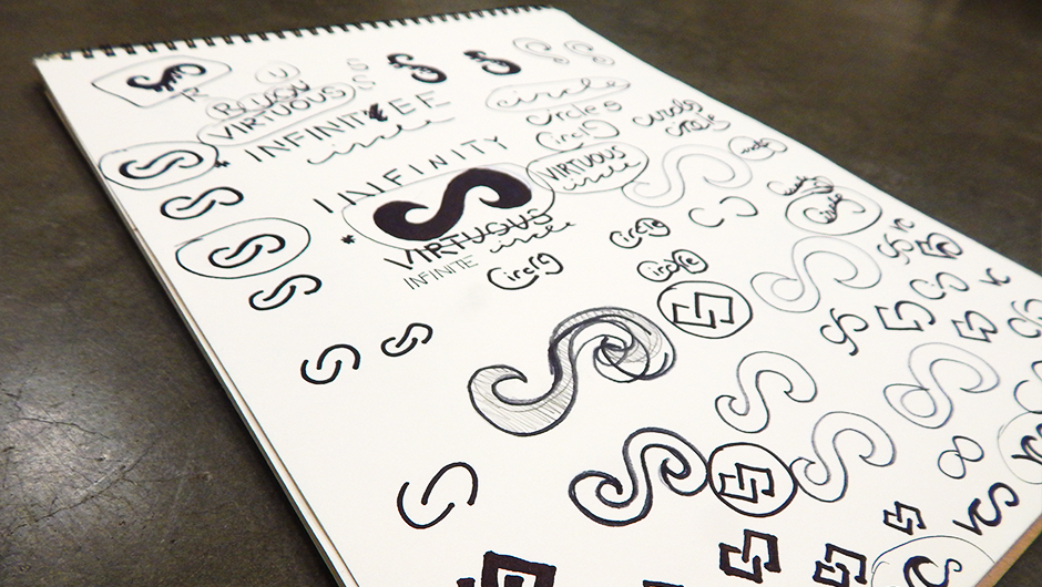
My initial sketches for the logo and mark.
Type Magazine
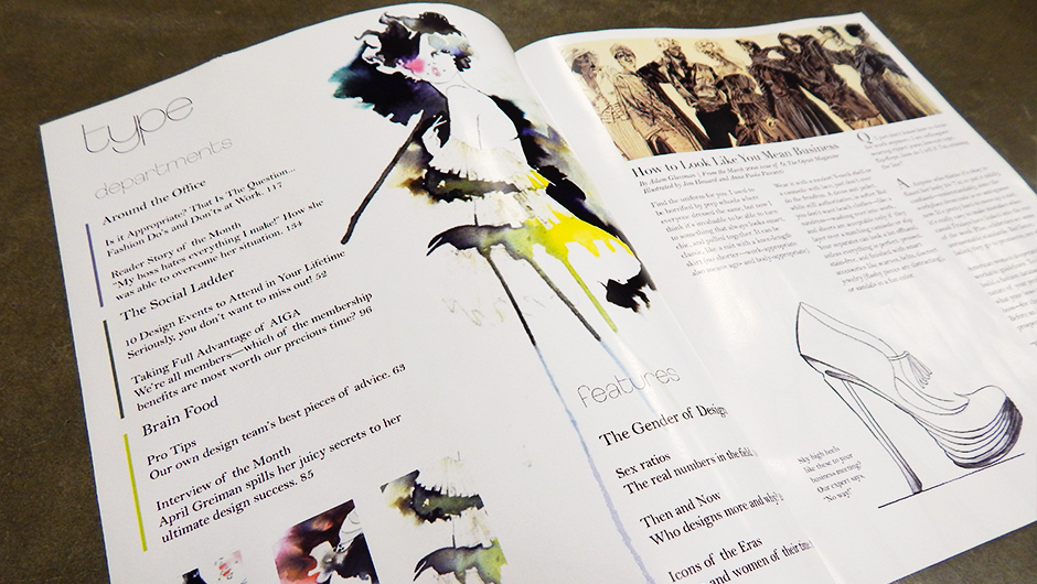
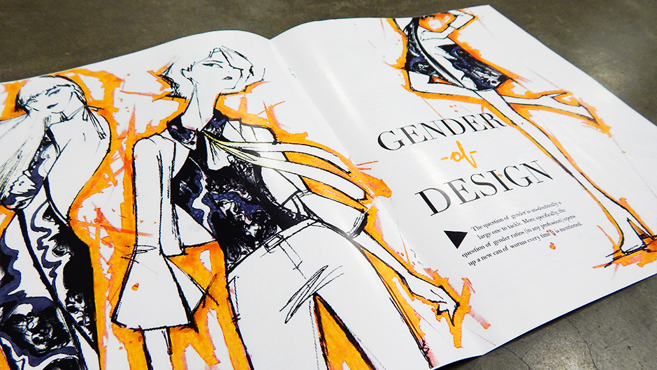
I designed a fictional publication entitled “Type”, a magazine targeted to young designers. I created a masthead and designed a cover, table of contents, department page, feature spread, and jump spread. I edited and used found illustrations to create a consistent aesthetic. I also authored the feature article, “The Gender of Design.”
back to top
back to top
The magazine cover highlights the masthead, and introduces the theme of the issue.
Tap Café App Design
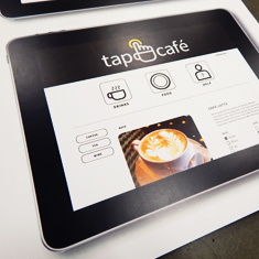
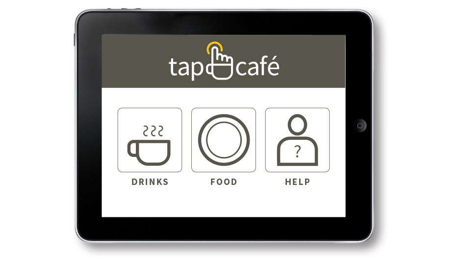
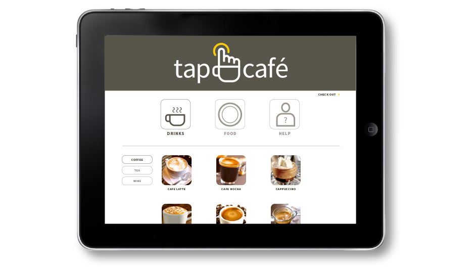
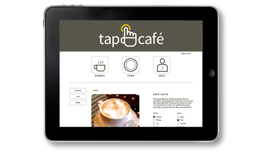
At AIGA’s Branded event in April 2014, a team of designers (including myself) created a brand identity system for Tap Café, a startup company by SPU business students. Tap Café is innovative because it replaces human cashiers with an iPad app. We came up with their business name, logo, and much more. I was most instrumental in the app design.
back to top
back to top
When the customer approaches the tablet in the café, they see this icon system. Then, they tap what they would like to order.
Kimmy's Place
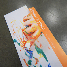
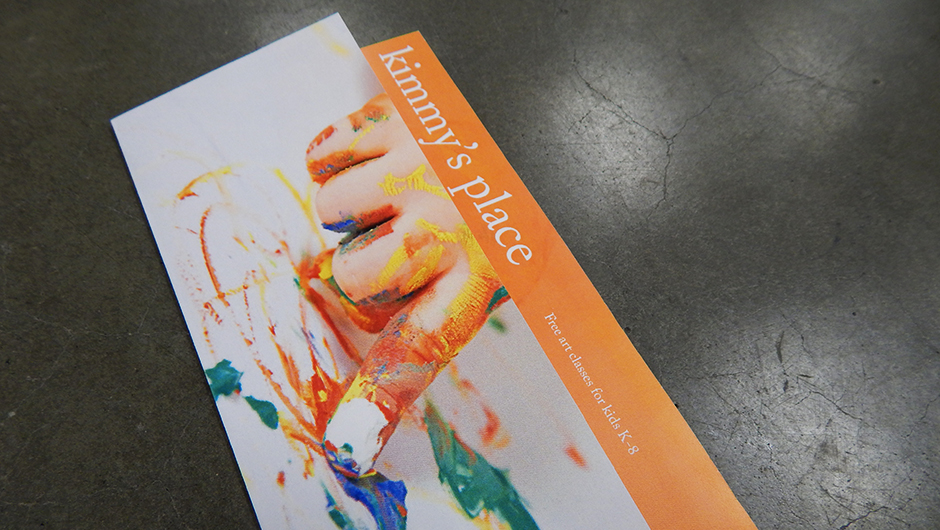
Kimmy’s Place is a fictional nonprofit I came up with for my senior project. Art played a huge role in my childhood development, so I want to encourage children to explore their creativity. Kimmy’s Place would be a series of art classes (including drawing, painting, sculpture, and digital art) offered for free to children from Kindergarten through 8th grade.
back to top
back to top
I knew Kimmy’s Place should have a brochure to distribute to schools and parents, so I sketched some layouts.
