
Brooke Snyder
“Shower, keep clean, enjoy colors and animals. People, if possible.”-Slyvia Plath

brukesnyder@gmail.com |
425.443.0351 |
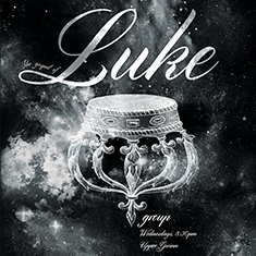
Group Posters
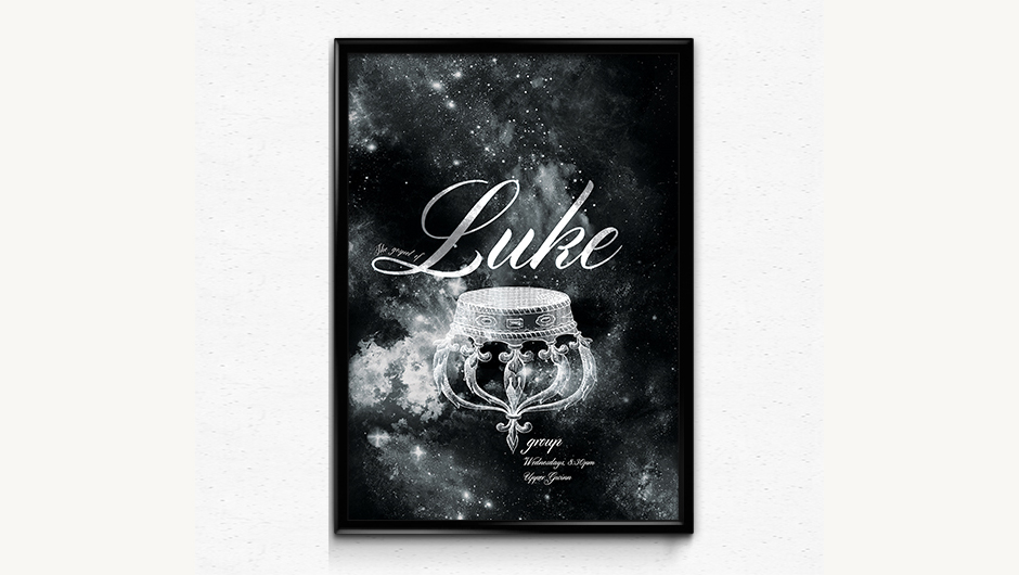
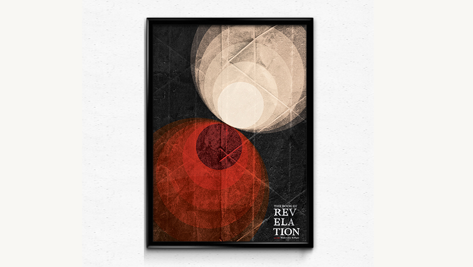
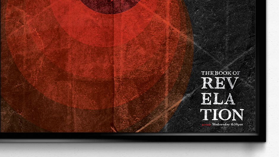
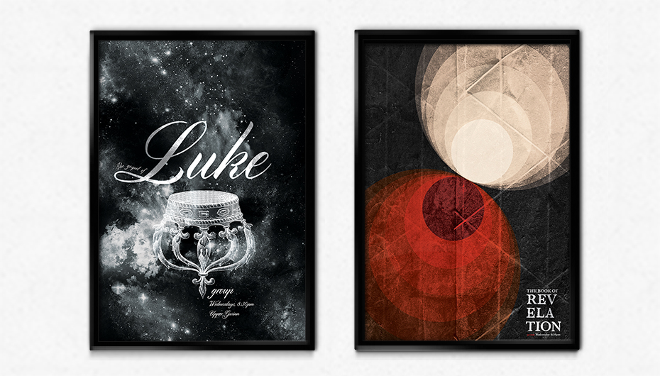
Posters were used to advertise for group, a weekly worship service put on by students of Seattle Pacific University. Each quarter focuses in on a single book of the Bible. These specific posters are for The Gospel of Luke and The Book of Revelation.
back to top
back to top
The theme of the “upsidedown kingdom” was the major inspiration for this design.
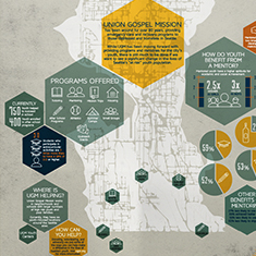
Seattle’s At Risk Youth
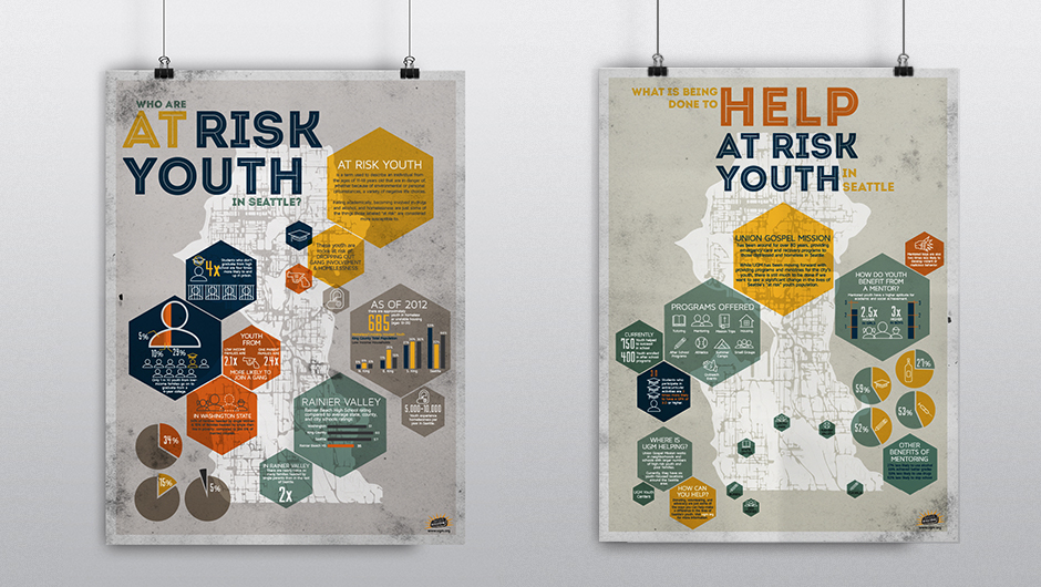

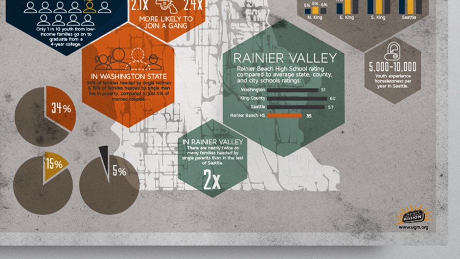
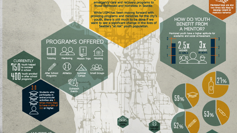
Two large-scale information graphics. The first displays statistics about Seattle’s at risk youth and the difficulties they face. The second shows what can be done to help prevent a child from being labeled “at risk,” and how Union Gospel Mission is working meet these needs.
back to top
back to top
The overall design is meant to appear urban and gritty, with saturated color to contrast.
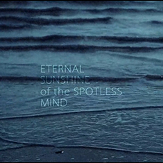
Eternal Sunshine Of The Spotless Mind
Title sequence for the 2004 film Eternal Sunshine of the Spotless Mind. Inspired by the fluidity and inconsistency of memory. Stylized to appear disordered, blurred, and grainy. Text was treated to correspond to the films themes of temporality and loss. Edited and rendered in After Effects.
back to top
By And By
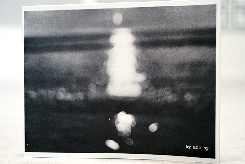


This zine was a personal project to bring together my own photography with the artist work of those close to me. The design is very simple, with mostly black and white photos and minimal text. The aesthetic is meant to appear hand-made and replicable.
back to top
back to top
The cover image is blurred and abstract to express emotion rather than subject.
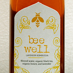
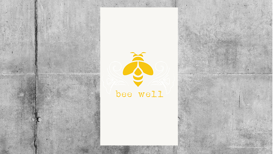
Bee Well Kombucha
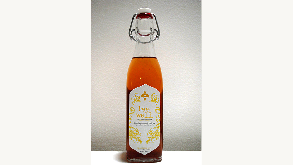
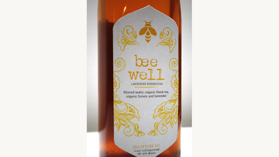
Packaging for a holistically-focused beverage company. This design is both natural and illustrative, with selective, saturated colors and rough lines. Simplicity, uniqueness, and serenity are meant to be felt when enjoying kombucha, and this design reflects those emotions as well.
back to top
back to top
The design takes up minimal space to better show the beautiful color of the beverage.
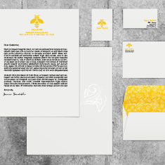
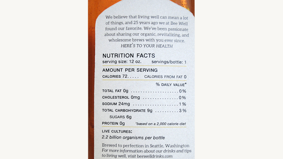
Bee Well Branding
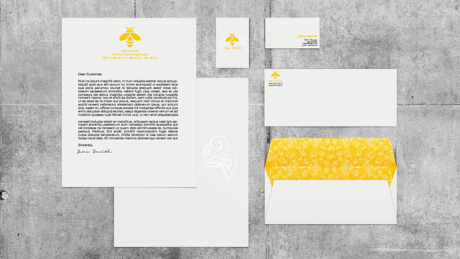
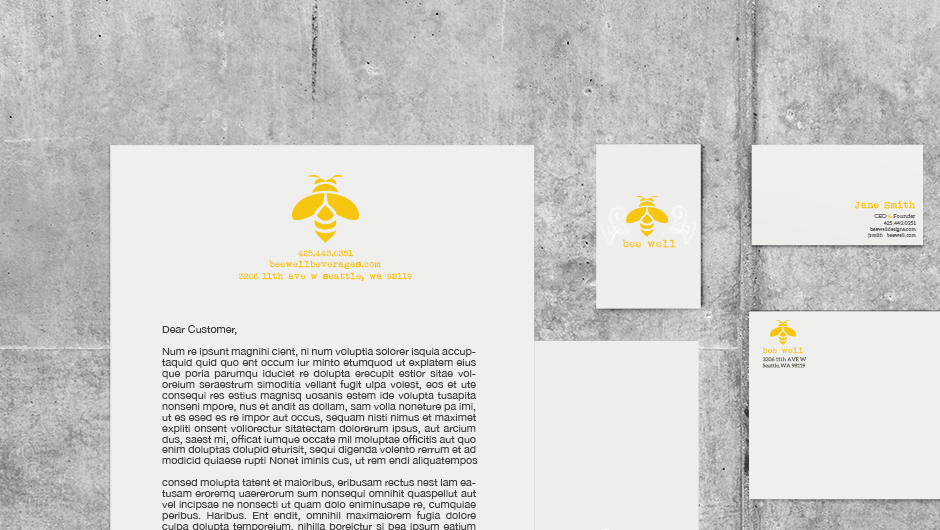
This branding system is meant to go along with the Bee Well beverage packaging. Again the themes of cleanness and vitality are present within the business papers for this company. The use of color as well as illustration is selective, fitting with the brands down-to-earth design.
back to top
back to top
Each piece is meant to stand well alone, or together. Minimal color helps highlight the logo.