
Claire Nellessen
Design isn’t only my vocation, it’s my creative outlet. I find joy in creating beautiful form to accompany function. I specifically enjoy the marriage of visuals and identity in branding work. The intellectual aspect of making visuals that accomplish an objective is what peaks my interest in design itself and what drives me to continue learning.


nellessenc@spu.edu |
630.433.6703 |
Virtuous Circle


A brand created out of a competition for the non-profit Virtuous Circles, and chosen by the organization to implement as their identity. The brand was designed to be both approachable and trustworthy to reflect the non-profit’s desire to appeal to both their audience (students) and their investors.
back to top
back to top
Brand identity implemented in letterhead and business cards
Type Magazine


A magazine article about minimalism, and designed minimalistically, with geometric imagery to reinforce the clean sterility of the minimalistic aesthetic. Used a limited blue-green color palette juxtaposed with starry photography to emphasize the cosmic, futuristic aspect of minimalism.
back to top
back to top
Cover spread of “Minimalism” article
Information Design Poster
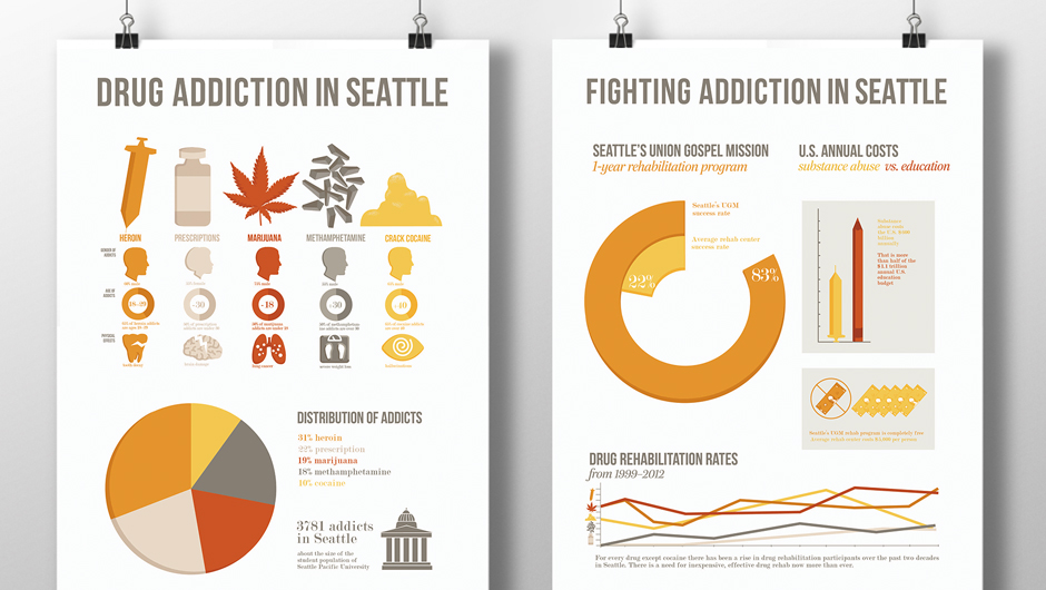


Posters designed for Seattle's Union Gospel Mission to promote awareness of the city's drug addiction. Researched information and statistics on Seattle drug addiction and translated the data into accurate, easy-to-interpret visuals. Used clear titles and sections, a bright color palette, and prominent graphics to draw viewers in.
back to top
back to top
“Problem” and “Solution” posters side by side
Hunniwater


Mark and label designed for a healthy, honey-based beverage. The watercolor honeycomb within the droplet shape gives a textural, organic feel to the product. The green accent color adds a freshness to the label that also says "natural". The simplicity of the label gives the product professional validity
back to top
back to top
Labeled product
Cascade Yearbook


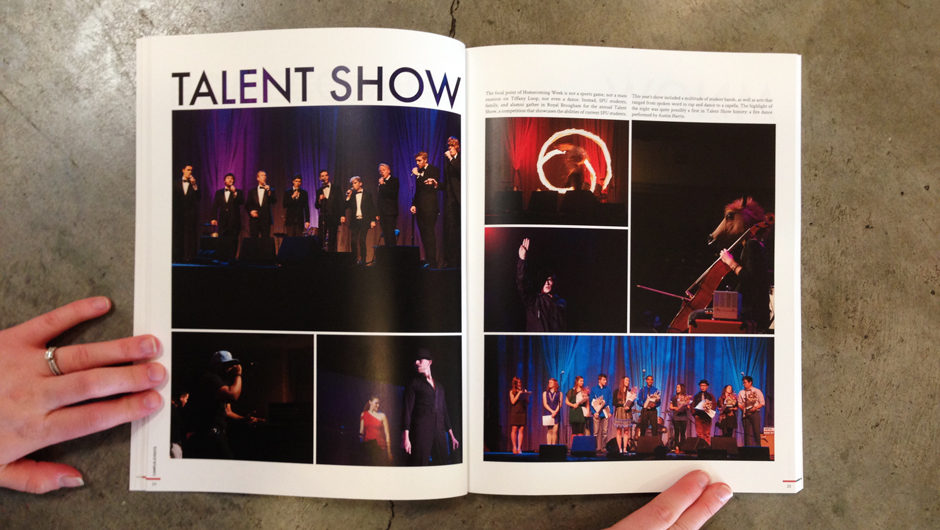

Designed layouts and spreads of the University’s yearbook. Created a design system based on a community-driven theme, and revolutionized yearbook organization for better user navigation.
back to top
back to top
Cascade cover
Wedding Invitation


Designed wedding invitations and accompanying informational card. Created handwritten type and vine illustrations as the main imagery. Used a limited color palette to emphasize the watercolor texture, and so as not to distract from the type imagery.
back to top
back to top
Invite, information card, and envelope