Per capita GDP by country, 2017, 2010, 2005 and 1960
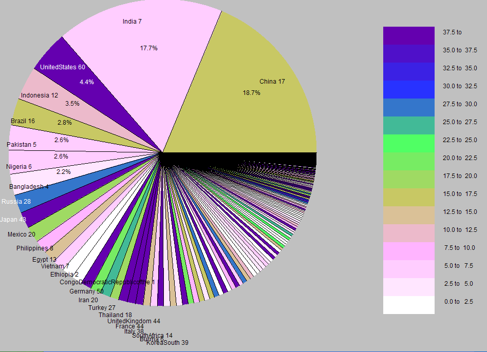
2017

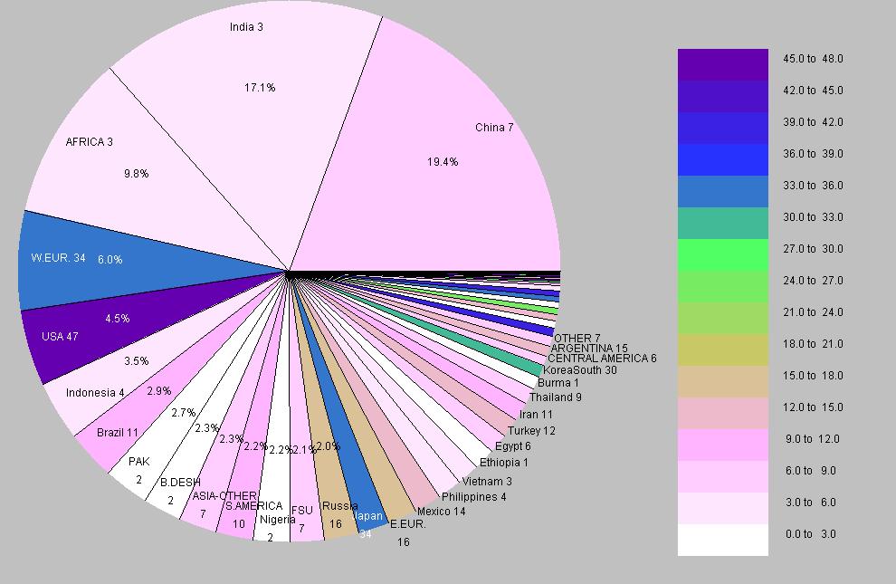
2010

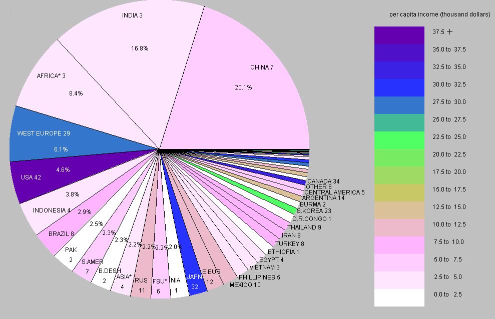
2005

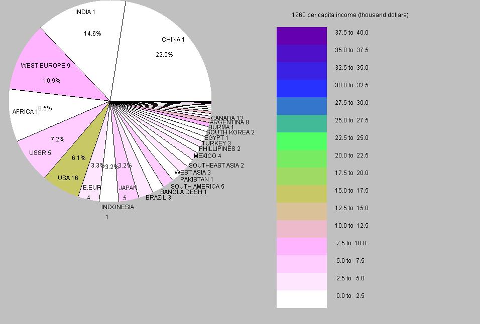
1960

- The pie charts illustrate per capita GDP for
the countries of the world.
- Earlier charts show large population countries are shown individually;
other countries are grouped into geographical categories.
The 2017 chart shows individual countries.
- The size of each slice is proportional to the population
of that country or category. Categories are arranged in
descending order of population. The percent value displayed
shows the percent of world population for that category.
- The color of each slice indicates the per capita GDP,
as shown by the color scale. The number after a category
gives the value of per capita GDP rounded to the nearest
1,000. (1960 values are expressed in 2005 dollars).
- The increase in the area of the circle from 1960 to 2005
is proportional to the increase in world population between those
two years.
- Current data is from the
CIA World Factbook
...(
click here for total GDP data)
(
click here for per capita GDP data)
- 1960 data is from the book
The World Economy: Historical Statistics, Angus Maddison, OECD Publishing
Development Centre Studies, 2003.
- Detailed data for the pie charts are available at these links:
2005 details and
1960 details.
- Note that per capita GDP is only an average and provides no indication
of the dispersion of income within each category.
