
michael sand
Branding / Production Design
/ Experience Design
I have been interested in art from an early age. I grew up painting and drawing, and always had an interest in visual arts. Today is no different. I love the challenge of creating visual assets that not only tell a unique story, but also create a bond with the viewer. Through my time at SPU, I have learned that I am most interested in branding as well as experience design, and through an internship I learned that I equally interesting in production design. I hope you enjoy Spectra 2017 as much as I do.
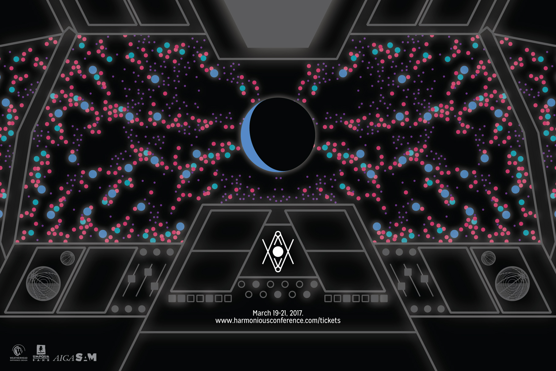
Harmonious is a brand created for a senior level design course at SPU that seeks to unite communities together through experience design. Harmonious looks to the stars for inspiration. The sun, moon, earth, and everything else has to be in harmony for us to exist. Harmonious’ brand is best described by a quote by Matthew R. Francis,
“Low-mass black holes ‘sing’ in harmony with themselves, through flashes of light instead of sound.”
My process for creating a name for this conference consisted of finding a word that seemed familiar with first time readers, that also represented the core ideas of my brand. I felt as though this, paired with a logo that was somewhat unique and wasn’t too “on the nose” would create a unique and exciting brand identity.
Many sketches eventually were boiled down into this logo.From here on I was tasked with creating a poster and brochure that were similar to one another. I wanted to create a poster that captured that sci-fi influence I had from the beginning, and stick to a brochure that was more familiar to what people were used to seeing. I figured this pairing would be helpful when discussing a experience design, which can be some-what esoteric.
In a later motion design class, I was tasked with creating a promotional video for my brand using “analog effects”. These effects were required to be created out of the After Effects engine, and to be filmed by hand. Utilizing vegetable oil, glow-sticks, and food coloring, I created an interesting spacial effect in pitch darkness.

Vision is an app designed for a course at SPU. Vision is a VR social media app that allows you to look through your phone’s camera like a lens to see what others have posted. When you post your content, it “hangs” in the space where camera is pointing. Additionally, Vision allows you to change what you want to see via filters. You can choose to only see photos, videos, text posts, or any combination of the three. You can also set an “appraisal discrepancy” which will only allow you to see posts that have been liked above a number of your choosing. Finally, you can create custom filters and invite your friends. These filters allow you to only see what your friends have posted in them, and nothing else.