LECTURES
What is information Design?
ABOUT NIGEL HOLMES
Nigel Holmes was born in 1942 in England. He graduated from The Royal College of Art in 1966, and worked as a freelancer for newspapers and magazines in England until 1977, when Walter Bernard hired him to work at Time Magazine in New York, to design what he calls "explanation graphics" — pictures that elucidate the subjects in the magazine. Following 16 years at Time, he became a freelance designer, lecturer, and author of books on the subject including Wordless diagrams.
After a sabbatical he started his own company, which has explained things to and for a wide variety of clients, including Apple, Fortune, Nike, The Smithsonian Institution, Sony, United Healthcare, US Airways and Visa, and he continues to do graphics for publications such as Harper’s, The New York Observer and The New York Times.
Nigel Holmes has written six books on aspects of information design. The latest, Nigel Holmes on Information Design, is a book-length interview with Steven Heller. It was published by Pinto Books in May 2006. Wordless Diagrams, from 2005, has been published in Chinese and Swedish editions as well as the original English.[3] Wickipedia
ARTICLE
Excerpt from
Harvard Management Communication Letter, August, 2002
An interview about making presentations
...
Q. Your peers have credited you with pioneering a whole new design genre called "explanation graphics." What does that mean?
A. It's literal: graphics (drawings or animations that are generally flat and two-dimensional) that explain information quickly and clearly. I use the term "explanation graphics" because I believe that "information graphics"(or the horrible contraction "infographics") is an overused, as well as inadequate and imprecise, name for what I do. Today, many graphics explain nothing. They just present data, and the reader is expected to work out their meanings. Charts that don't explain themselves are worse than no charts. "Information must inform" has become a cliché, but it's right.
Q. So what exactly are "explanation graphics" compared to other forms of design? Any examples?
A. They are a mixture of words and pictures, wedded together, so that one cannot be "understood" without the other. They make statistics visible. Consider the label of a commercial food product like soup: the part of it facing you on the supermarket shelf relates closely to advertising design. It attracts your eye, it sells you on the product. But only the white "Nutrition Facts" design, created by Greenfield-Belser Inc., really explains the contents. So, the nutrition label on the back is an explanation graphic. The front of the can isn't.
Q. How do you go about creating an "explanation graphic"?
A. I start by thinking how can I keep the result simple. However, "simple" is a difficult word, because there is a fine balance between "simplifying" and "dumbing down." Nevertheless, I remind myself that most graphics appear in situations where the reader, viewer, or audience can take only so much at one time, especially during live presentations.
Remember that we move around in a full-color world with images passing by us all the time. But charts are not pictures of the real world; they depict abstract ideas, numbers, and concepts. We don't change the color of the type to blue when we describe the sky. It's the idea that counts.
And so I often start by imagining that I can use only black and white. I introduce color only when the information requires it to clarify a point or to focus the reader's eye on the point. Charts distinguish themselves best when they don't imitate the rush of images around them. They should be simpler than their surroundings.
Q. What rules do you keep in mind, whether you're creating charts for an annual report or for an annual shareholders meeting?
A. I'm generally not in favor of rules because, people can't get away from them. The PowerPoint rule, "no more than seven points on one slide," has led everyone to make seven points on every slide whether they needed to or not. But they think that they're giving a good presentation. It's silly. Better to think hard about who the audience or reader is, what they've heard or read on the subject, what you can best present live in person, and what you can leave behind for them to read.
That said, people tend to overdo charts, showing off or dazzling the audience with the latest bells and whistles available. Computer software offers an array of special effects, backgrounds, typestyles, and icons that often make charts harder to decipher. And so I tend to stick to some basic principles. (See below.)
...
Q. Which picture is worth a thousand words?
A. Fever charts (or line charts) track the progress f a quantity, like price or inventory, over a period of time. They show trends–what happened in the past and what might happen in the future. As a general rule, dates appear along the bottom and quantities go up the side. A thick line represents the movement of the quantity, traveling across a grid of fine lines (like graph paper) from left to right over time and up or down according to the scale, such as dollars or units.
Bar charts show the relationships among different items at one time. Vertical or horizontal bars, or objects of differing lengths according to the quantities represented, are arranged in rows. Unlike fever charts, bars work best when no time element is involved, as in a comparison of the current prices of eight computers from different manufacturers.
Pie charts, essentially circles sliced into pieces, divide an item into its component parts or percentages. The relative size of each slice corresponds to its percentage. The numbers must always add up to 100%. If they don't, then insert a note about it on the chart because some readers delight in pointing out "mistakes."
Tables, basically grids with columns of data, show the actual numbers, arranged in an orderly form that clarifies their relationships. Unlike the others, a table doesn't plot data graphically. It isn't a visualization of numbers. It is the numbers. Tables work especially well when numbers differ by orders of magnitude so that no scale suffices in plotting them. Consider this set of numbers: 20; 400; 160,000; and 25,600,000,000. A chart will lose the detail of low figures if it tries to reach the high ones without breaking the scale. If you must break the scale, then just use a table, because a chart with a broken scale is no longer a true picture of the numbers.
Word pictures help when numbers are so big that we must put them in a human context before our audience can really grasp their size. Think of the million-man march, or a billion hamburgers served, or a trillion dollars of national debt. How much bigger is a trillion than a billion? Three zeros or one thousand times. To help readers see the difference, we can create word pictures using more tangible or recognizable numbers. Consider this: it's the year zero AD, the beginning of the first millennium. You have a trillion dollars to spend at the rate of a million dollars a day. By the year 3AD, you've spent a billion. By the year 2004, you'd still have 734 years to go, spending a million every day, before you reached the end of your trillion-dollar pile. We can picture that in our minds because we know the lengths of a day, a year, and a millennium, and we can imagine spending a million dollars.
—don't use the third dimension or animation for animation's sake. A chart shouldn't move around or jump off the page or screen–it should stay there and let the audience read it. Work in two dimensions.
—don't use a busy background to signify the subject of the chart. No cloud formations to suggest "sky." Most photographic or brightly colored backdrops interfere with visibility. Plain backgrounds allow the reader to read the information easily. Use white, black, or a pale color.
—don't use lots of color to tie-dye a chart. Too many hues confuse the meaning. Think of color as information itself, never as decoration to a finished chart. Start with black and white. Add color only when you need it to clarify something, like distinguishing two thick lines in a fever chart. If someone else has created PowerPoint slides for you, then use the computer to remove all unnecessary colors.
—don't use ornate, flowery fonts. Use one simple sans serifs font in a variety of weights and sizes. Keep the final size of the chart in mind when choosing type size. You might enlarge it to go into a store window, on a banner, or on an auditorium wall. You might reduce it to appear in a printed report, where space is at a premium. The final size matters, not what you see on your desktop.
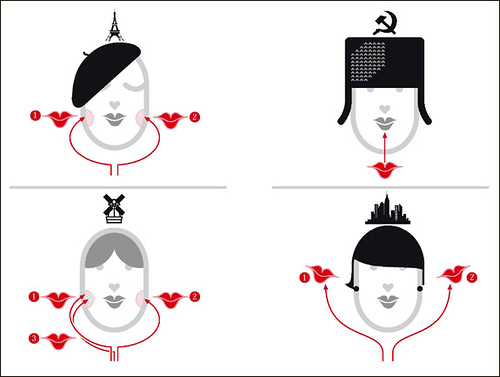
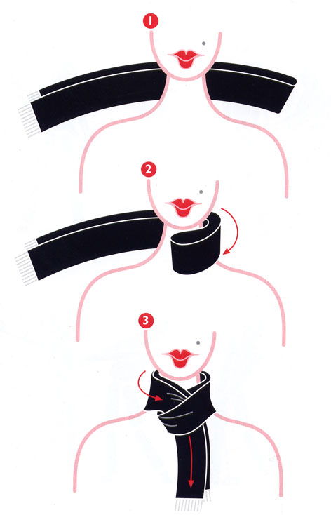
IMAGES FROM "WORDLESS IMAGES," BY NIGEL HOLMES