-

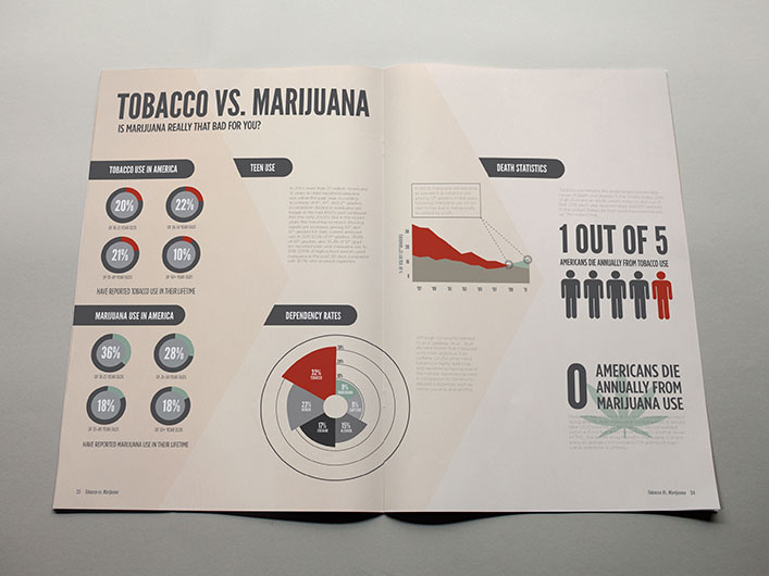
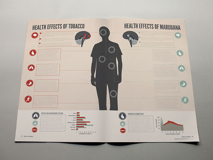
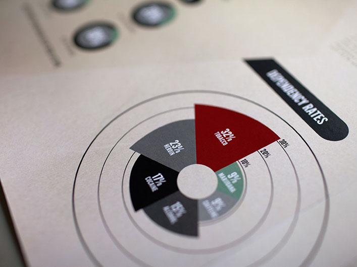
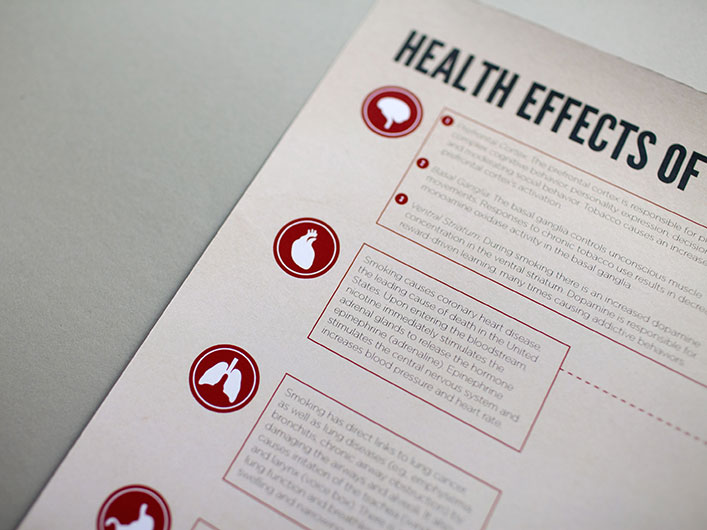
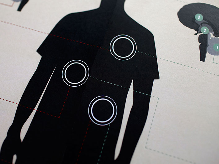
Information Design | This is a magazine spread relating tobacco statistics to marijuana statistics. The goal was to inform the audience of basic facts and the effects of each on the body. Through the use of consistent color codification and graphics, the viewer is able to easily move throughout the information. See more from Adrienne

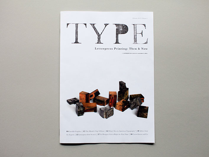
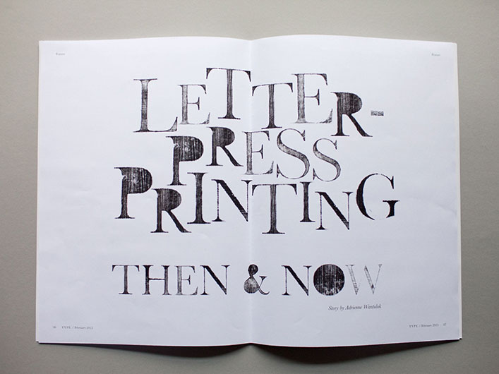
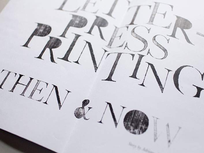
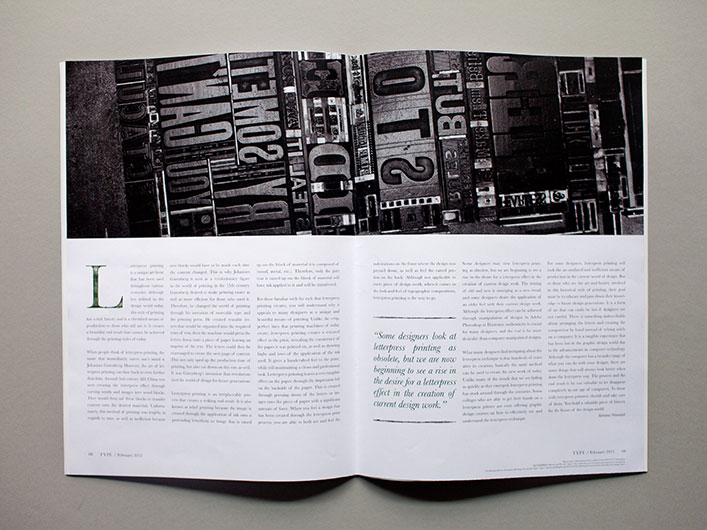
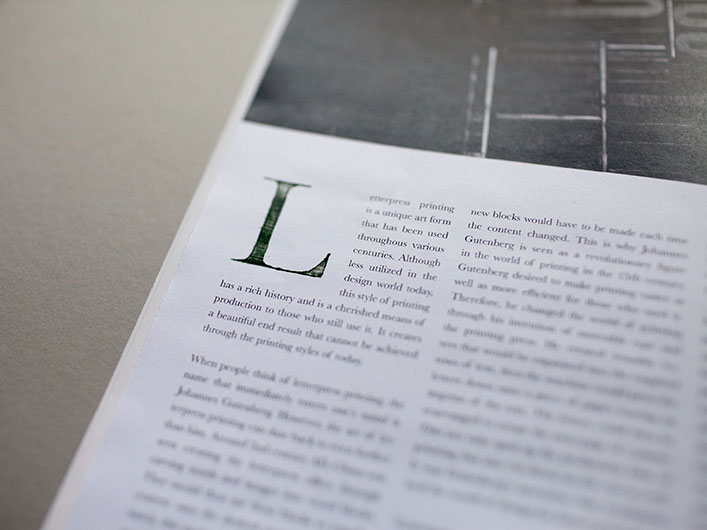
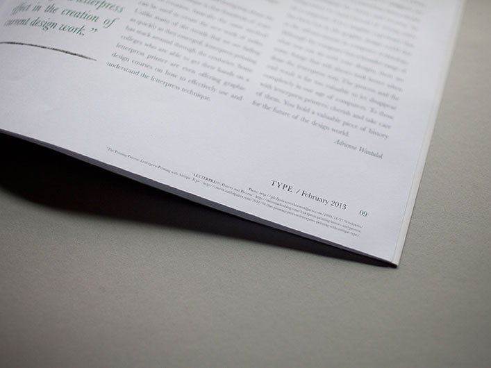
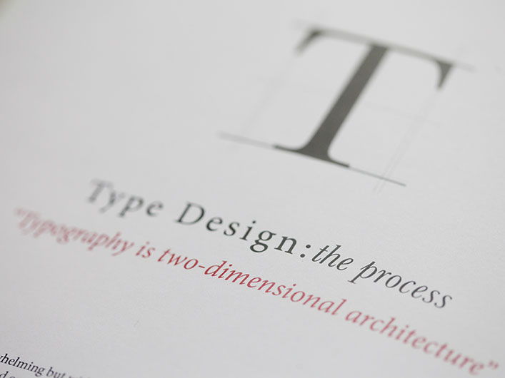
Type Magazine | This publication focuses on the process of letterpress printing. Through the mixture of handcrafted elements with clean typography and photography, the craft of the letterpress is highlighted.
See more from Adrienne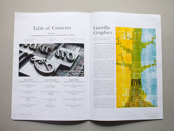
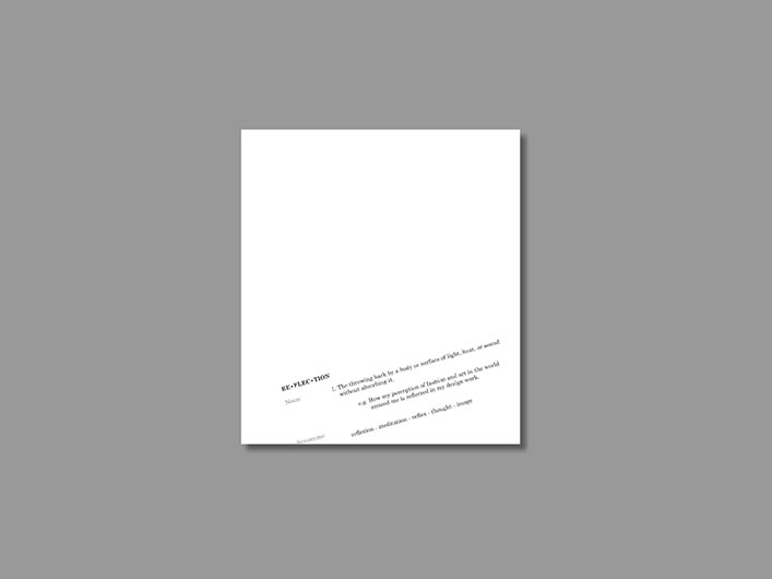
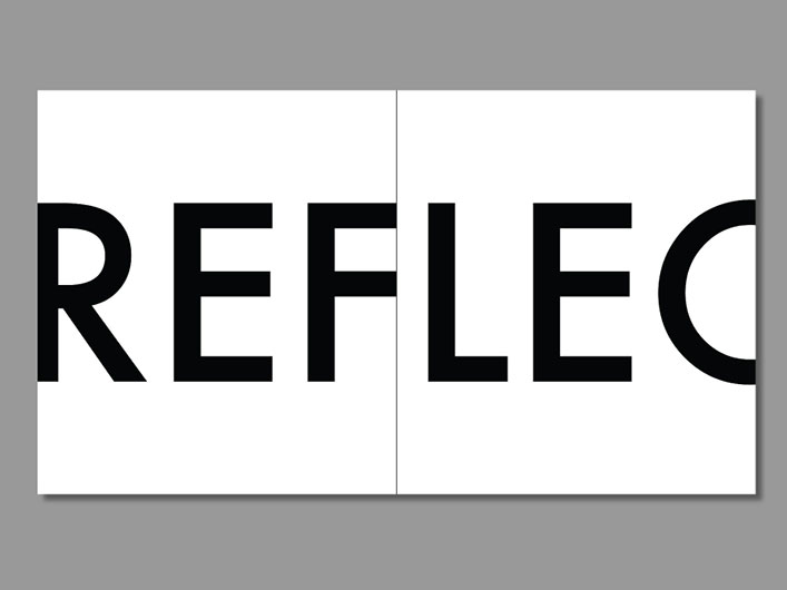
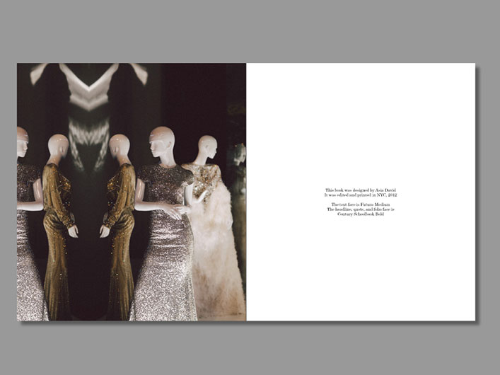
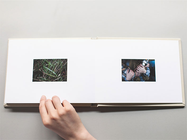
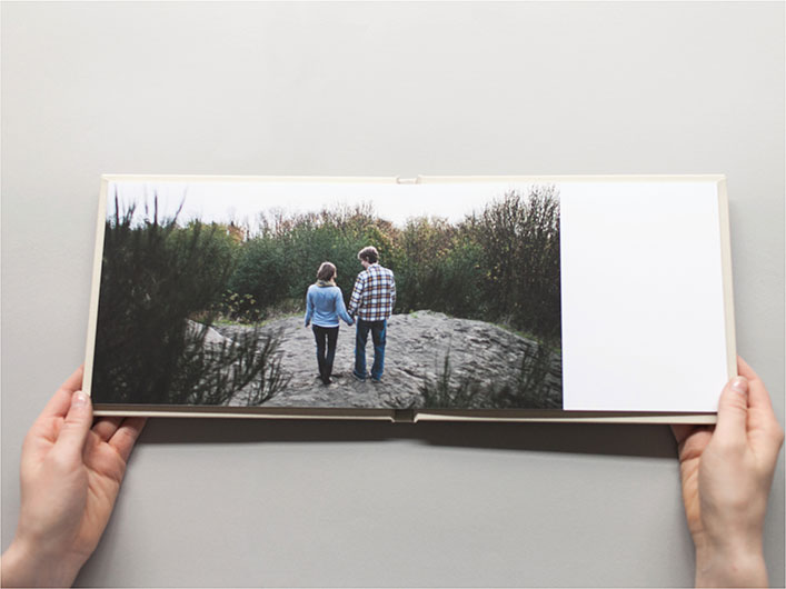
Book - Reflection | Reflection is a book designed while in NY about my experience there as an artist, what inspired me, and how it was shown through my work. The theme reflection revolves around the growing relationship I have with myself and how everything I am surrounded by reflects itself through my work and being. See more from Asia

Magazine | Designed a cohesive layout and theme for magazine departments page and feature spread. The magazine placed emphasis of the use of type, and explored different ways to use and treat text within the composition.
See more from Ben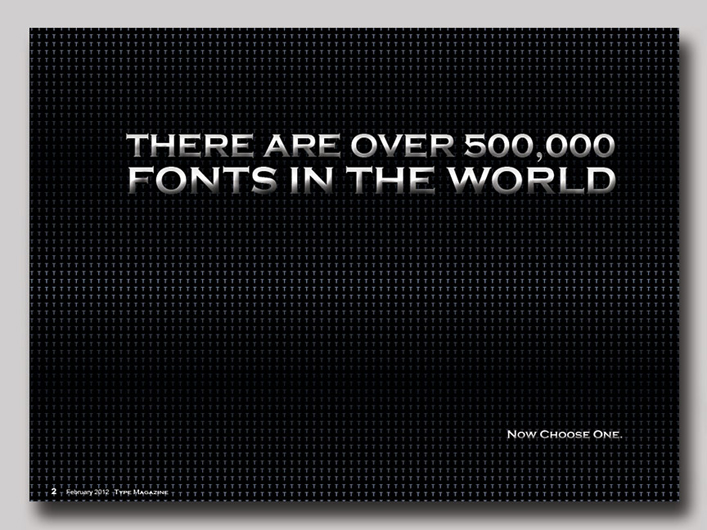
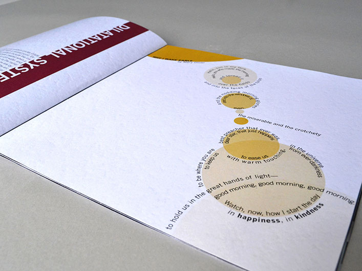
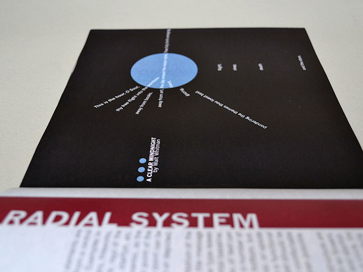
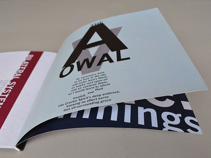
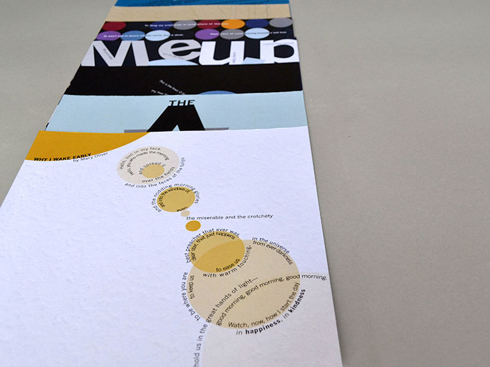
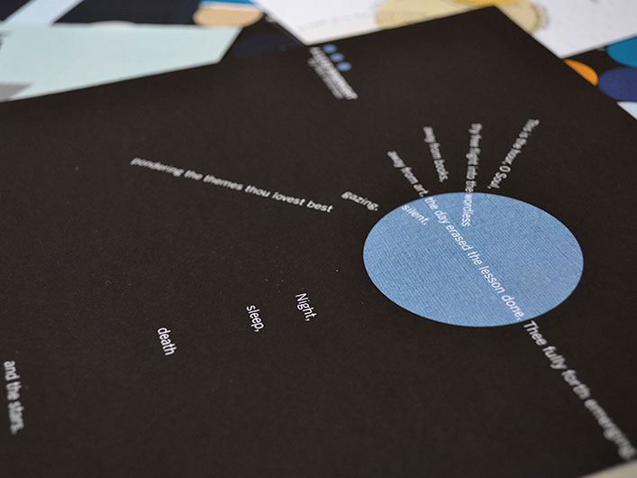
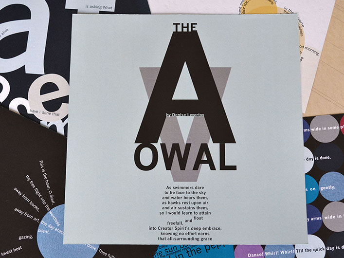
American Poetry Anthology | This is an anthology of famous American poems demonstrating some of the key typographic systems of design. Typography and layout are used to enhance the effect or meaning of the poems without compromising their communication. See more from Chris
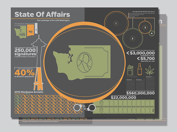
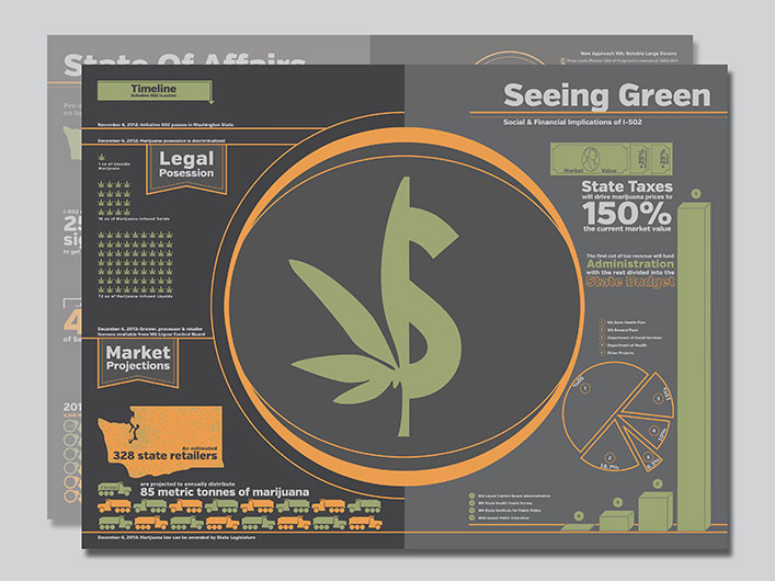
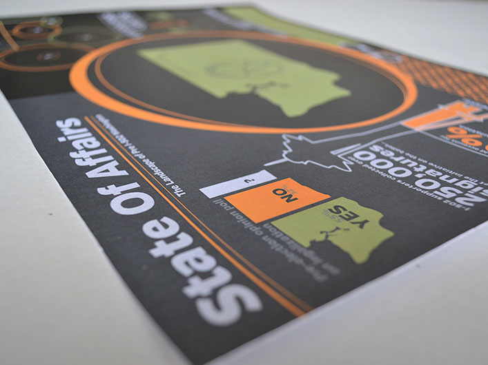
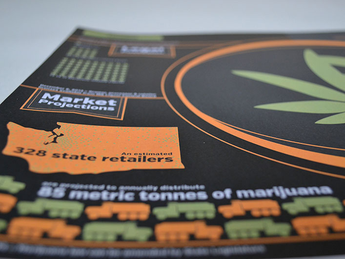
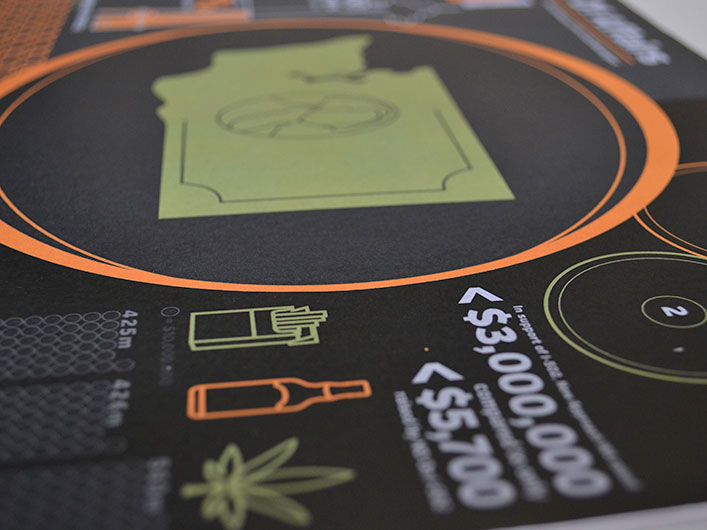
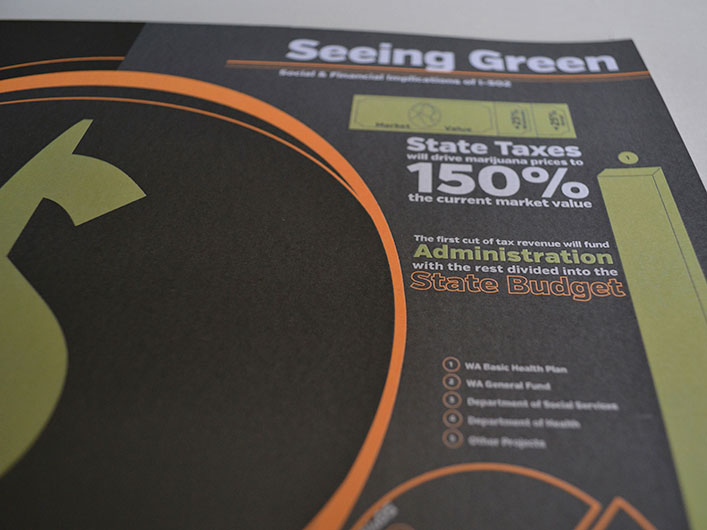
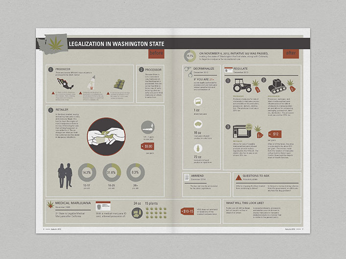
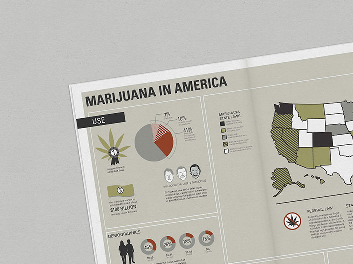
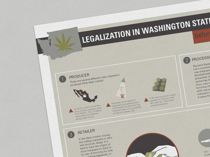
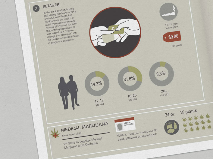
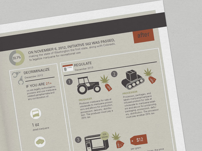
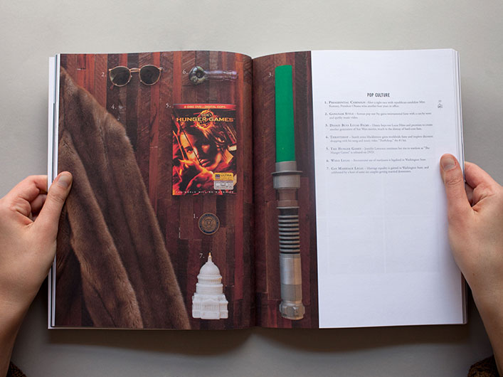
I-502 Infographic | These researched informational spreads are created to highlight the key implications of WA Initiative 502, which legalized marijuana in the State of Washington. They use a variety of infographics in order to illustrate the statistics that citizens need to know. See more from Chris
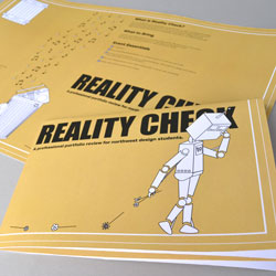
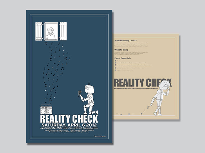
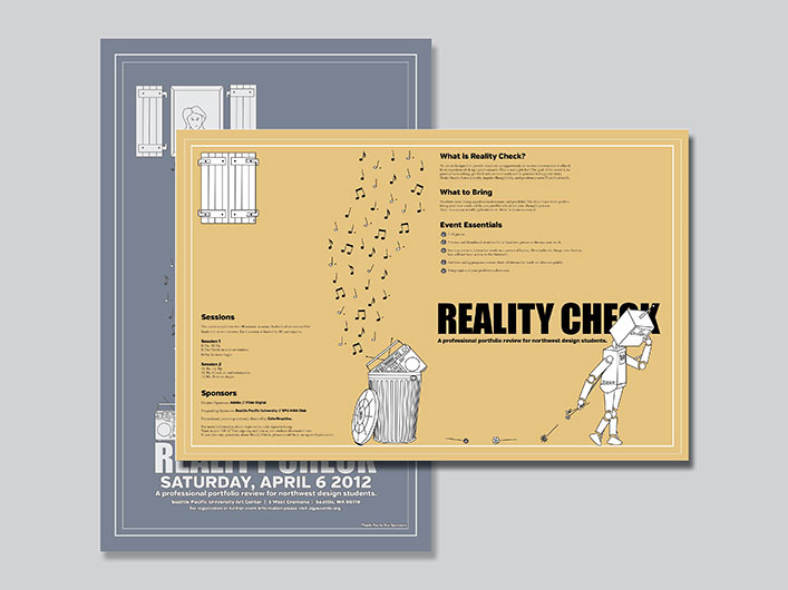
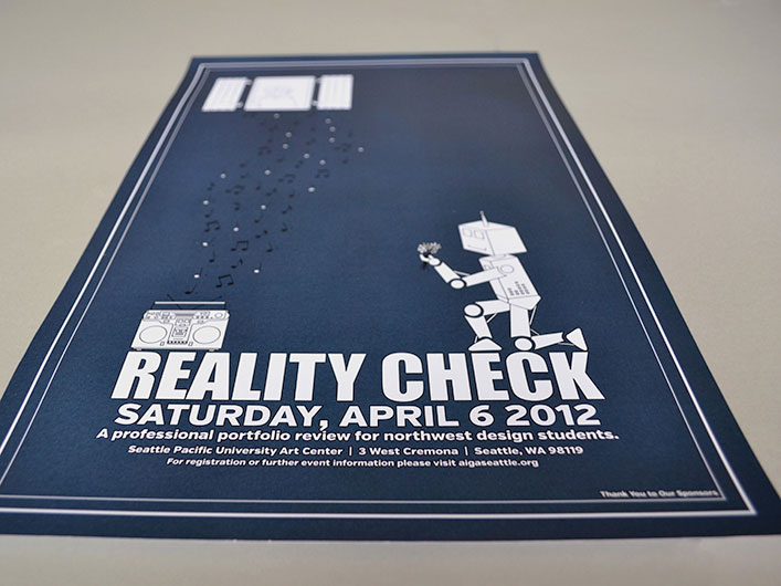
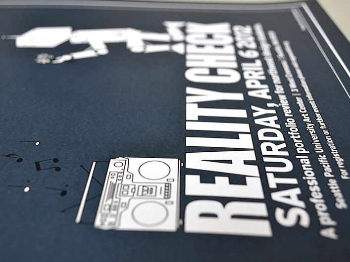
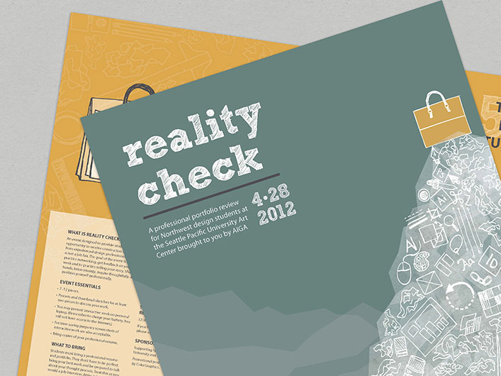
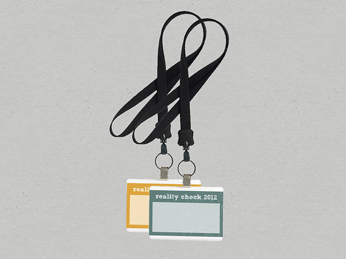
Reality Check Poster | This poster was designed for Reality Check, a portfolio review event in which local professionals hold critique-interviews for design students. My concept for the two-sided, mailed poster was less literal, using humor and narrative to bring interest to the event. See more from Chris

Education Infographic | To create an understanding story about today’s education to the college audience.
See more from Claudia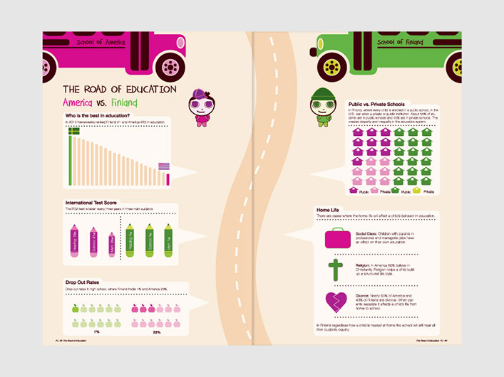

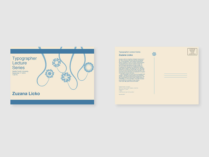
Type Postcard | A set of postcards for a typography event. I focused on making circular shapes using the artist's typefaces. See more from Claudia

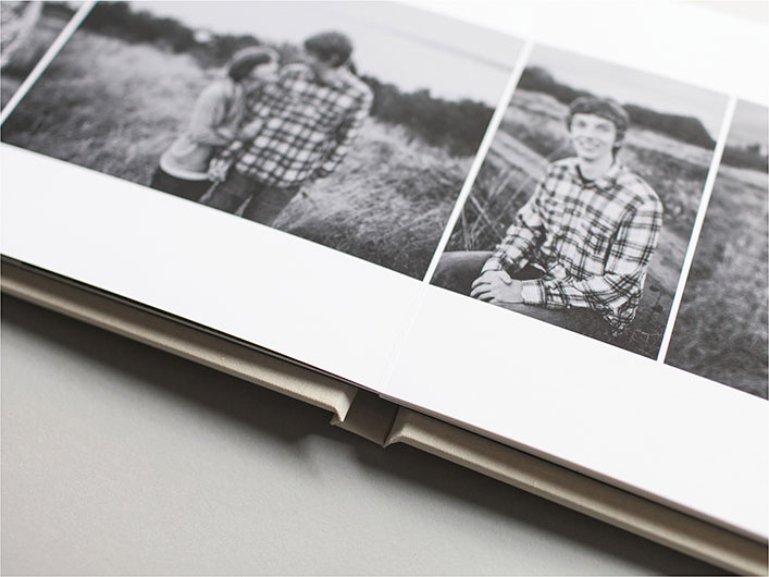
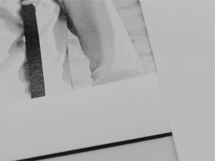
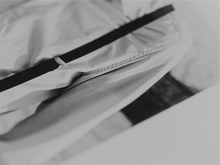
Album Design | This album was created with the intention of it being a guest sign-in album at a wedding. Both images and design are by me. The album was printed and produced by Vision Art. See more from Dorothy

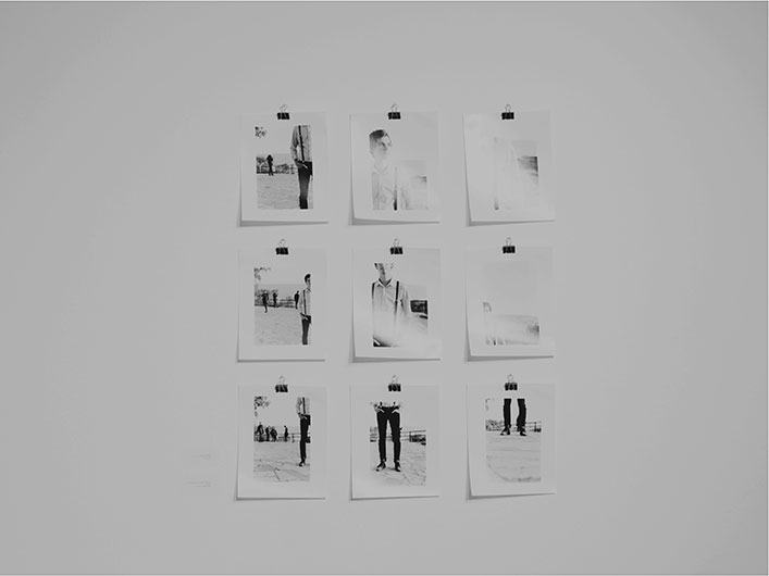
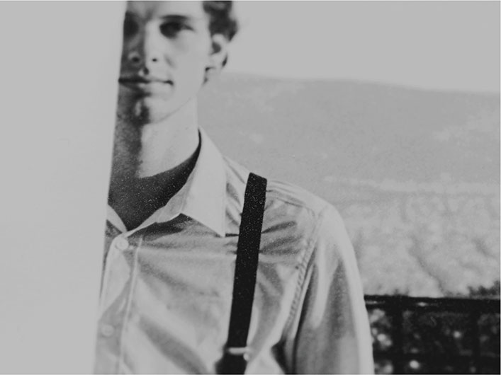
Constructed Image | This was a project done for my film photography class while studying abroad. The piece consists of 9 individual 9 ½ in. by 12 in. photographs hand developed and printed on Ilford Pearl paper. Together they form a constructed image. See more from Dorothy

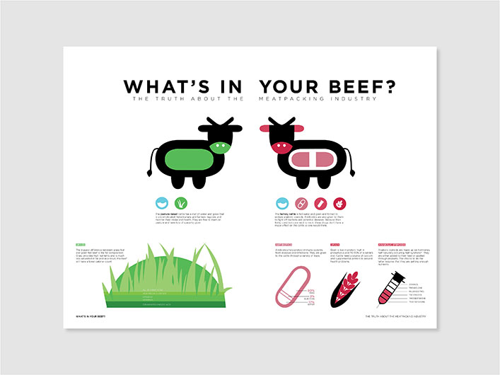
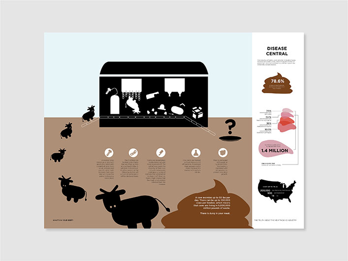
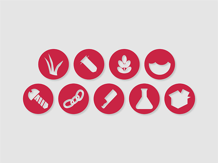
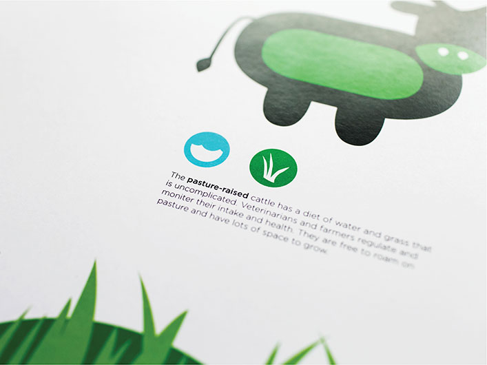
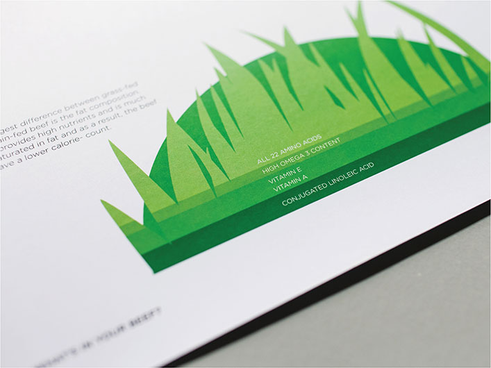
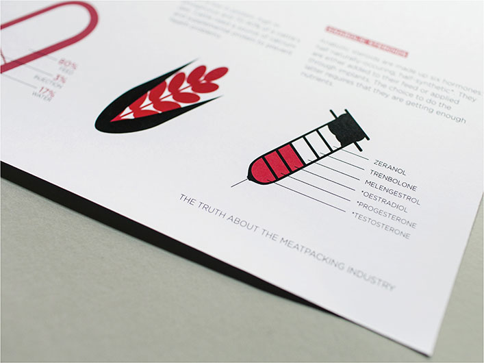
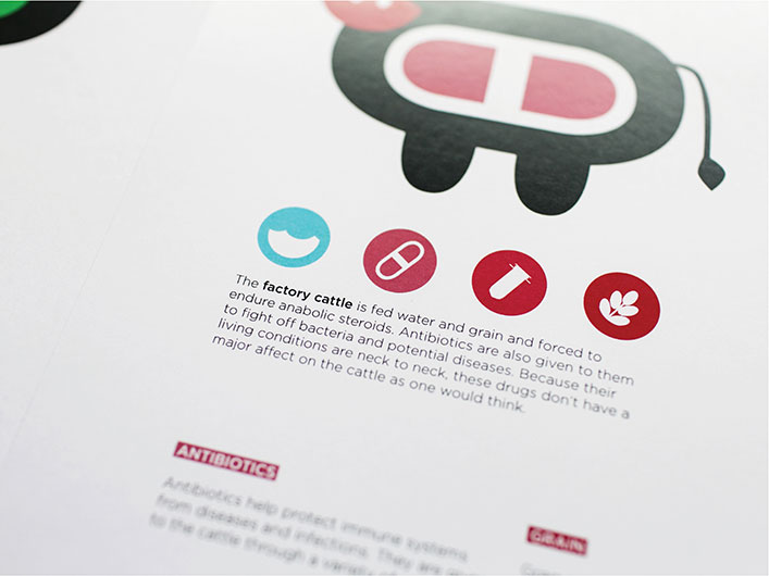
Information Design | These info graphics were created for a magazine-type spread. They explore the difference between cattle-fed cattle and hormone-infested cattle and its effects. An iconography system was created to help the reader navigate the narration of the story between the two cattle. See more from Dorothy

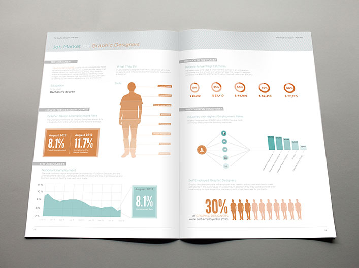
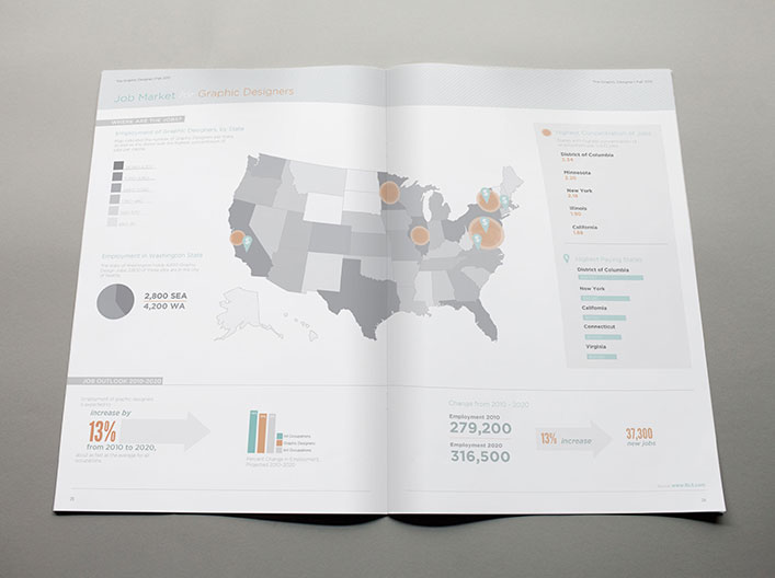
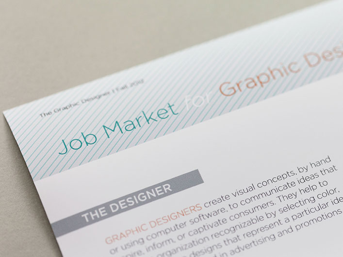
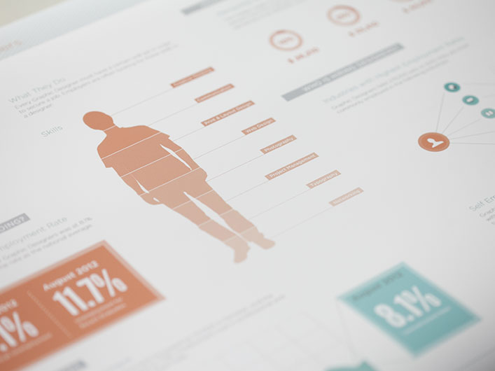
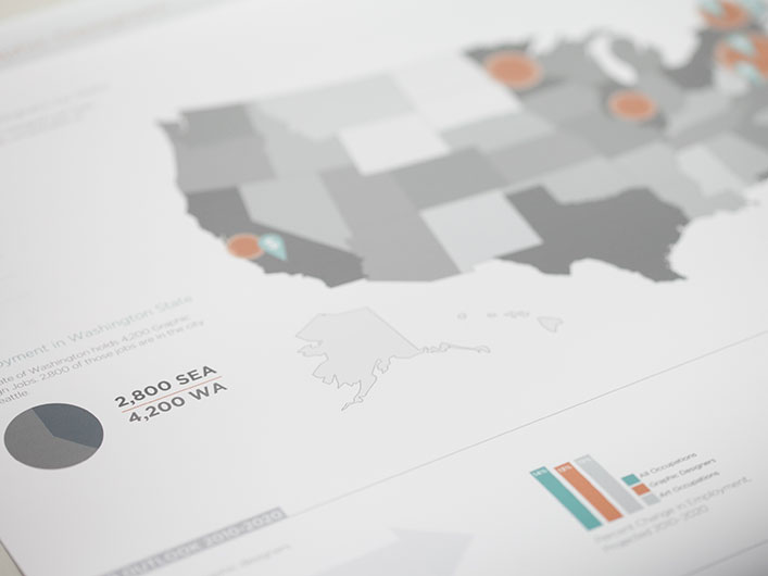
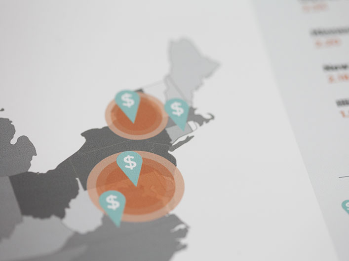
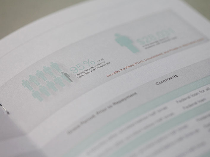
Information Design | The economy has been struggling for the last several years and has affected everyone in all occupations. This information graphic explores the statistics of the current job market and how the economy is affecting the creative workers, more specifically those in graphic design. See more from Eleni

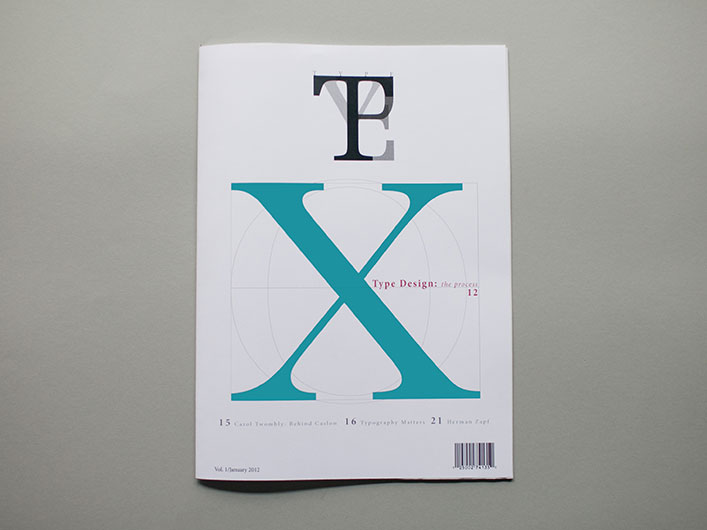
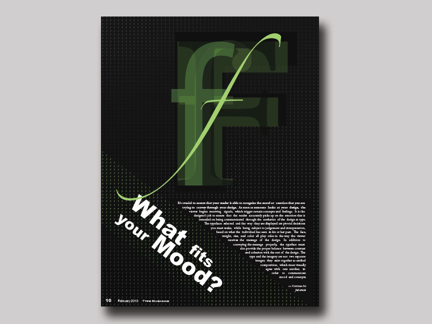
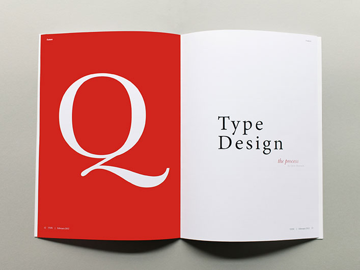
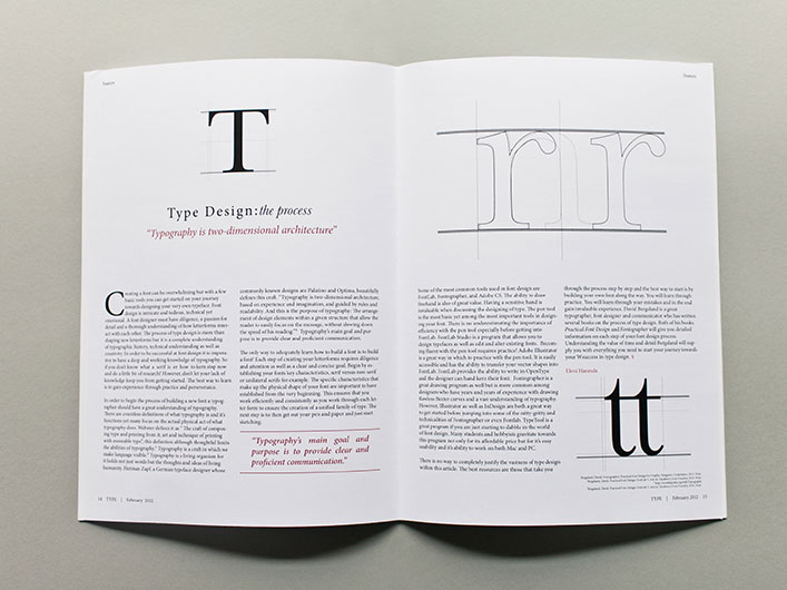
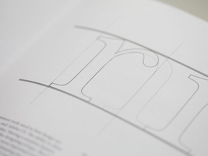
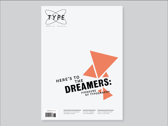
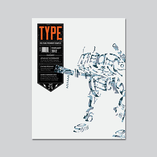
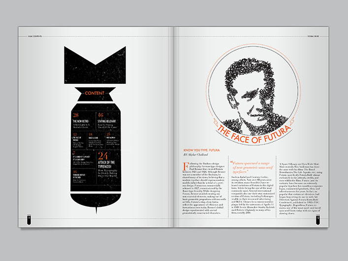
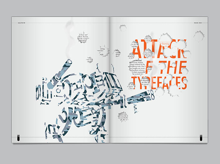
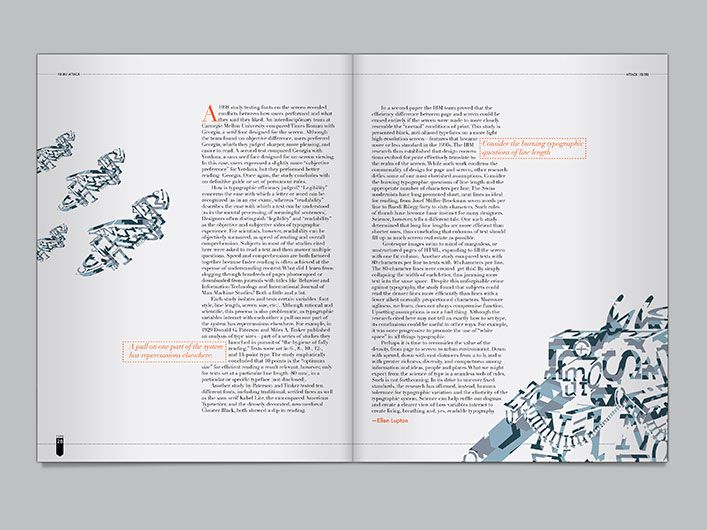
Type Magazine | Type is a fictional magazine publication that explores everything having to do with typography. Through detailed illustrations of how type is formed, this feature highlights the processes behind building a typeface.
See more from Eleni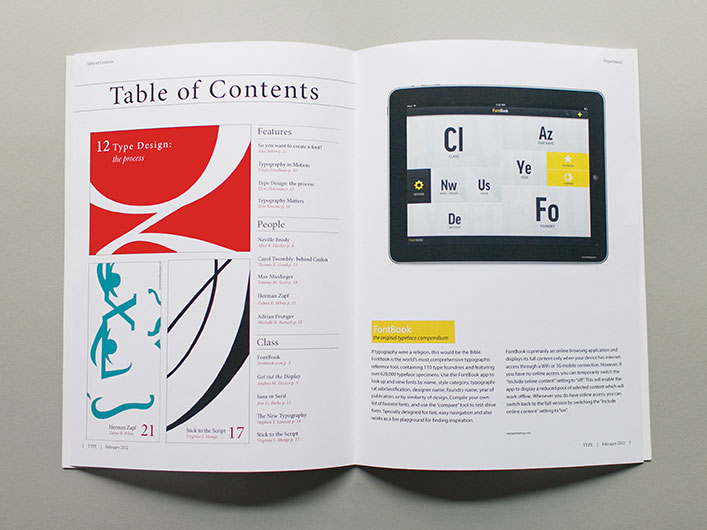

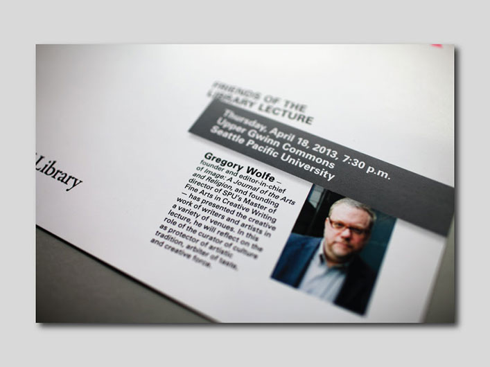
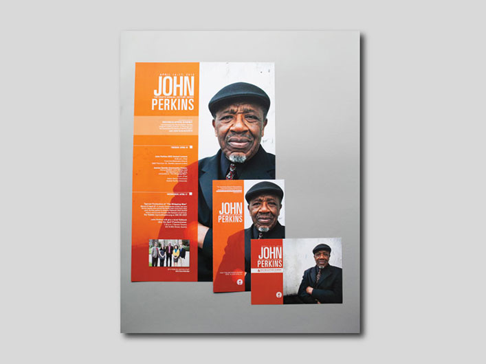
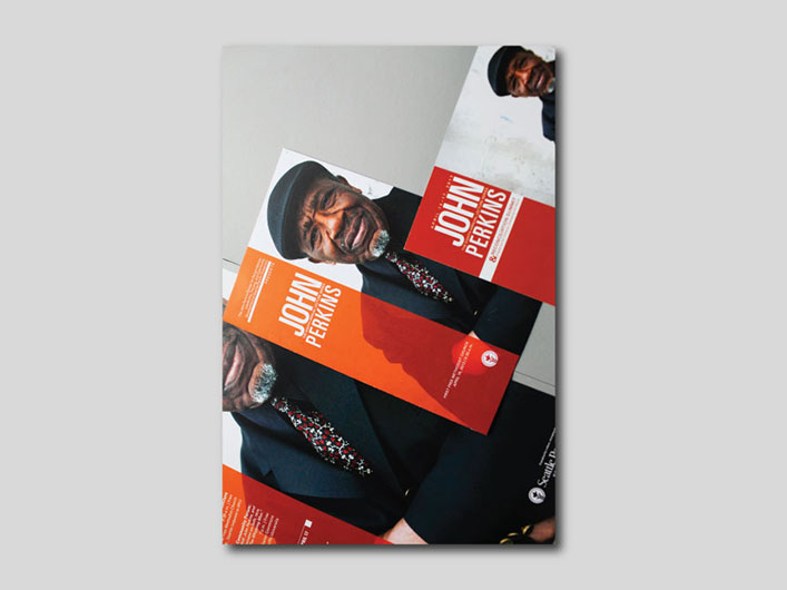
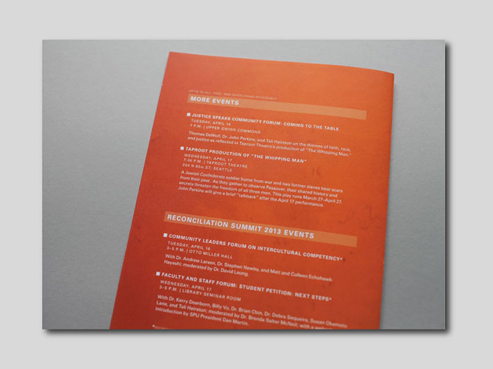
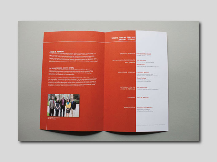
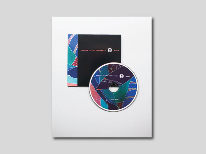
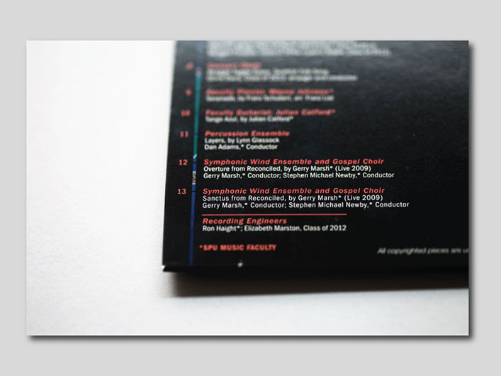
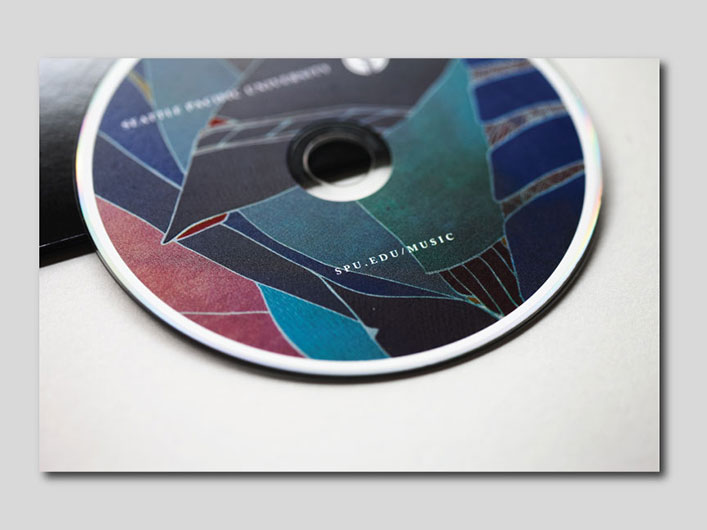
University Communications | These are selected projects that were done during my year of working at
University Communications at Seattle Pacific University. See more from Eleni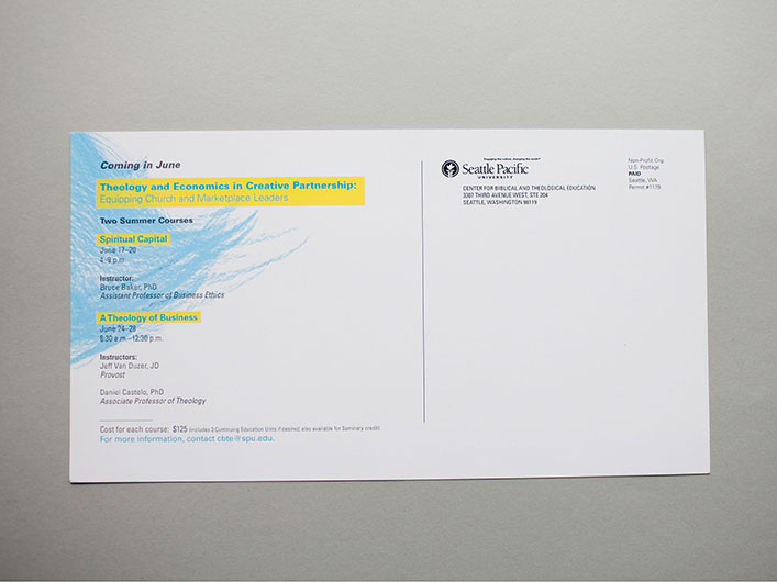

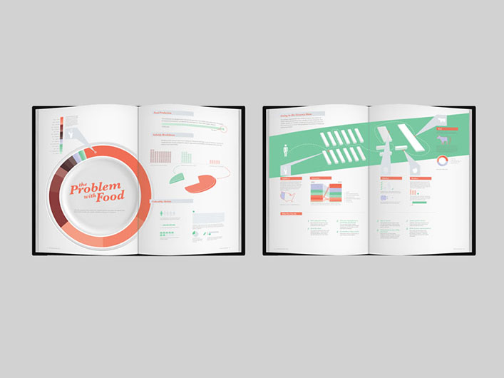
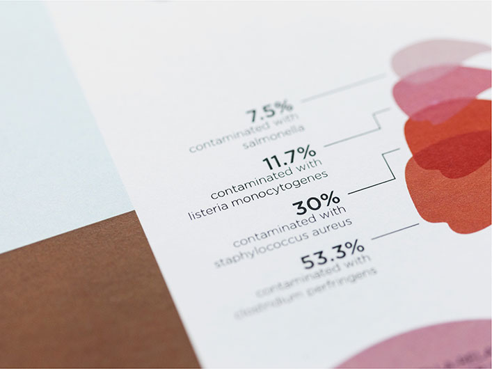
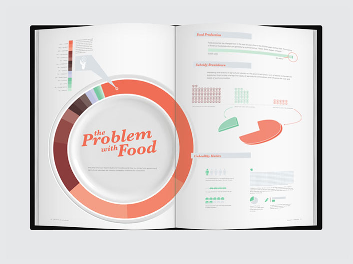
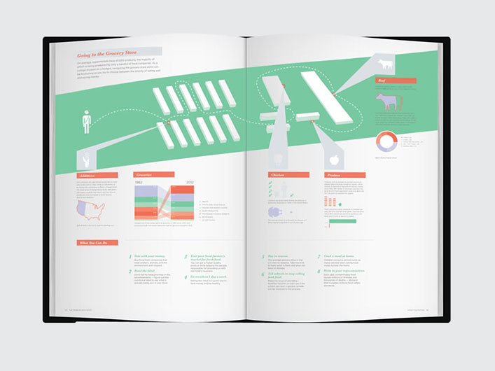
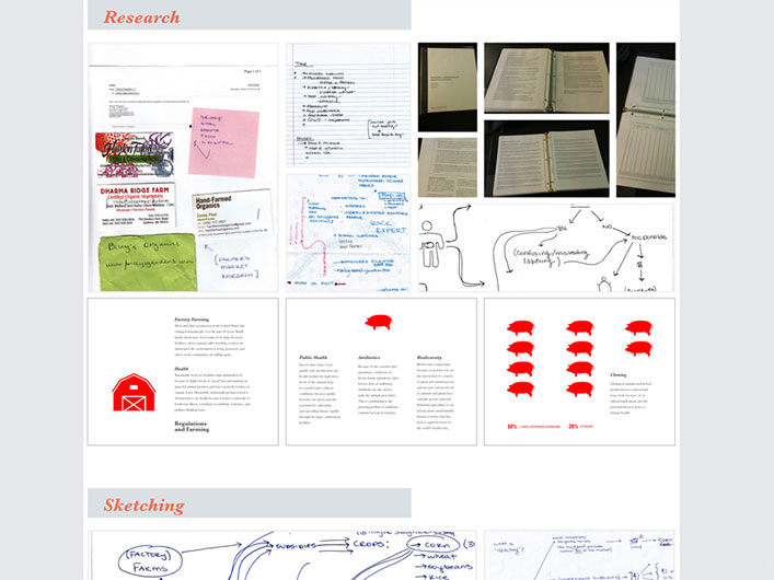
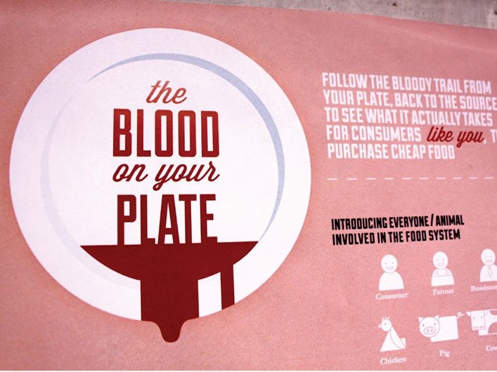
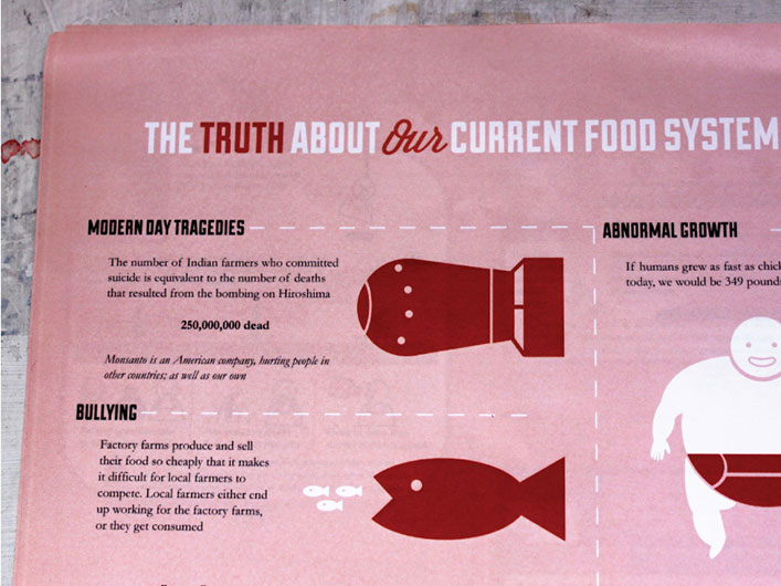
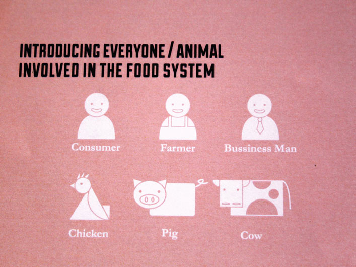
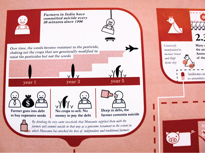
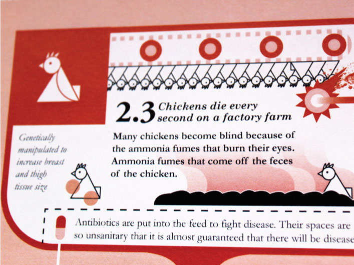
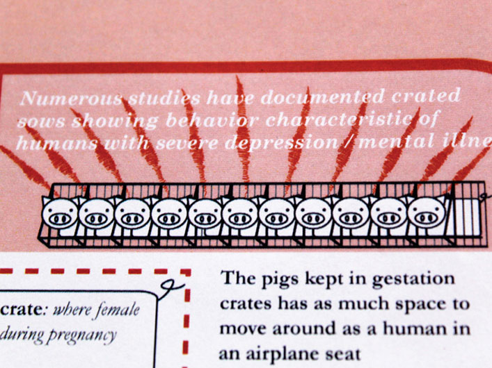
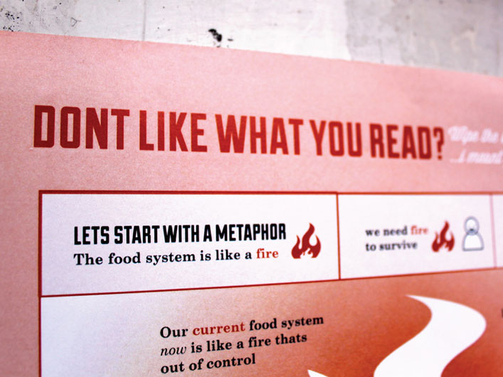
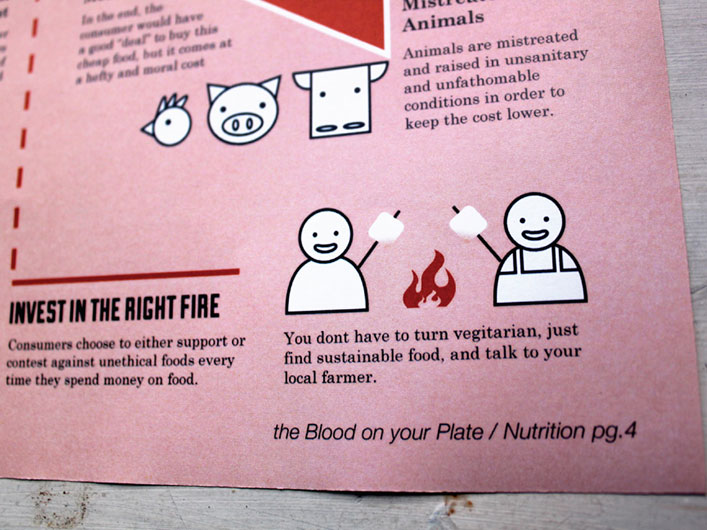
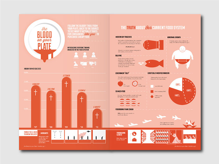
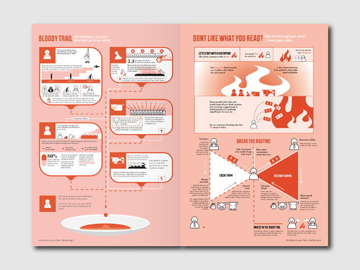
Food Production Infographic | Meant to visually process the fundamental problems of the American food production system, specifically seen in a walk through the grocery store. The source of food is revealed as well as the relevant consequences, specifically the role of government subsidies. See more from Hailey

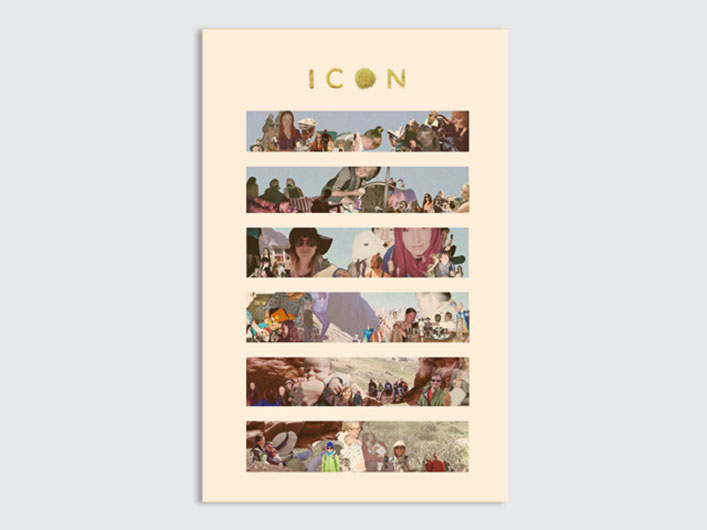
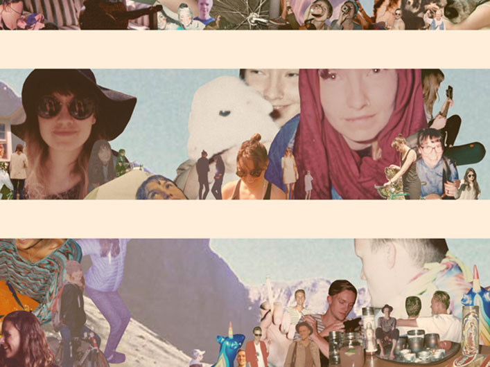
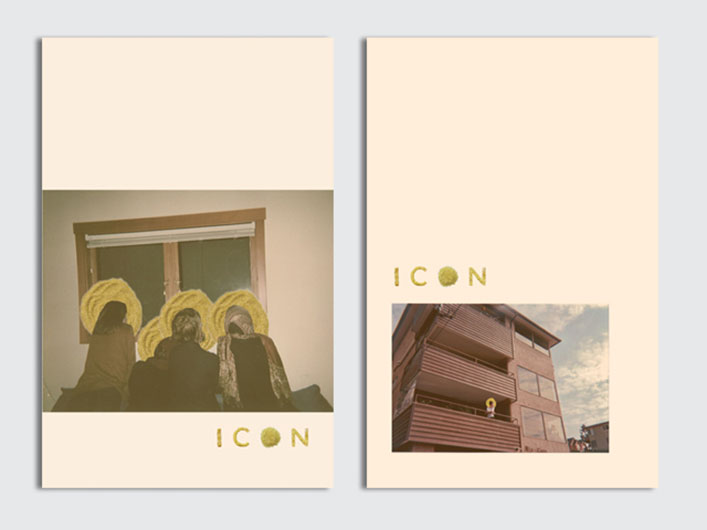
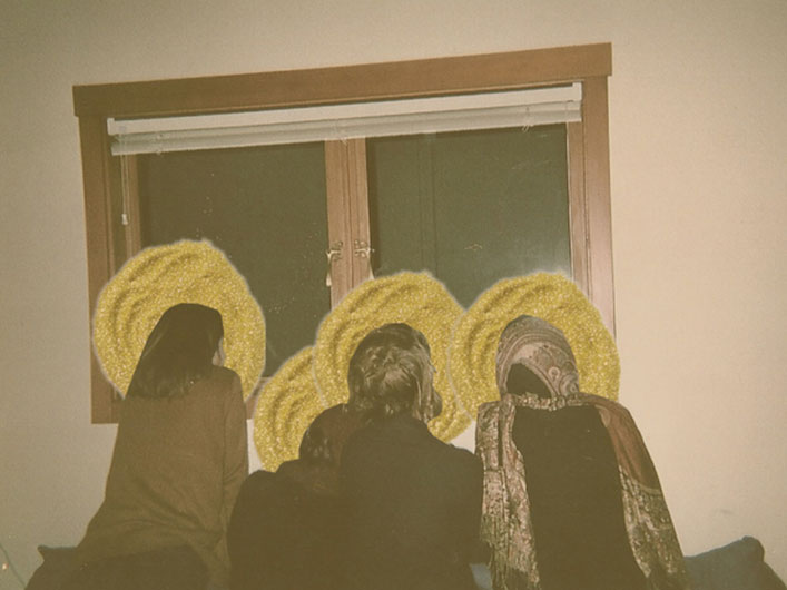
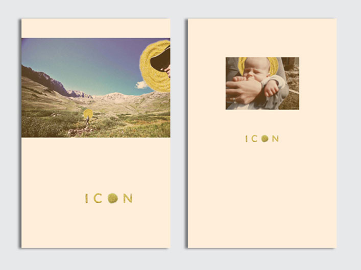
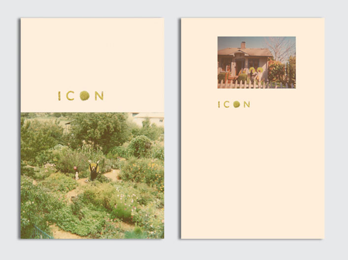
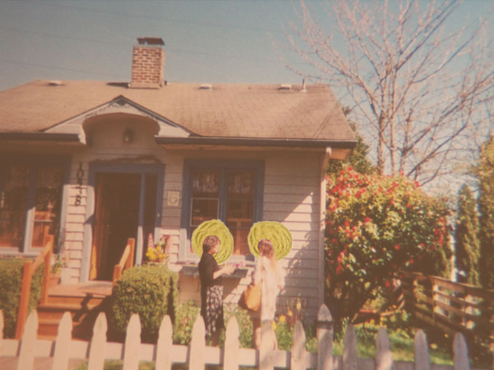
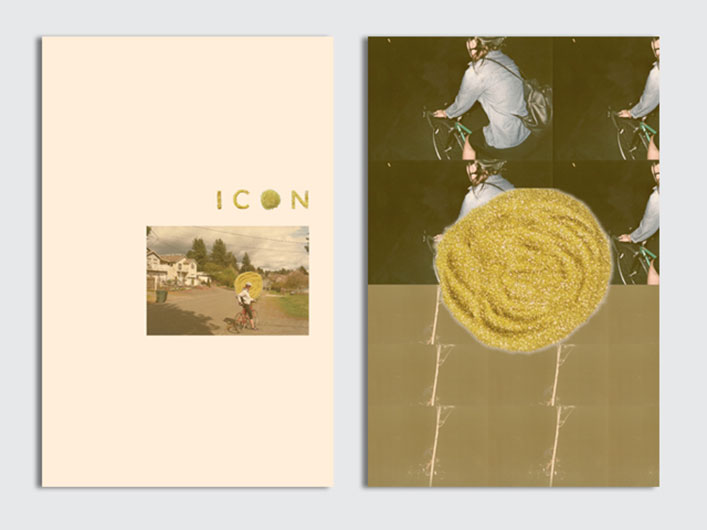
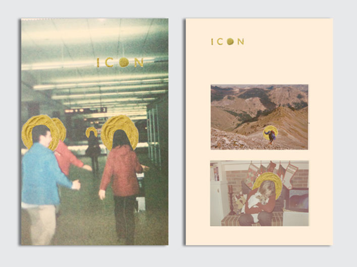
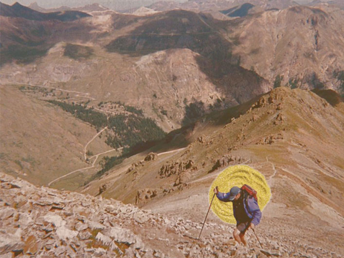
Holy Aesthetics | These visuals are heavily saturated with the themes discovered through a case study of Russian iconography, including finding the sacred in the everyday and achieved through the collaging of cheap film photography compiled over the course of a year. See more from Hailey

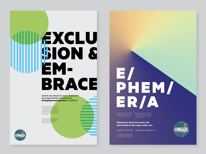
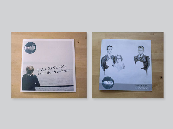
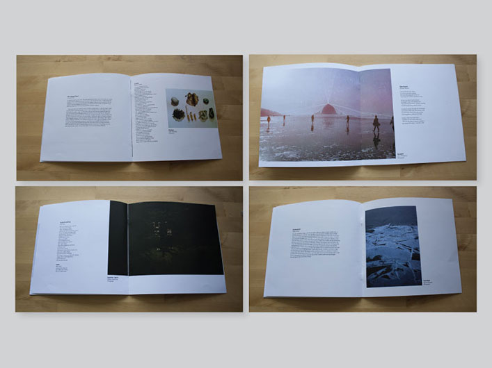
Lingua | A series of publicity and zine layouts designed for Lingua, the campus art and literary journal.
See more from Haley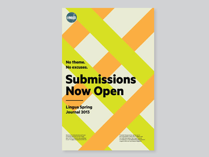

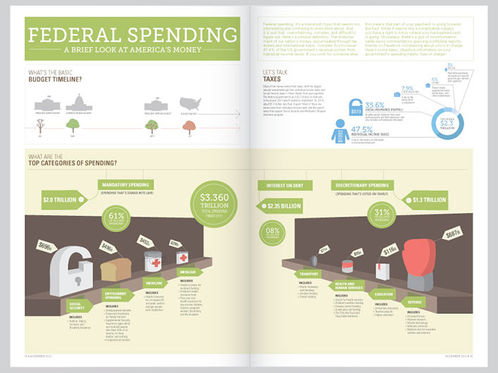
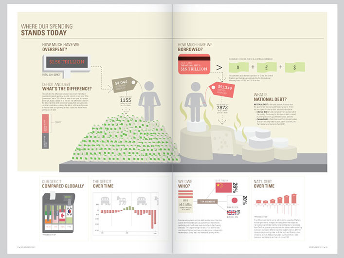
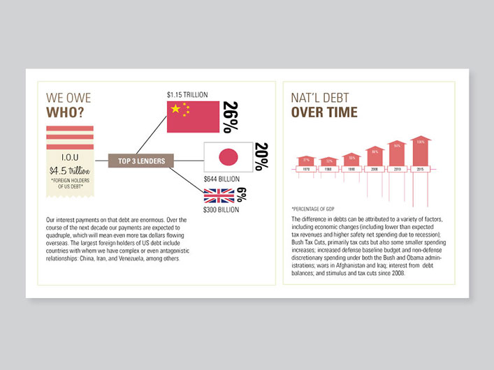
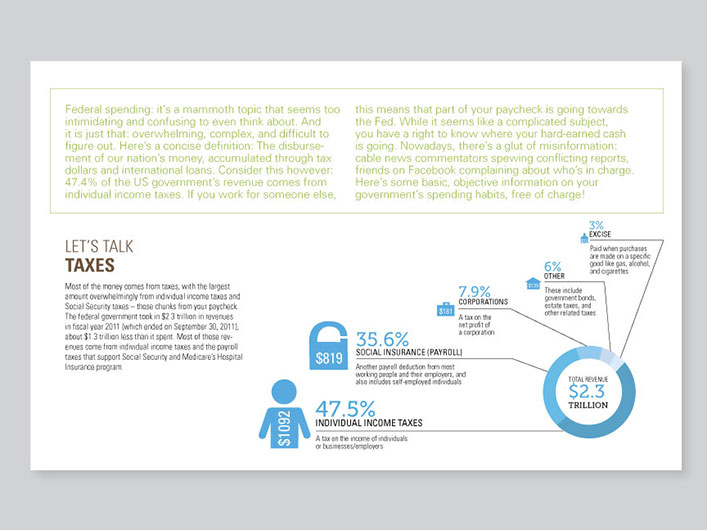
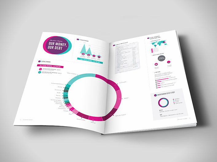
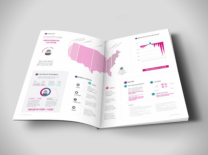
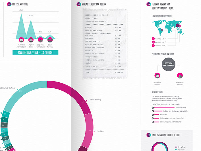
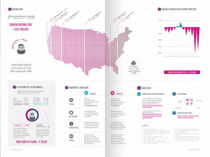
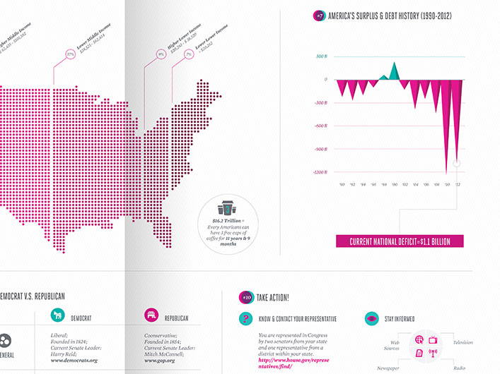
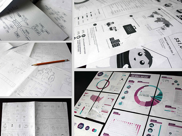
Infographic | Did you know America's deficit currently stands at $16 trillion? The topic of federal spending in the US is a mammoth, formidable one that's difficult for anyone to engage in and understand. This editorial infographic serves to clarify this topic through a clean, relatable design. See more from Haley

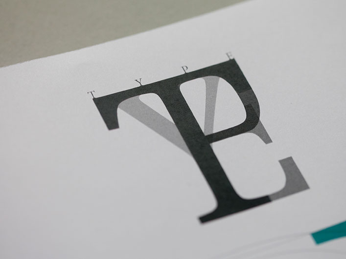
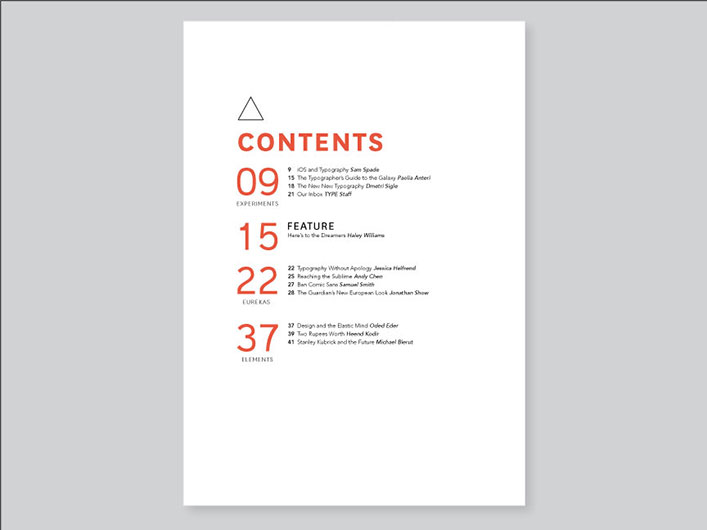
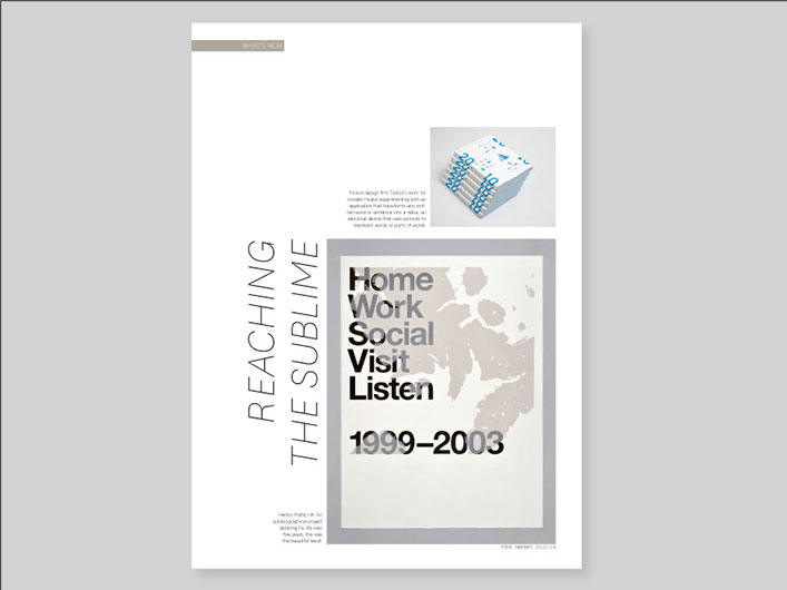
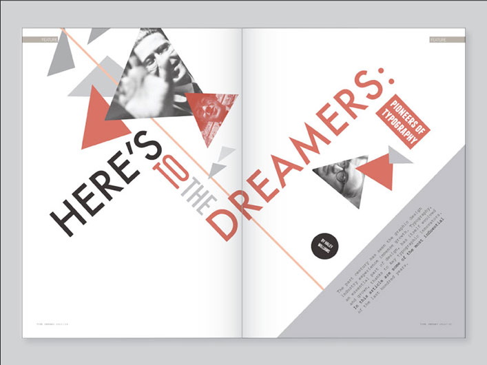
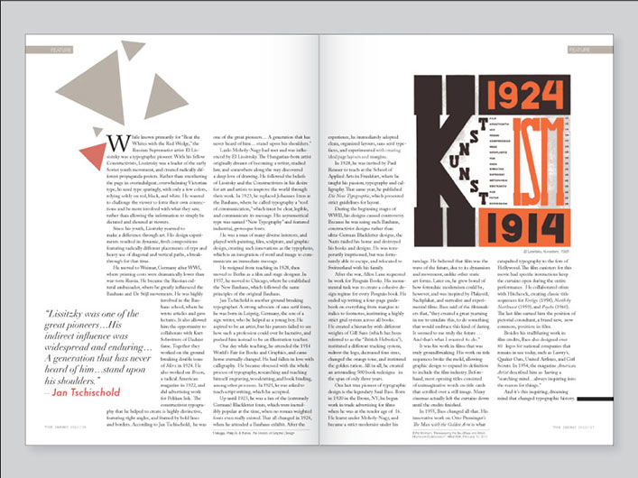
Type Magazine | A fictional magazine for type enthusiasts, with a emphasis on experimentation in type (hence the nod-to-physics masthead). This issue featured classic innovators such as El Lissitzky and Jan Tschichold, as seen in the feature spread. See more from Haley

Information Design | Agricultural Subsidies is quite the dense subject, and in efforts to communicate this
information better, I created a two-spread information design that breaks down the subject into coherent
bite-size pieces for the viewer to digest both visually and comprehensively. See more from Henry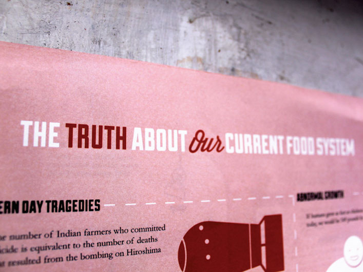

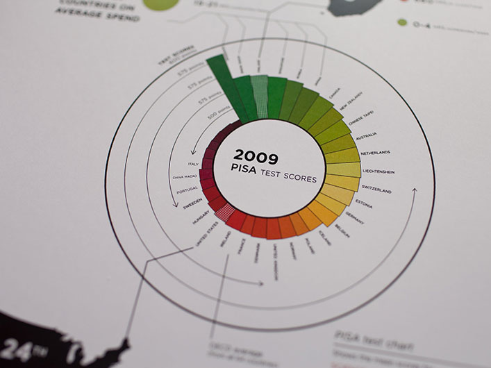
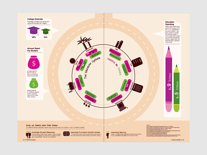
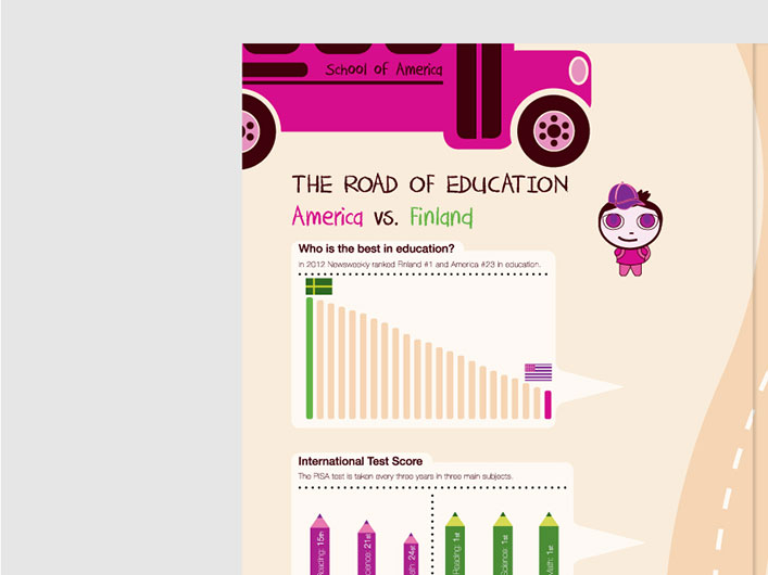
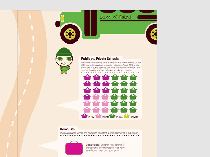
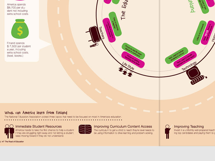
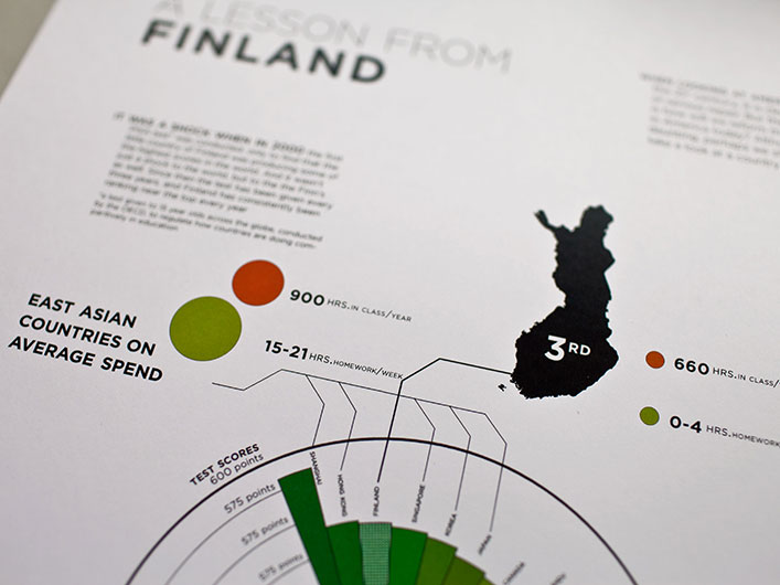
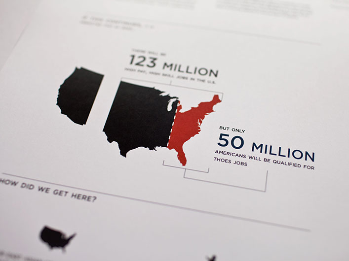
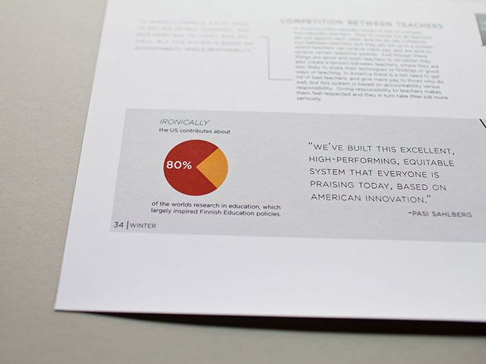
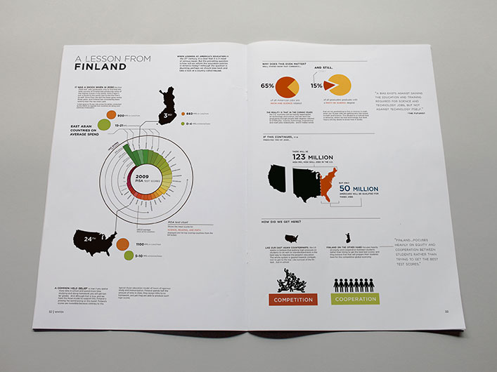
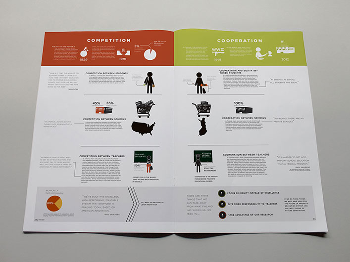
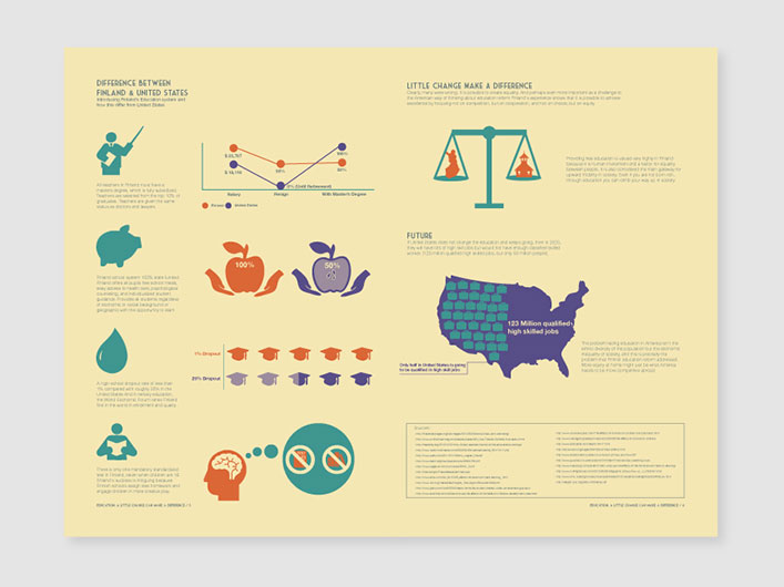
A Lesson from Finland | This is an information graphic on the comparison between the Finnish and American education systems. It explores the reasons behind Finland’s great success in regards to education and provides ways that we can learn from them. See more from Honnah

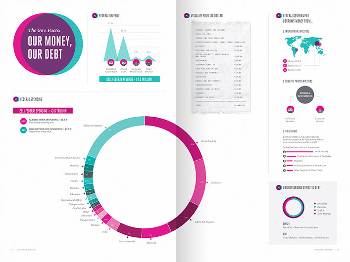
Federal Spending Infographic | My goal is to create a simple understanding of what is federal spending, why it is important for everyone, and how students can have a say in this matter. See more from Jessica

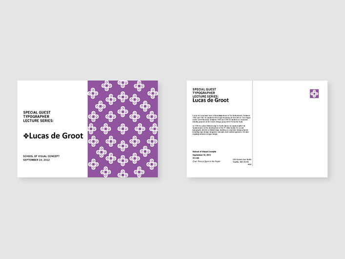
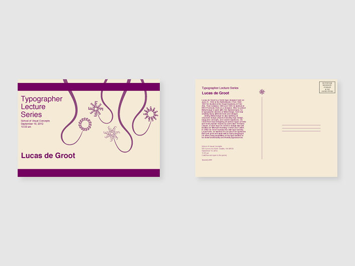
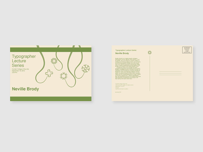
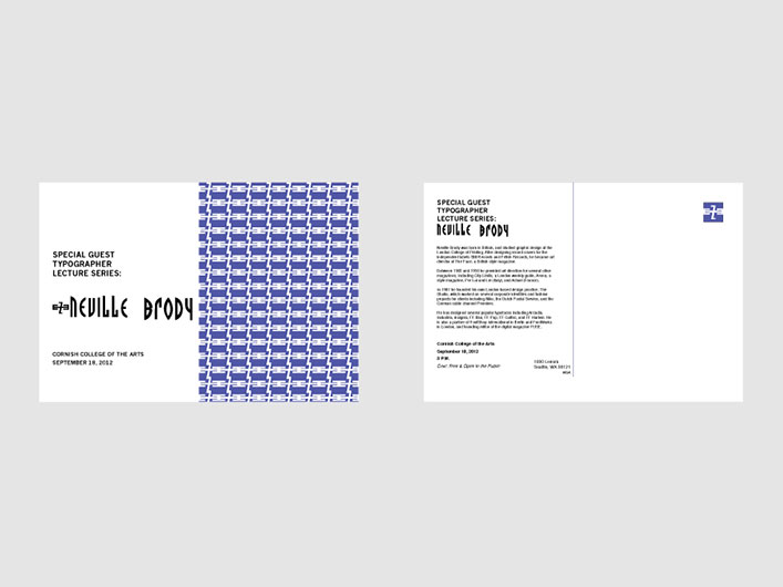
Postcard Design | Using typographer’s typeface to create a pattern to represent who they are.
See more from Jiyoon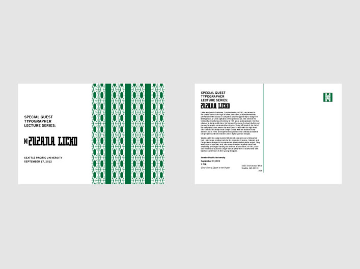

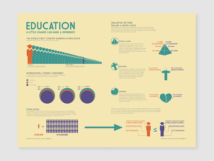
Information Design | This is representing how Education in America is ranked lower than how much they spend on. Comparing with Finland (ranked 1st) and concluding how this issue can get better. See more from Jiyoon

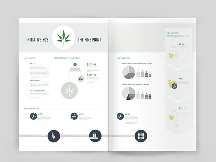
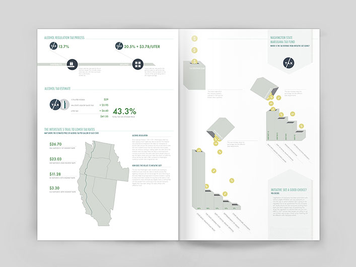
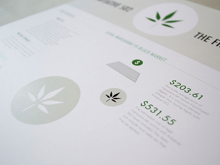
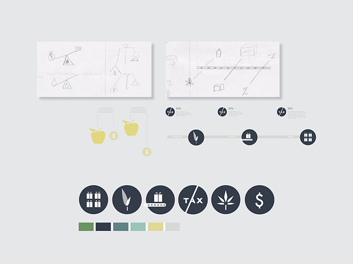
The Fine Print Information Spreads | After researching the political hot topic of Initiative I-502—the legalization of marijuana, I created these two informational design spreads. The use of an icon system and color codification is aimed at helping the viewer navigate through the magazine spreads. See more from Megan

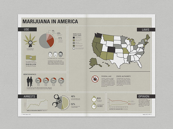
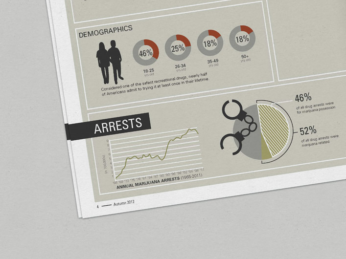
Information Design | This is a two spread information graphic meant to inform the audience on a basic level about marijauna use and laws in America and then move into more specifically the state of Washington before and after the passing of I-502 in November 2012. See more from Nora

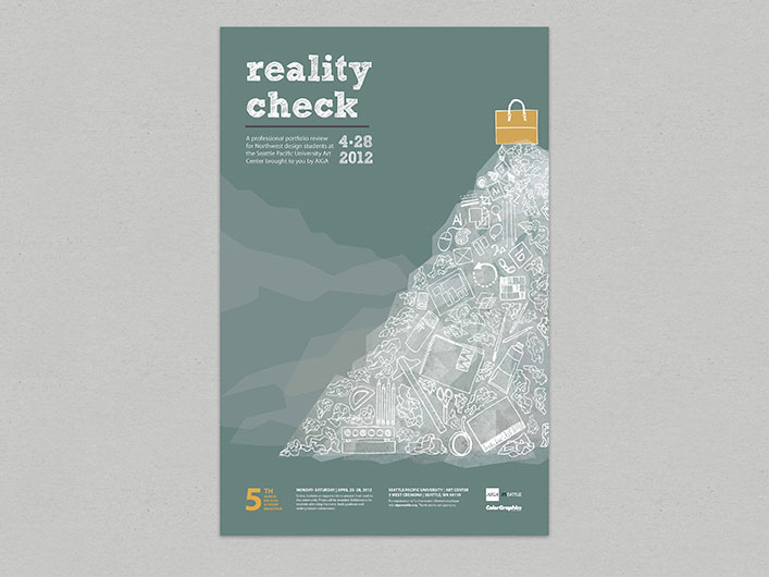
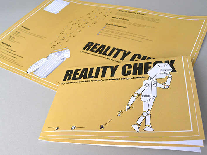
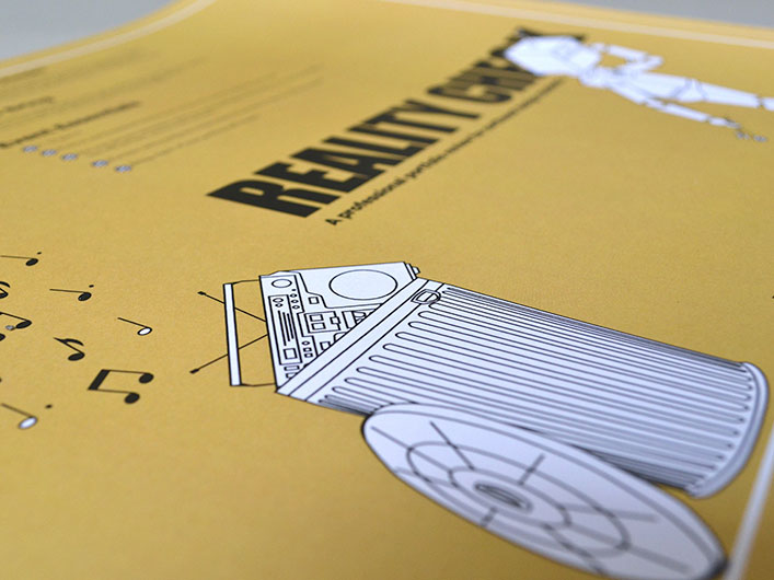
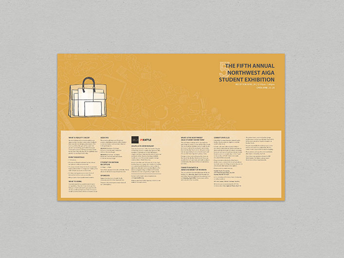
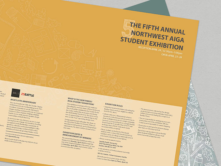
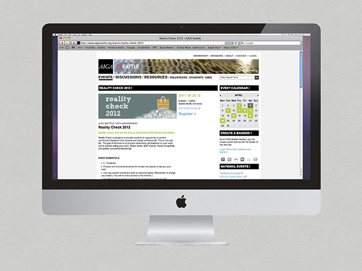
AIGA Reality Check 2012 | This poster was chosen to promote the 2012 AIGA Reality Check event, a professional portfolio review. I chose to illustrate the journey a student takes to reach the final goal of a well-crafted portfolio. See more from Nora

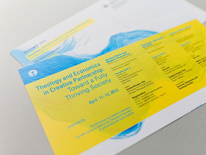
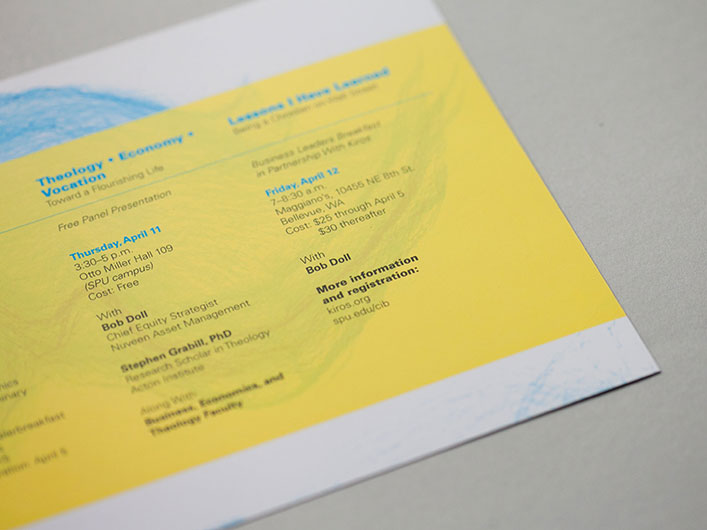
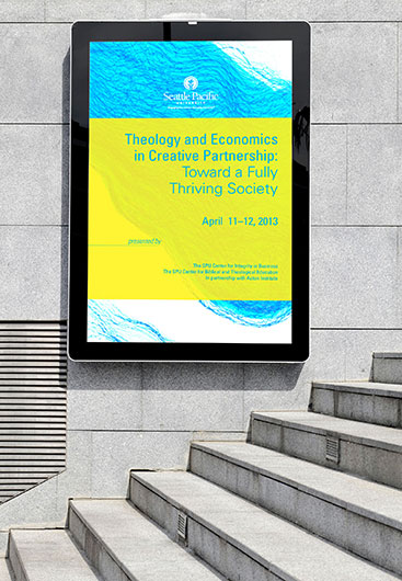
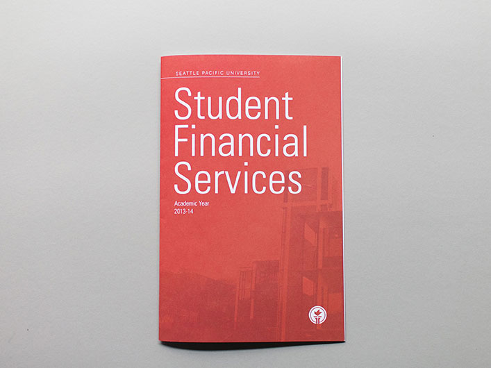
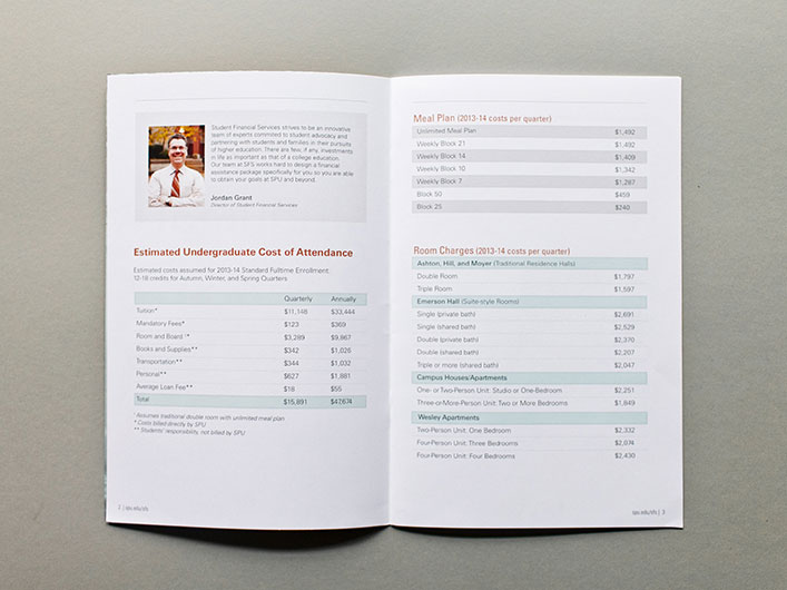
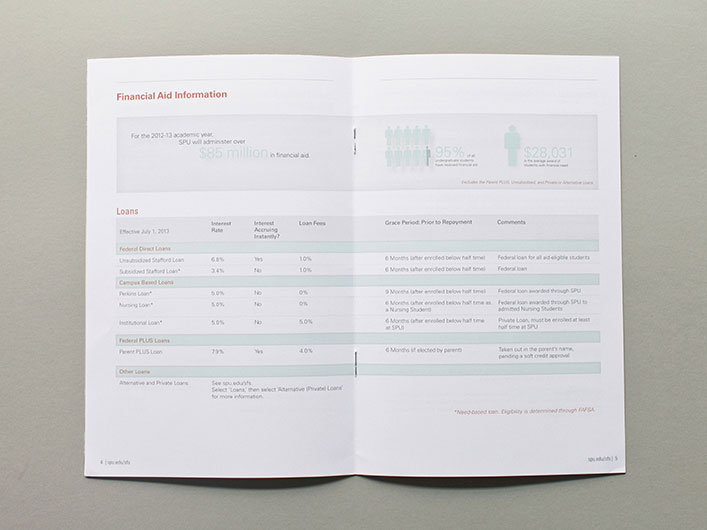
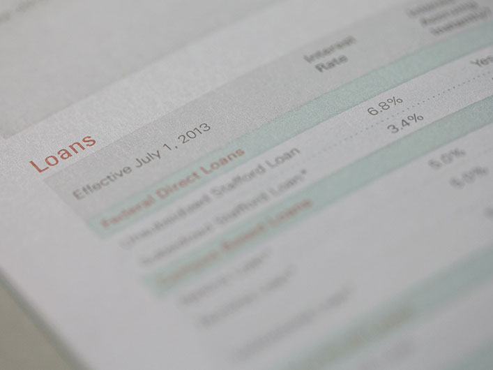
University Communications | Various print work done at my internship at the university communications department at Seattle Pacific University. See more from Ron

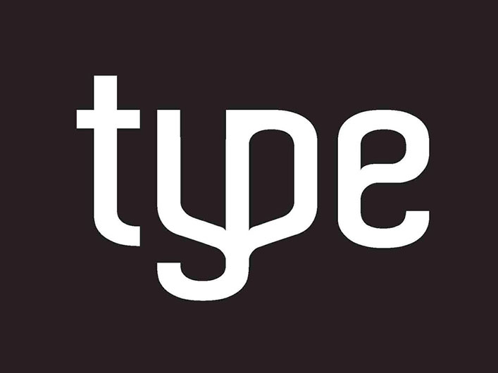
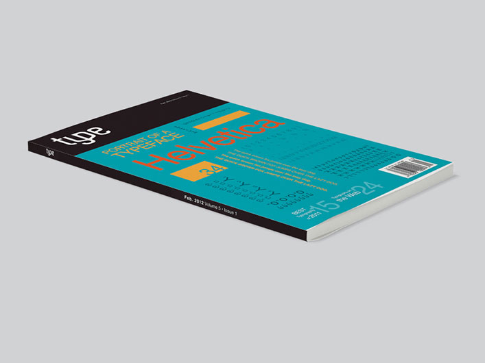
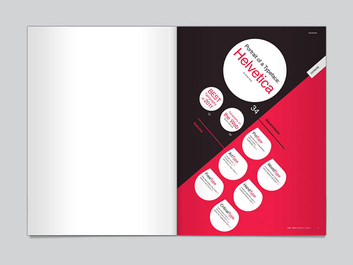
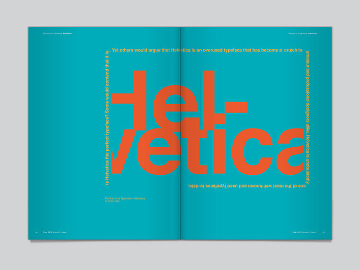
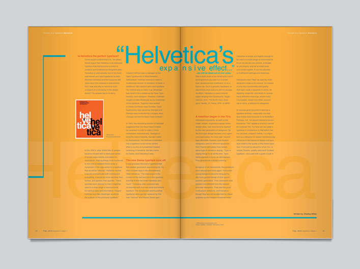
Type Magazine | The Type Magazine’s target audience is design students, or “type nerds” ages 18-25. The masthead is both modern and playful, while remaining sturdy and reliable. See more from Shelley

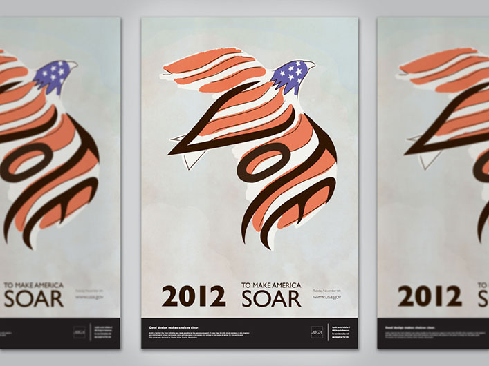
Vote Poster | The goal of this project was to design a non-partisan poster to convince Americans to vote in the 2012 election. What would motivate all Americans to vote? They all desire to make America thrive—make America “soar.” See more from Shelley

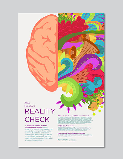
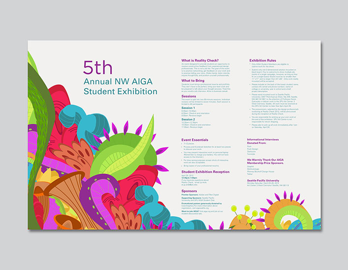
Reality Check Poster | A poster created for Reality Check. An AIGA sponsored event that invites designers from the Seattle area to come converse and critique students. The final product includes original illustrations showcasing right brained creativity. See more from Thomas

Type Magazine | This was a magazine publication created to showcase typography and the impact it has on the world around us. See more from Thomas

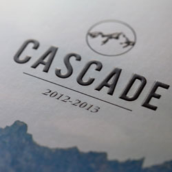
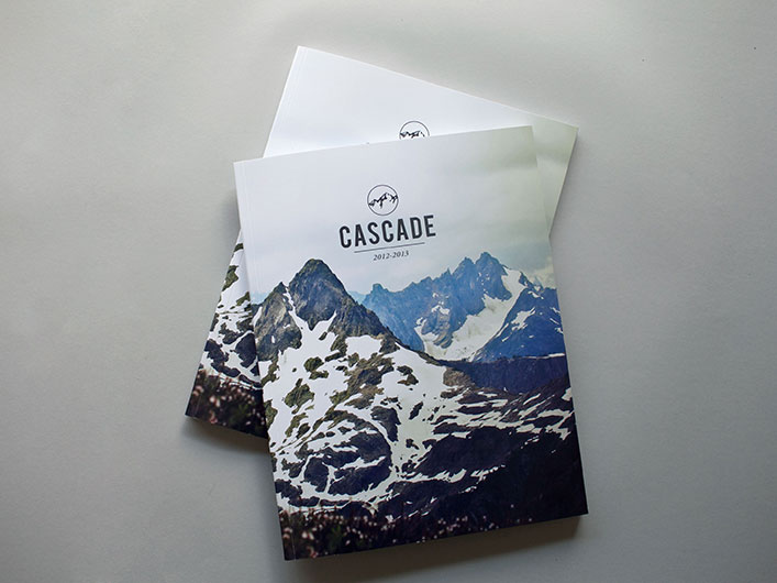
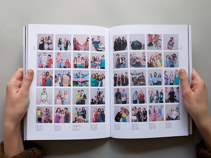
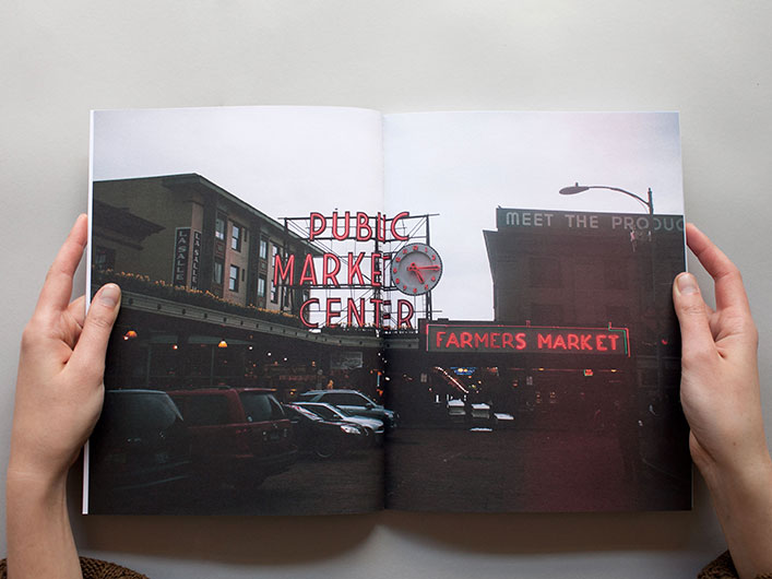
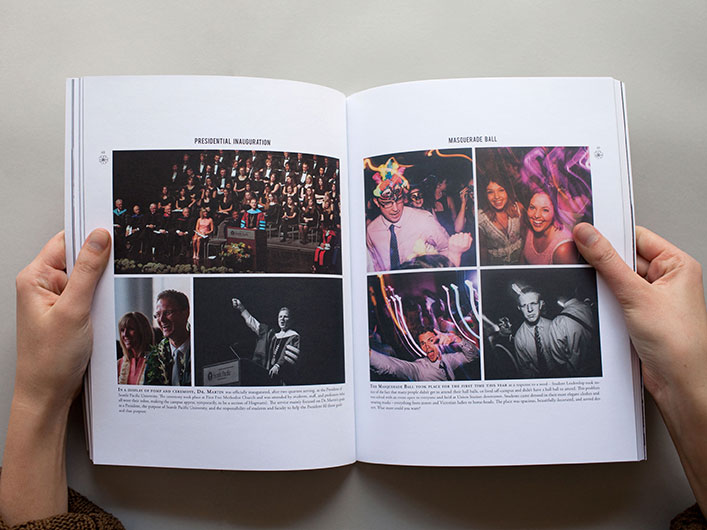
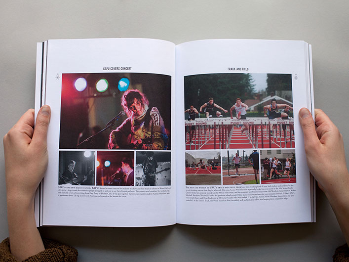
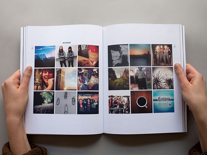
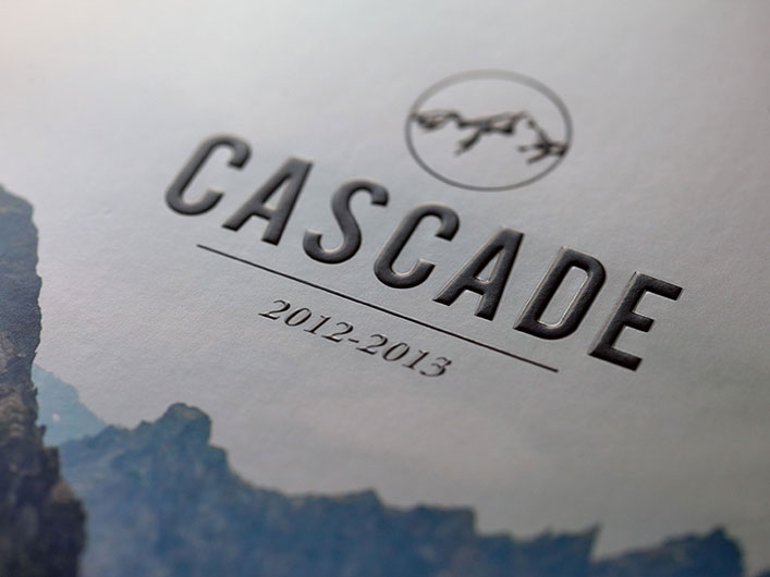
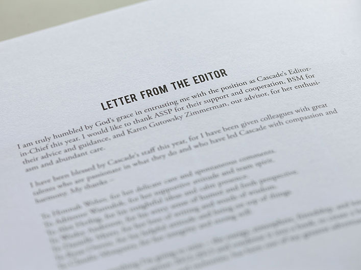
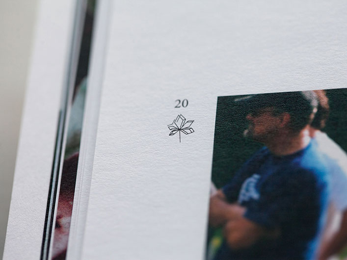
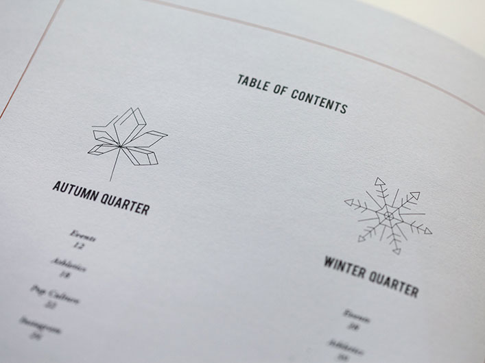
CASCADE Yearbook | This is Seattle Pacific's yearbook for 2012-2013, the final product of a
yearlong collaboration between artists and a marketing team. As one of the designers for the book, we
focused heavily on photography that is supported by a clean structured design style. See more from Adrienne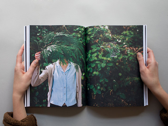
 MOTION
-


Into the Wild | This is an alternative title sequence for the movie Into the Wild. The original book explored different themes and this video incorporates the themes through use of icons. Darker and cooler colors help foreshadow the tragic ending

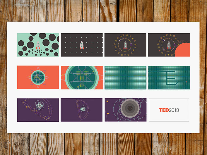
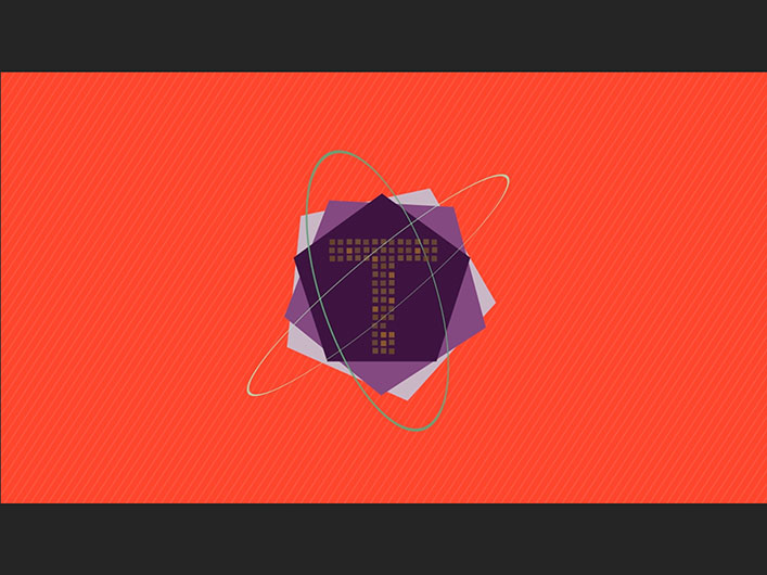
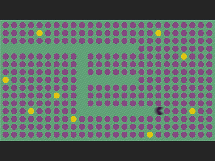
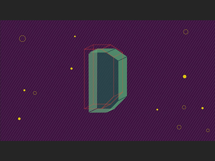
TED 2013 | A promotional video for the 2013 edition of TED Talks, themed “The Young. The Wise. The Undiscovered.”

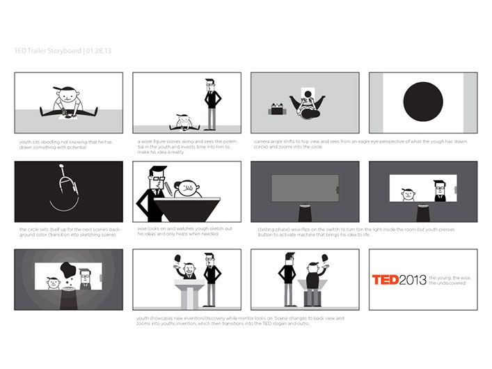
TED Trailer | The young. The wise. The undiscovered.

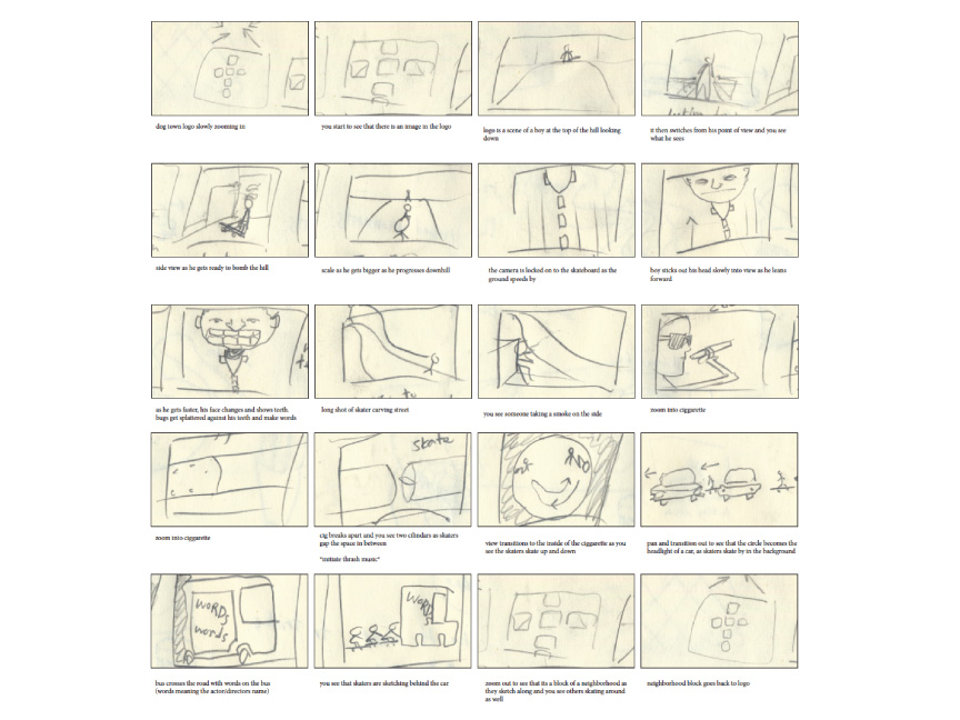
The Lords of Dog Town | Trying to capture the raw and youthful energy of The Lords Of Dogtown, I moved my illustrations around in the environment I created using video. Mixed media seemed appropriate for this title sequence because of the way the Z-boys creatively and imaginatively interacted with the world around them.

Jiro Dreams of Sushi | Jiro Dreams of Sushi is documentary, following the life of Jiro, one of the world’s most renowned sushi chefs. Because the documentary reveals both the quirky side of Jiro as well as his professional and serious side, I tried to mimic that by merging a playful aesthetic with a dramatic soundtrack. The result is a lighthearted and ironic title sequence that imitates the feel of the film.

TED Trailer | The fact that we live on planet Earth is somehow a planned coincidence, full of exciting facts and events yet to be discovered. Compared to the universe, we are so small and young. And through our brief existence, we are full of knowledge. Through this journey, we are pursuing the undiscovered.


TED Trailer |

TED 2013 Trailer | This video

Submarine | Title sequence made to the movie Submarine using After Effects.

Roman Holiday | Undercover princess and pressman, escape, romantic adventure: A Roman Holiday. The title sequence tells this story through illustrating specific elements from the film.

TED Trailer | My aim in creating this trailer was to portray the TED talk theme of this year, "The Young, The Wise, The Undiscovered." Attending a TED talk for the adult is not unlike the process the young boy goes through as he pulls up the end of the fishing line to find out just what it is he has brought to light.


Title Sequence |

Title Sequence |


TED Conference Introduction | This is a 20 second film clip to transition speakers at TED2013. I wanted to communicate the feel of the theme of 'The Young, the Wise and the Undiscovered' in my choice of imagery, music, and narration, combining all those elements to tell a story in a very short amount of time.
IDENTITY
-

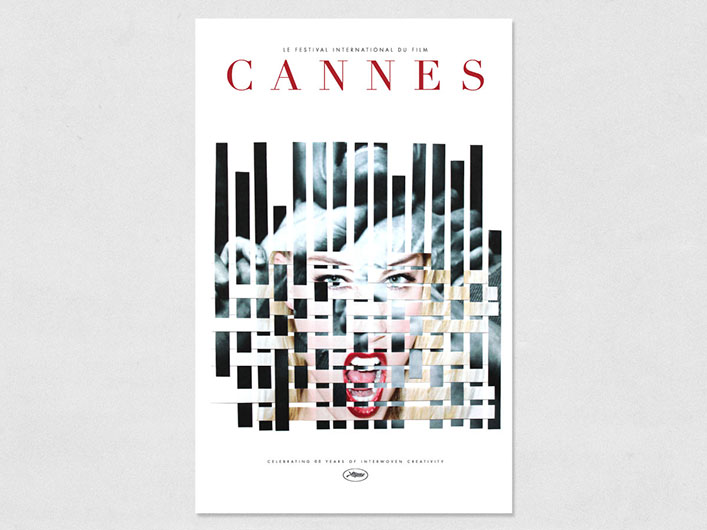
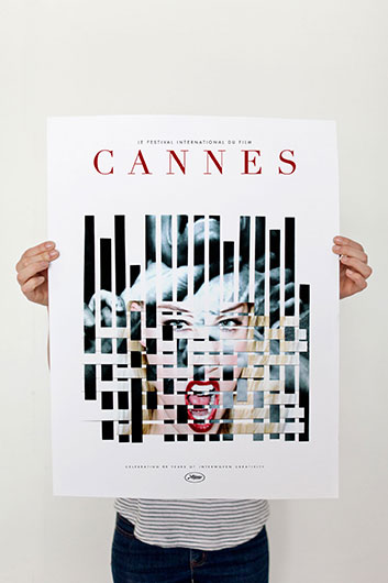
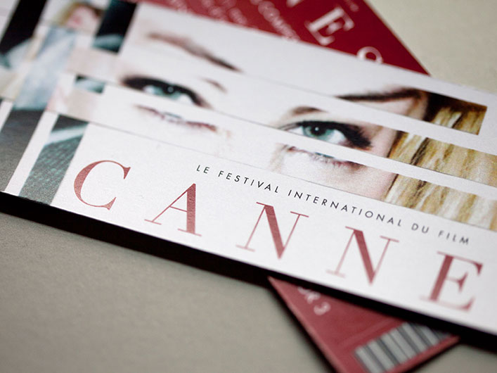
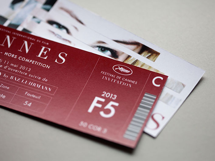
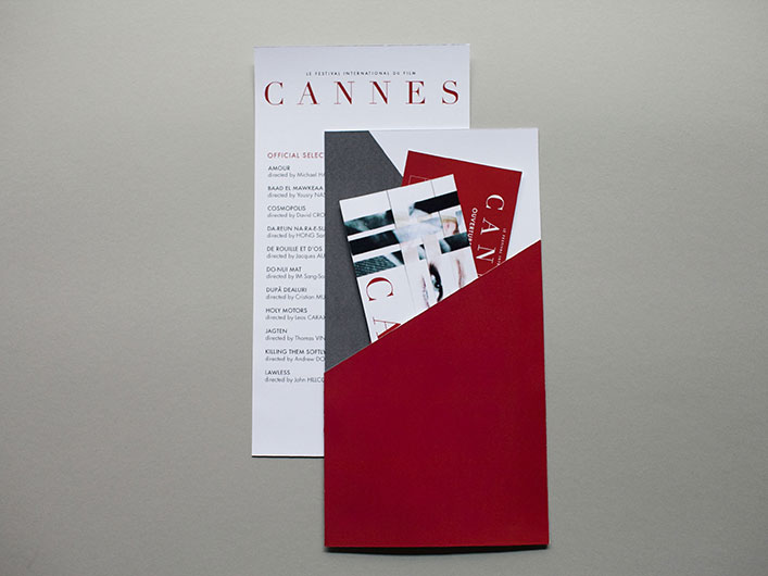
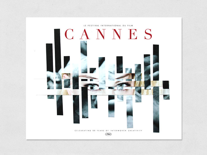
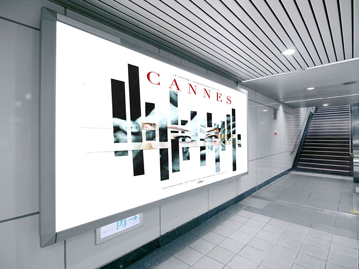
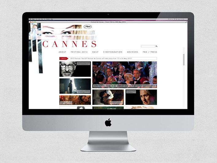
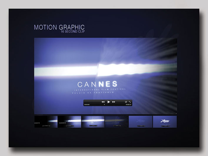
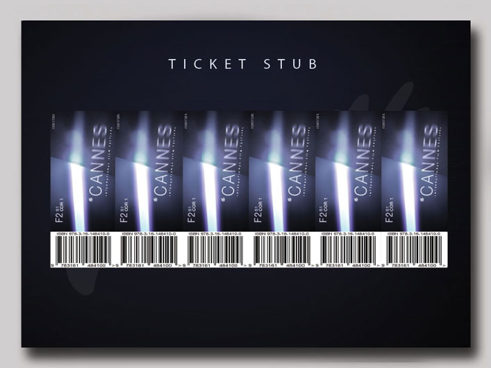
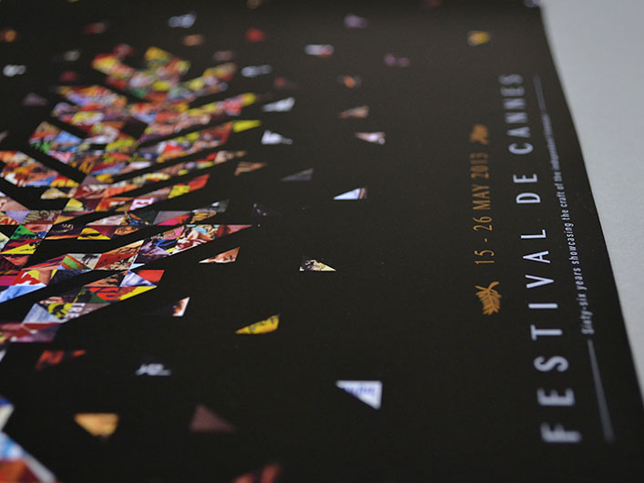
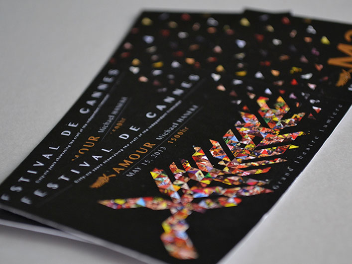
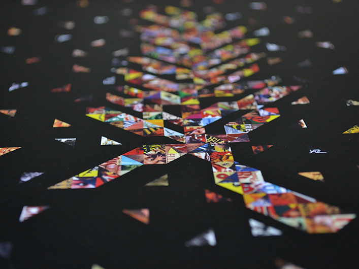
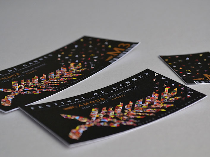
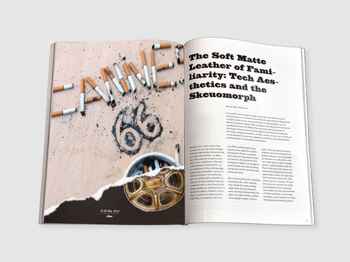
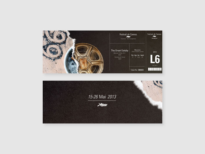
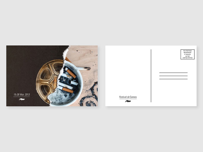
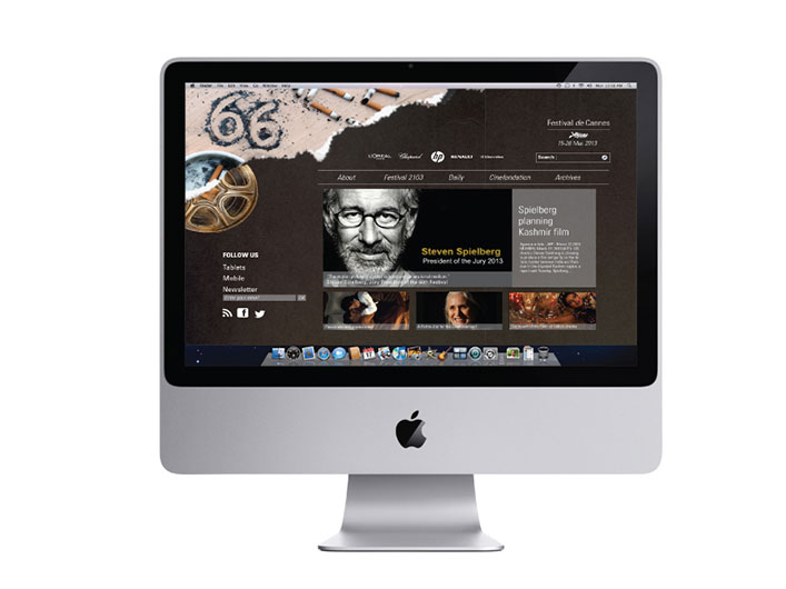
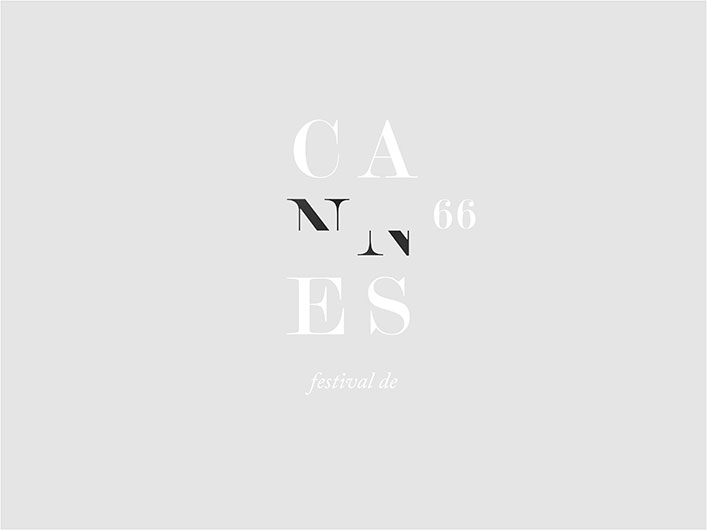
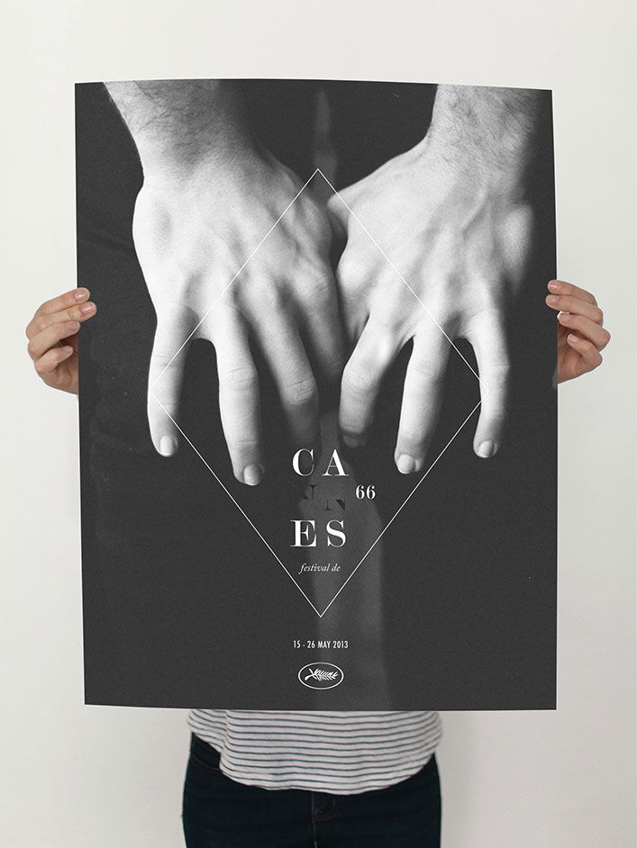
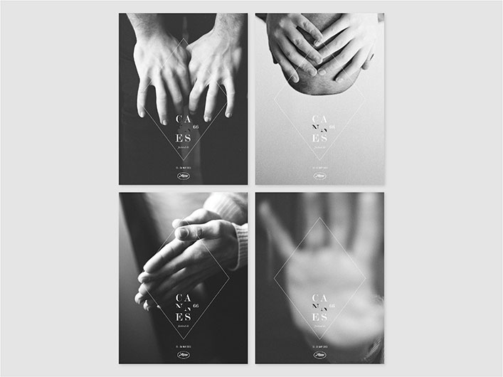
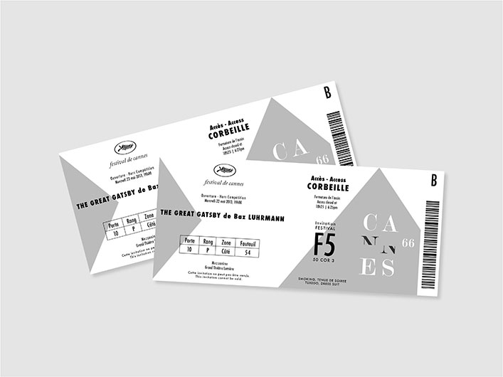
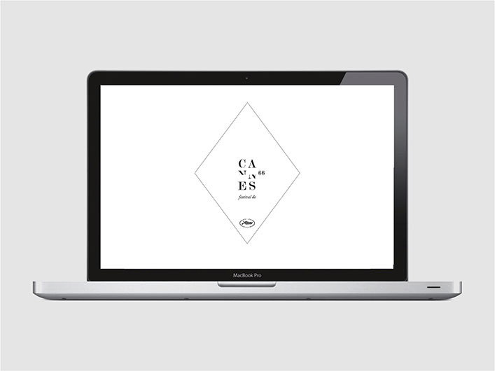
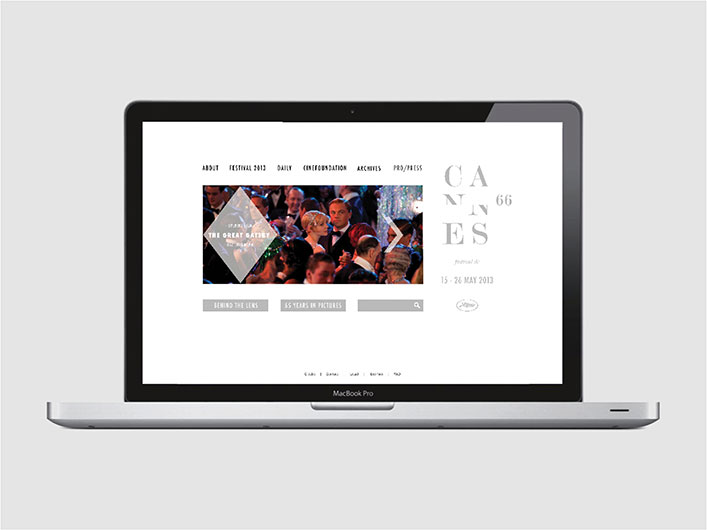
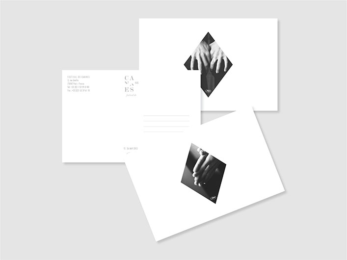
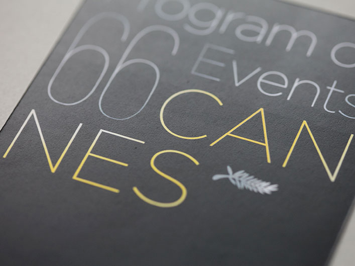
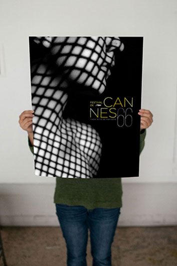
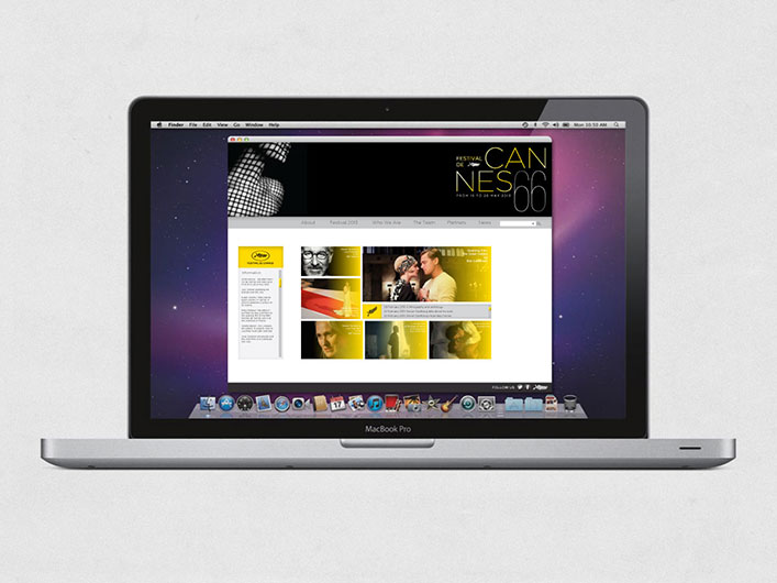
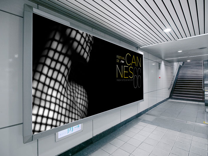
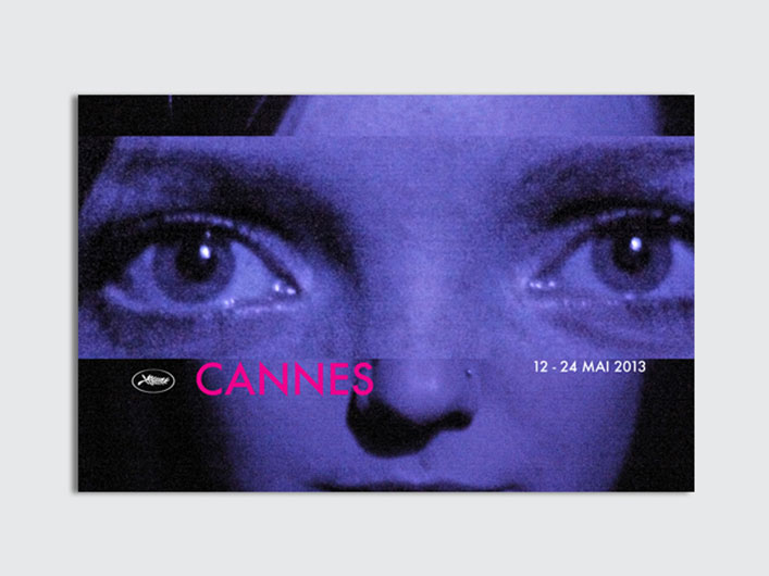
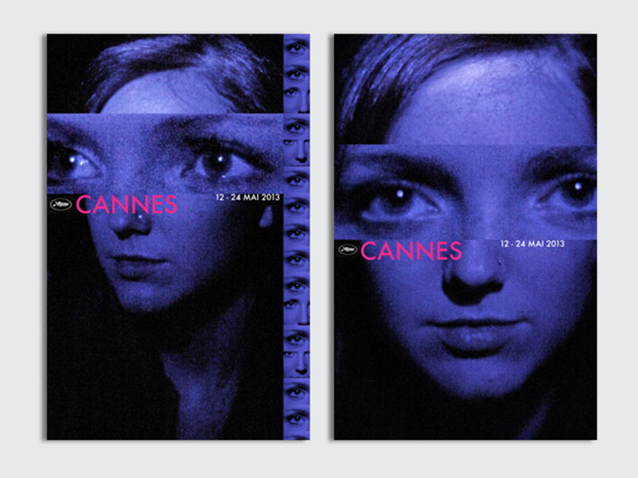
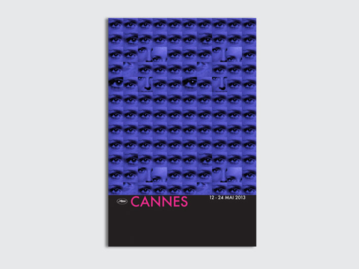
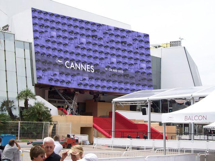
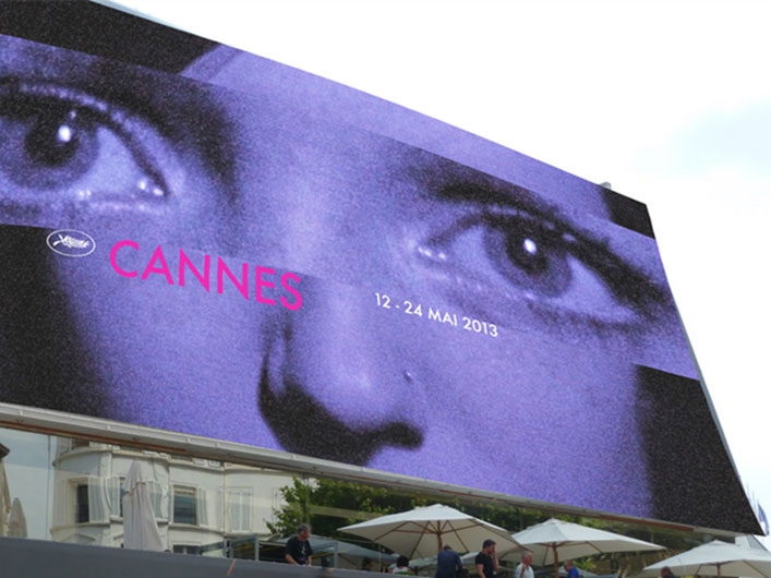
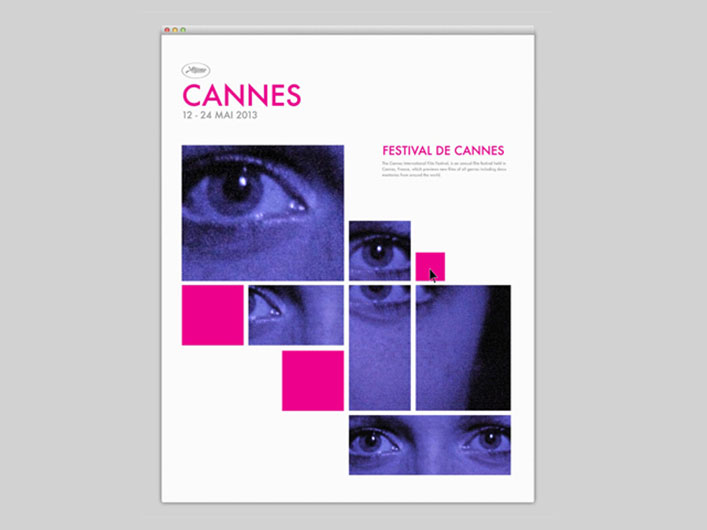
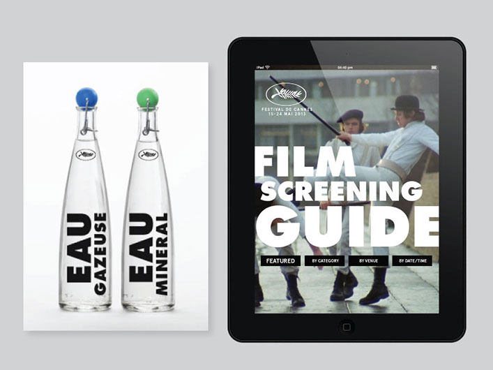
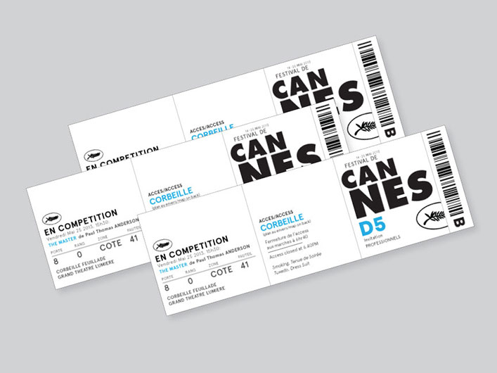
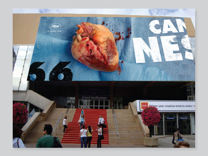
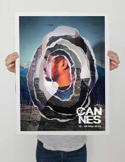
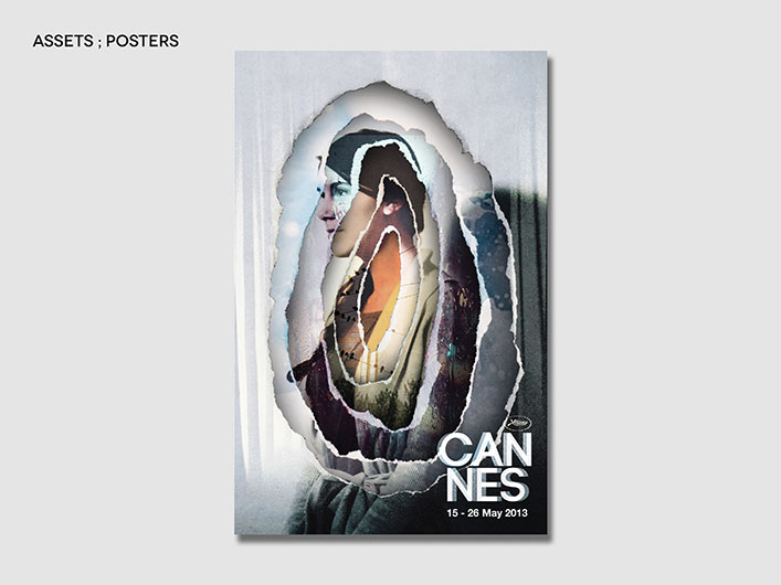
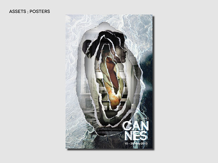
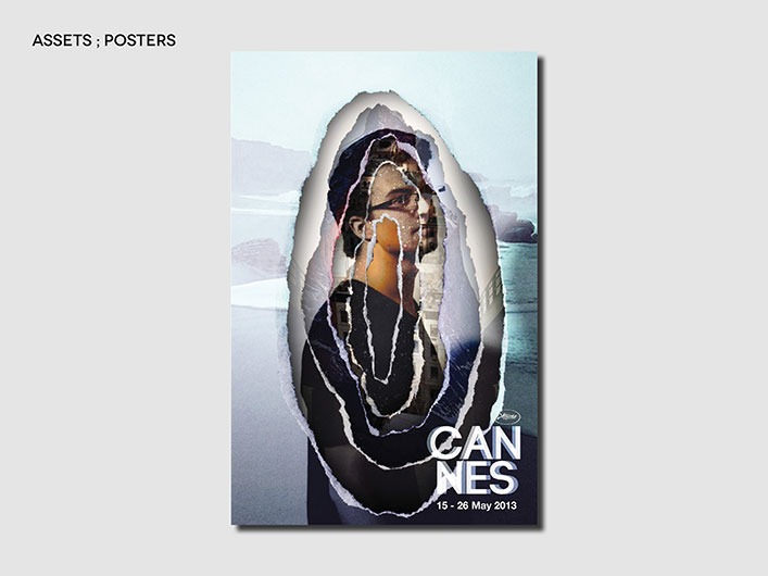
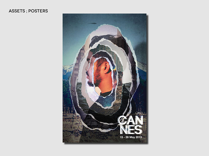
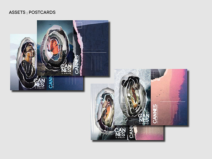
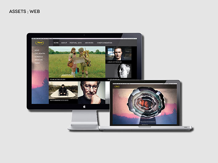
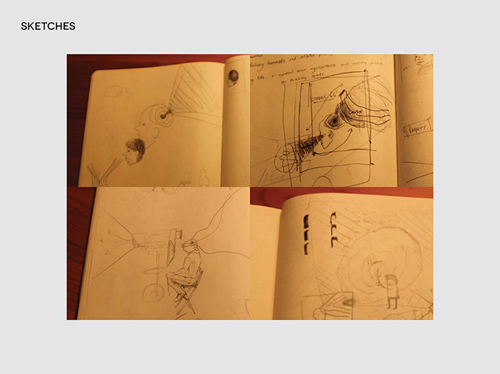
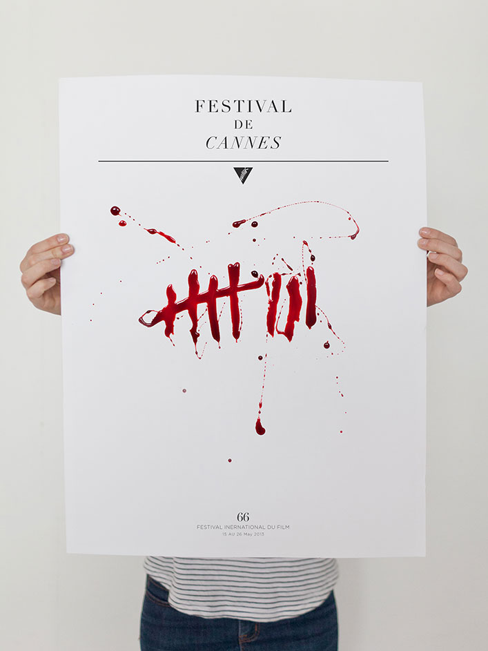
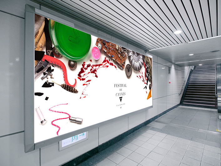
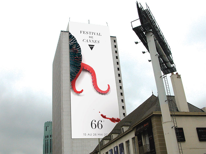
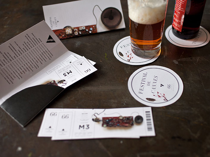
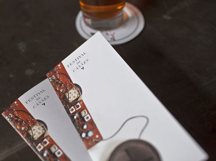
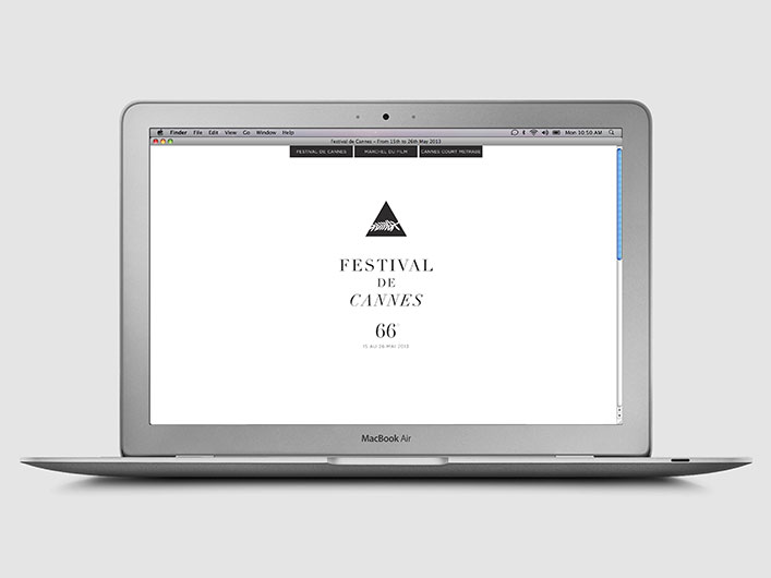
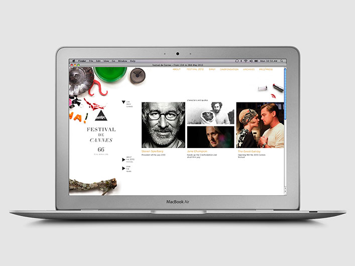
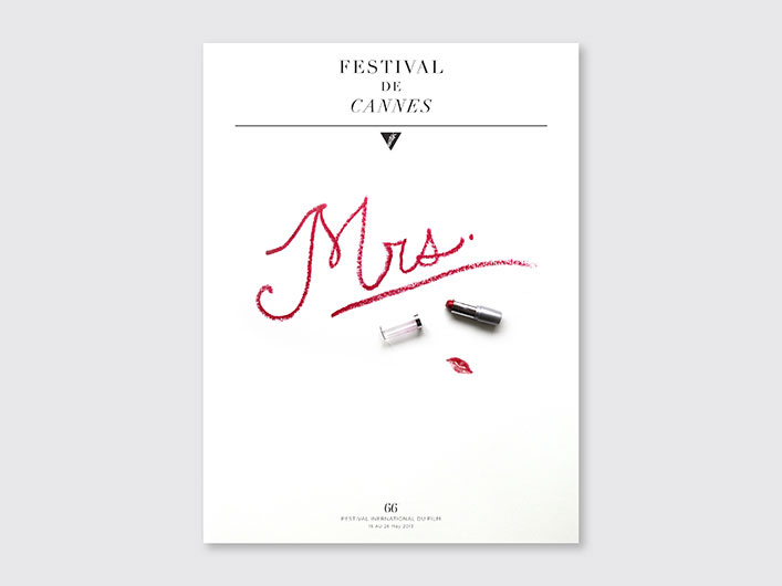
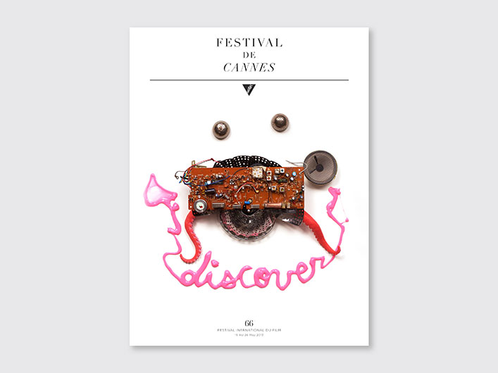
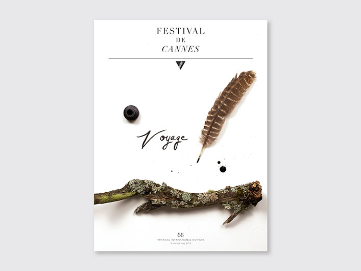
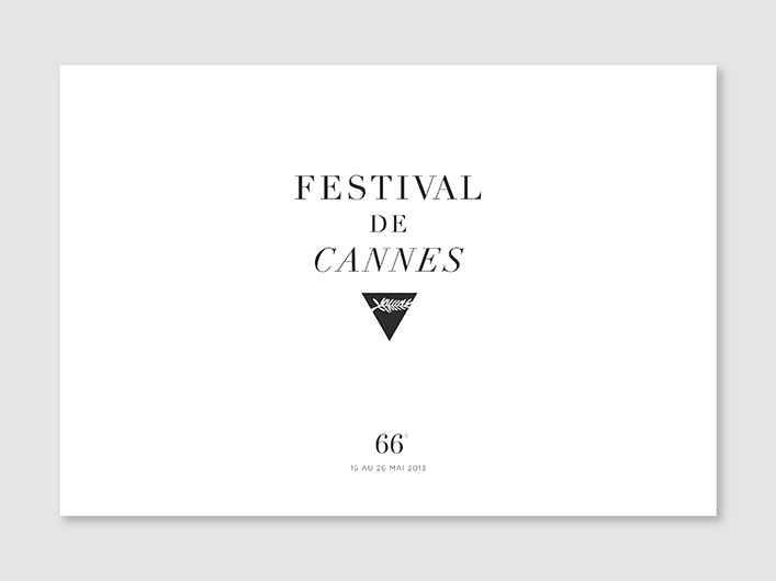
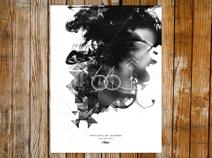
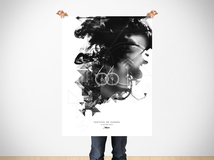
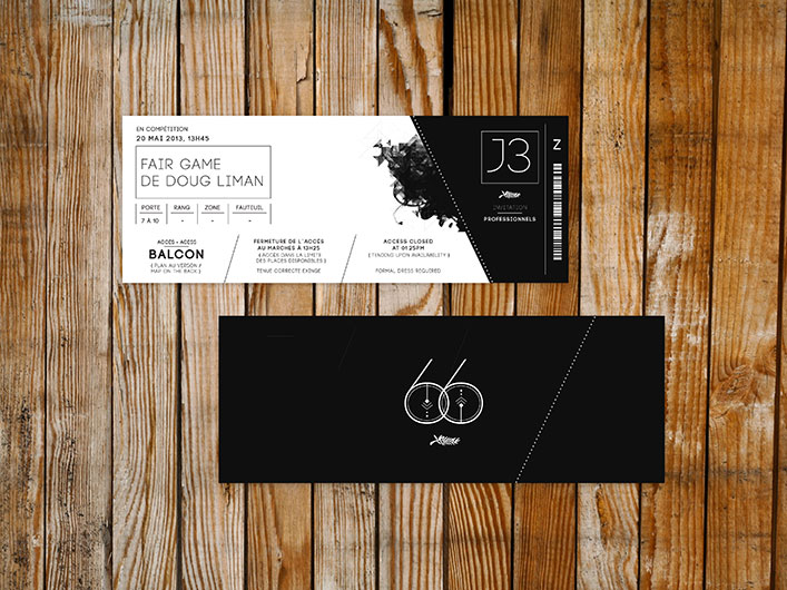
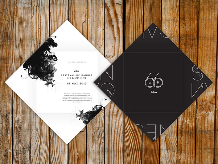
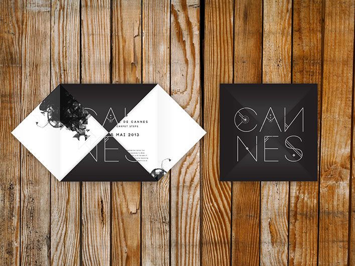
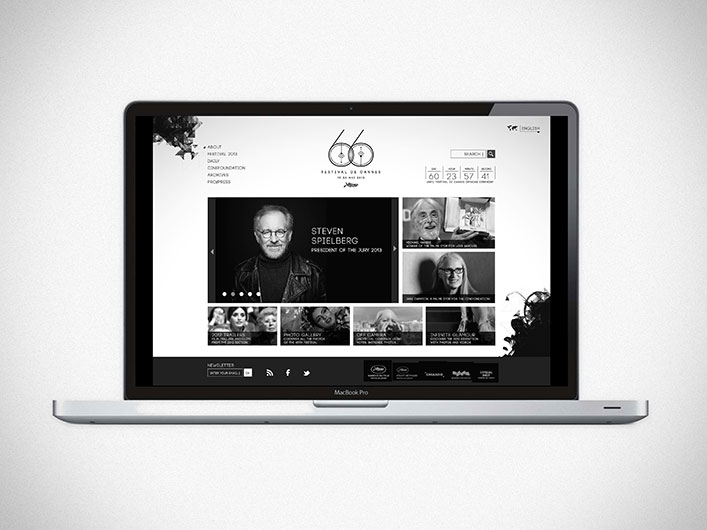
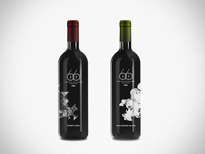
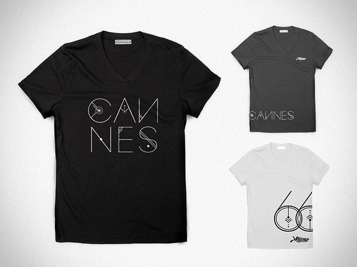
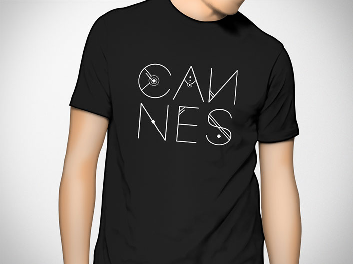
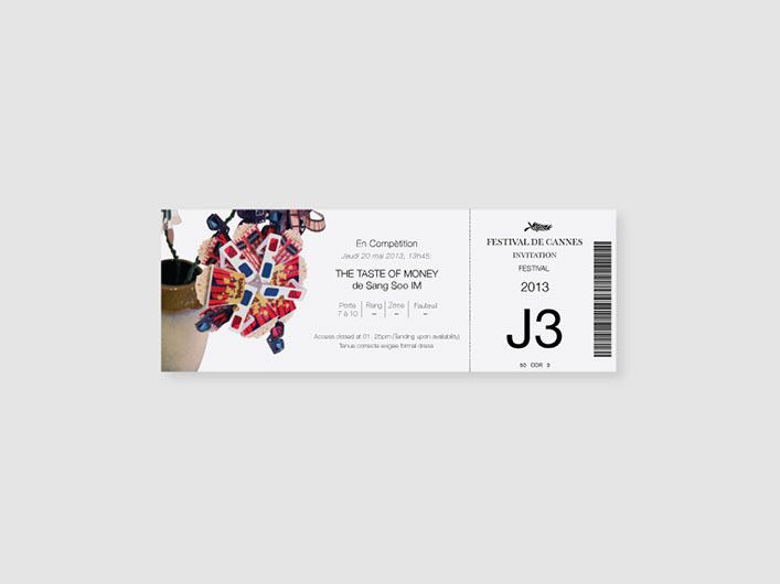
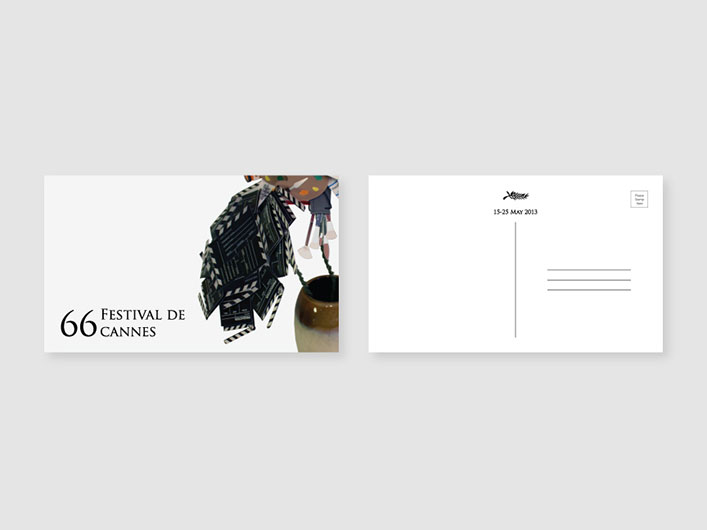
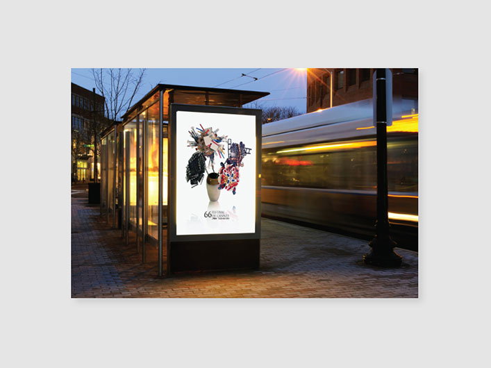
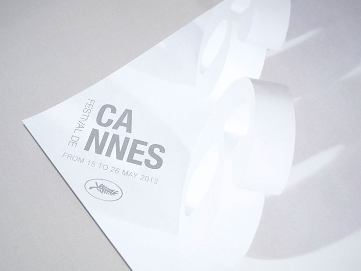
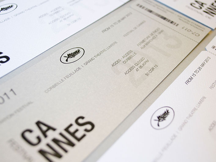
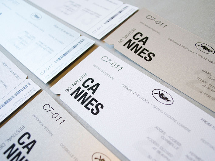
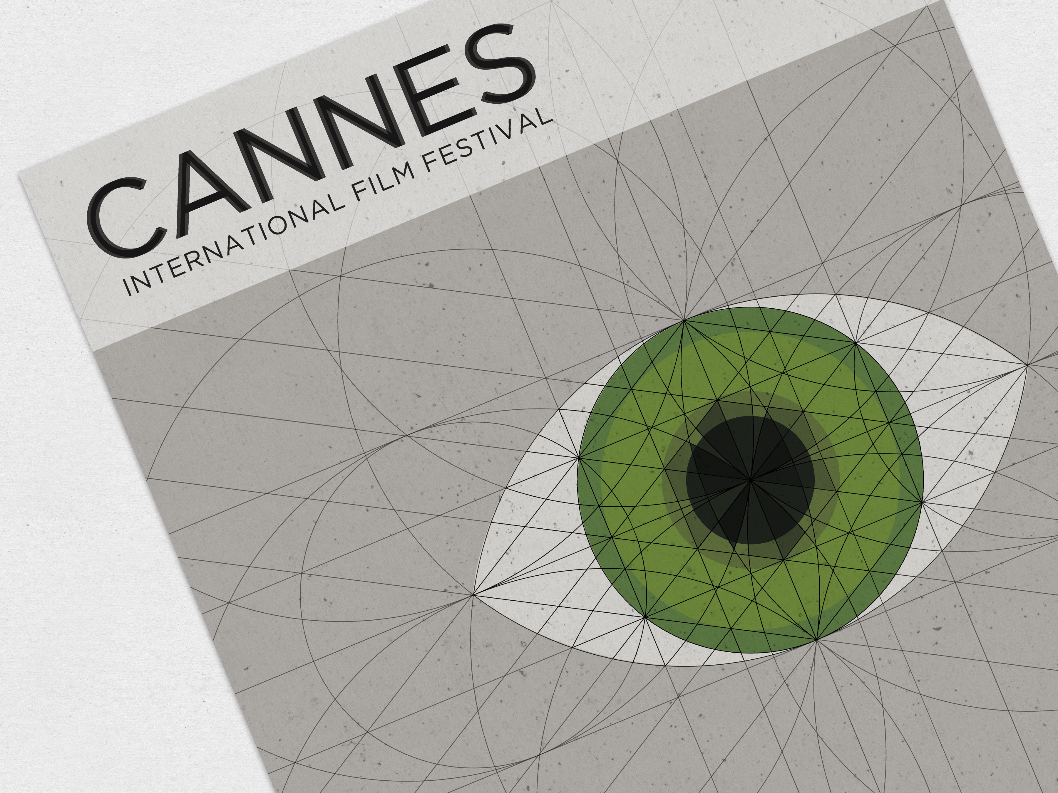
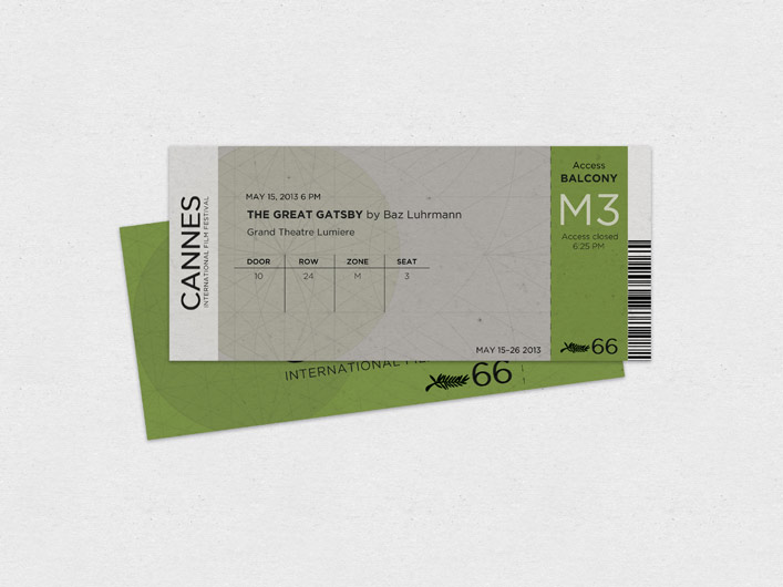
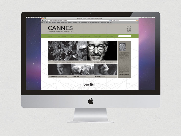
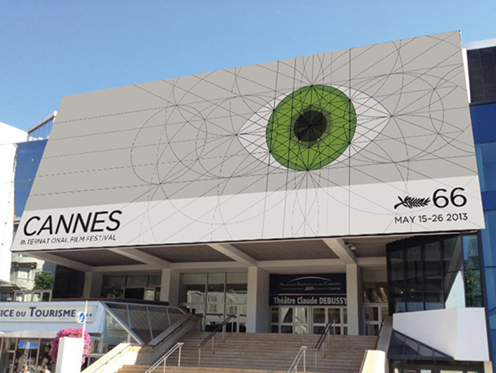
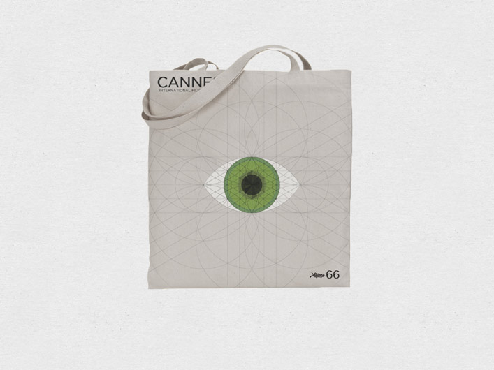
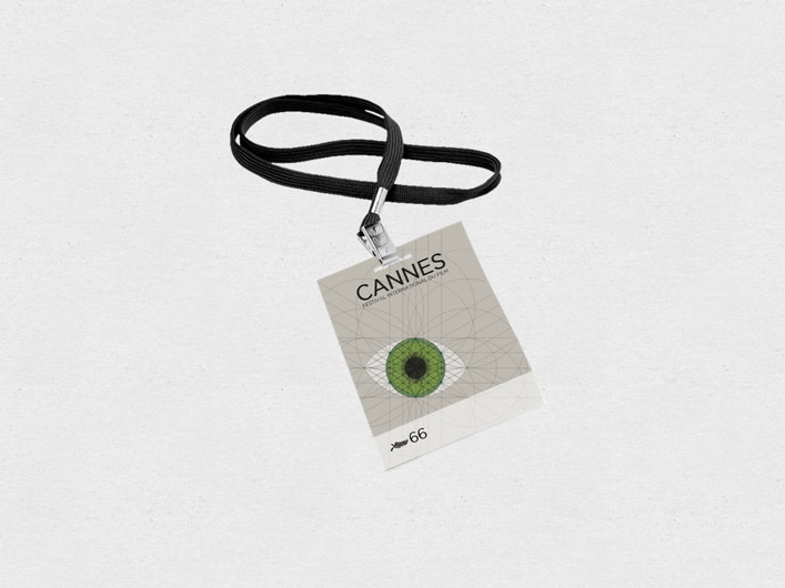
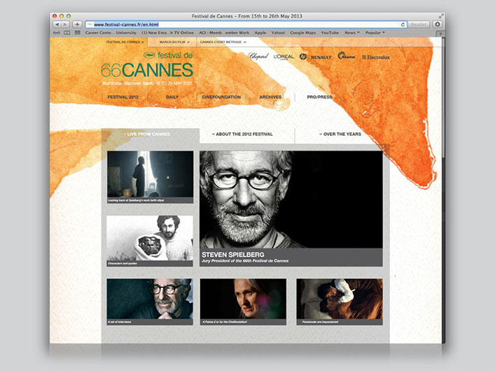
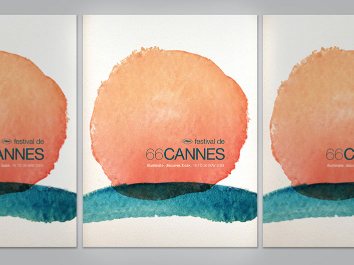
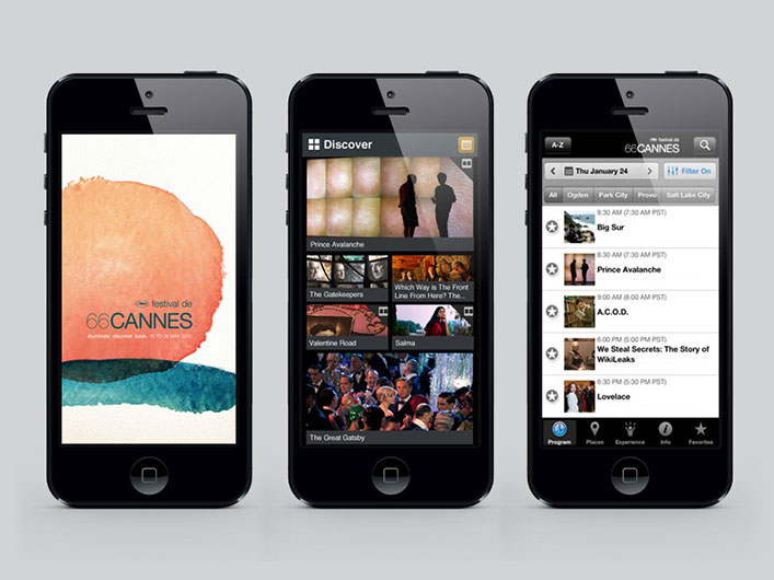
Cannes Film Festival | Inspired by the idea of the festival being a celebration of the interwoven creativity involved in filmmaking. The concept behind the design is the creation of new narratives through the weaving of different elements. See more from Adrienne
-

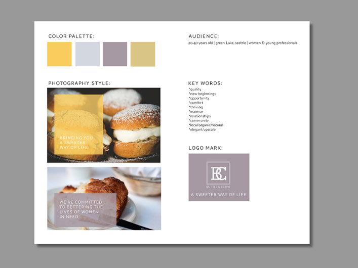
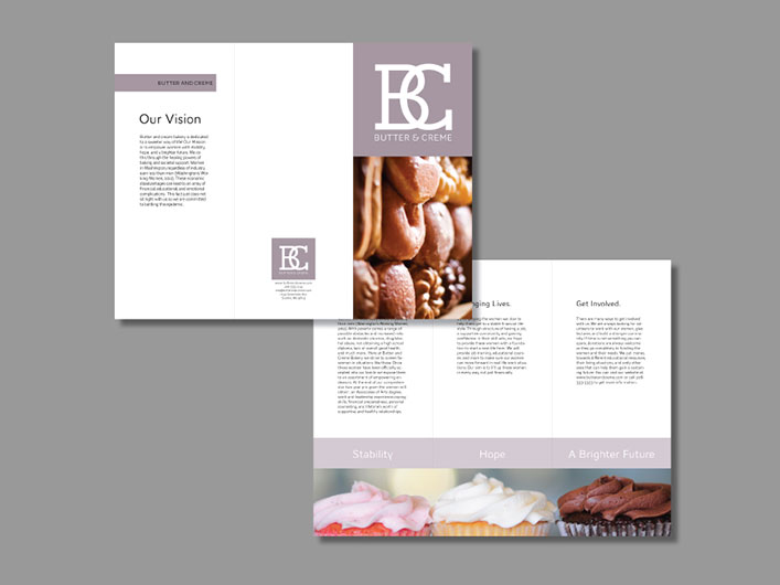
Branding - Butter & Creme | Butter & Creme is not only a bakery but a beacon of social change. The mission of this bakery is to provide community and opportunity for disadvantaged women in the Greenlake, Seattle area. It is a place where they can build a new foundation and a new life. See more from Asia
-

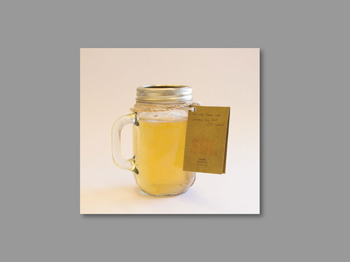
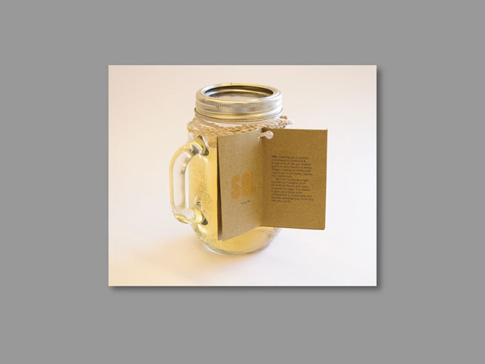
Product - Sol Herbal Tea | The packaging for Sol Herbal Tea is based around a California native theme of sun tea. I wanted to give the product a natural, homemade experience as you would from a farmer's market or if your grandma made sun tea in her background. See more from Asia

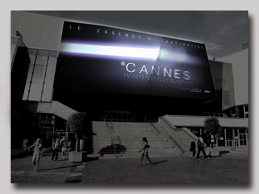
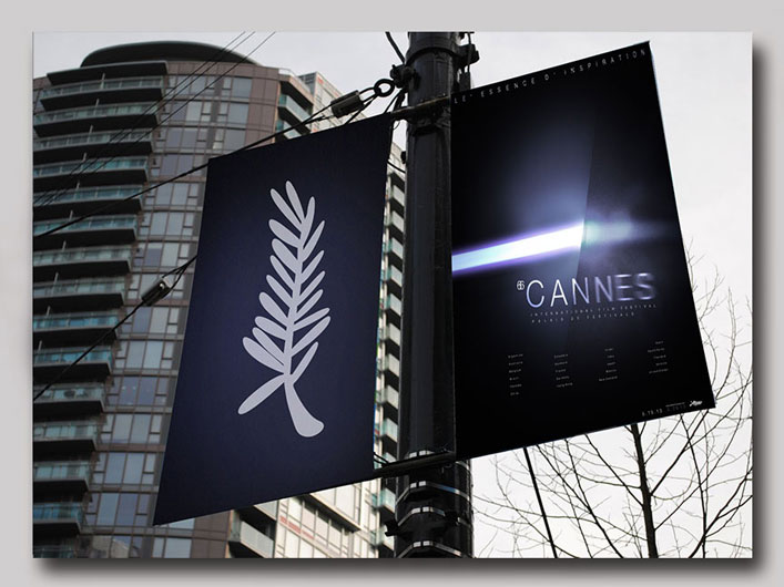
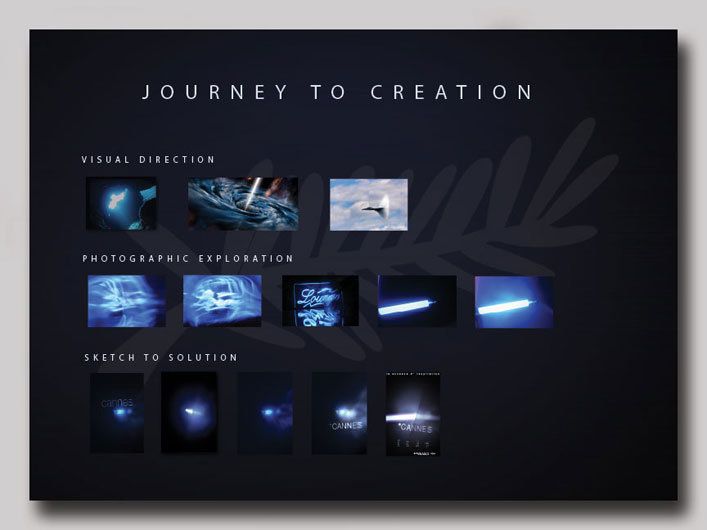
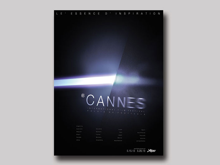
Cannes | The Cannes International Film Festival design revolves around the essence of inspiration. The visual system shows that inspiration is achieved when a concept breaks into our world from another dimension unbeknownst to the viewer. See more from Ben

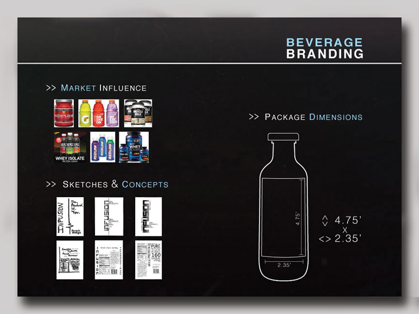
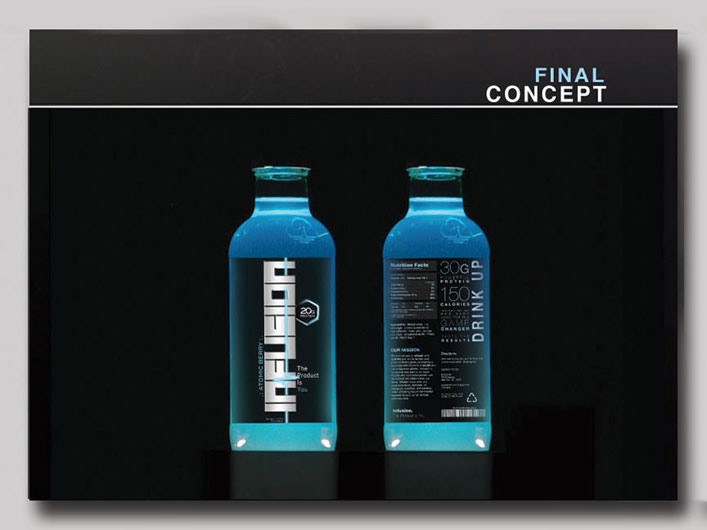
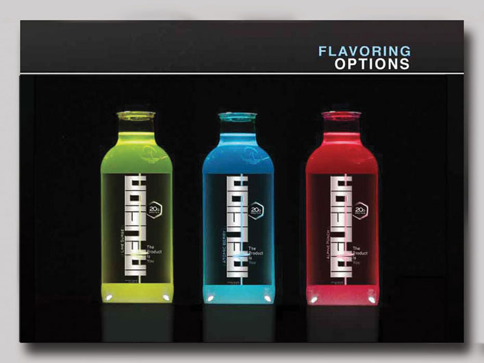
Infusion | The concept of the Infusion product is to provide athletes with cutting-edge on-the-go beverage. The goal is to empower those who wish to wish to perform at the top of their ability, maximizing the results of intense workout regimens. See more from Ben

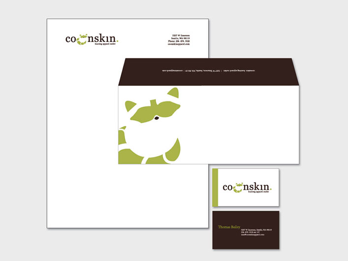
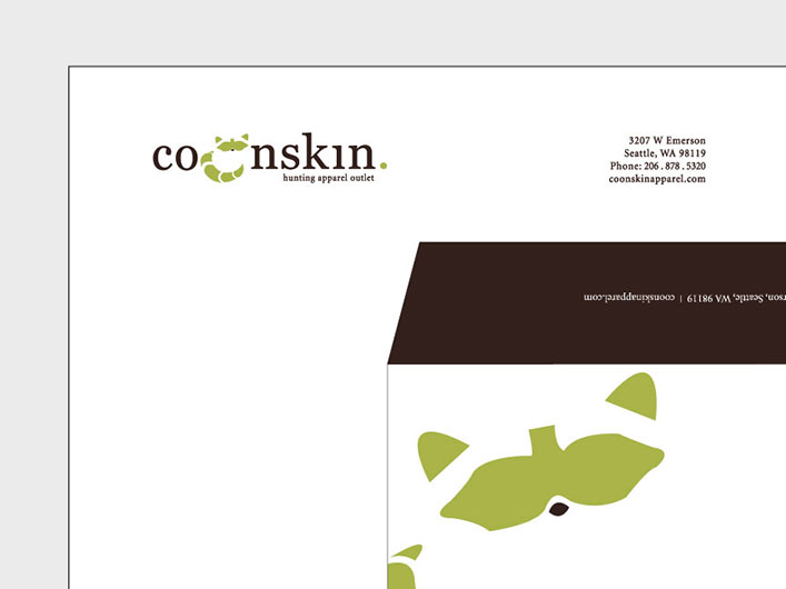
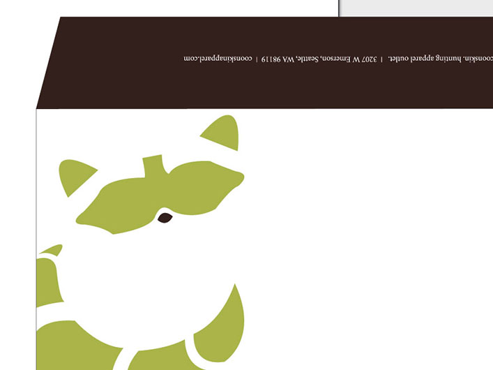
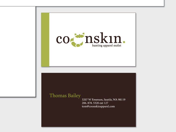
Coonskin | Creating a logo isn’t about trying to make the ultimate unique and trendy design. It’s about simplicity. Minimalism makes one think outside the box and express forms in more powerful ways. See more from Cara

Festival de Cannes | A major part of the Cannes Film Festival is the search for and discovery of note-worthy films. Mystery is a long beloved friend of film, so I created this promotional piece to capture that feeling of the “unknown”. Want to uncover the mystery of Cannes? You would have to go to find out. See more from Cara
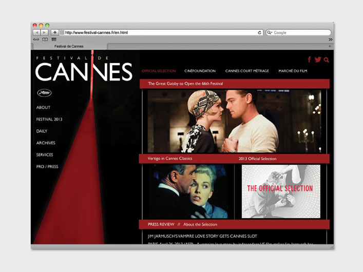
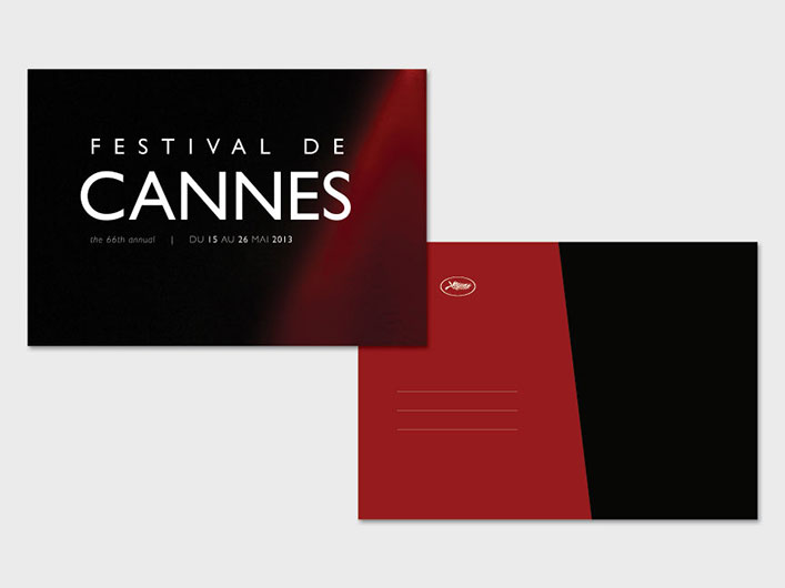
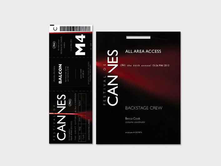
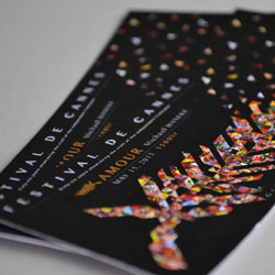
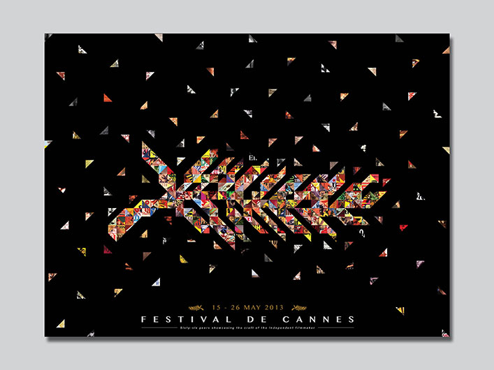
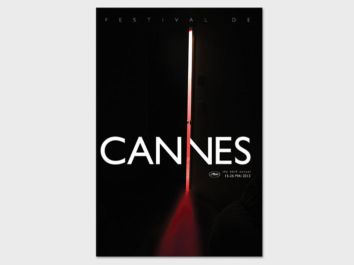
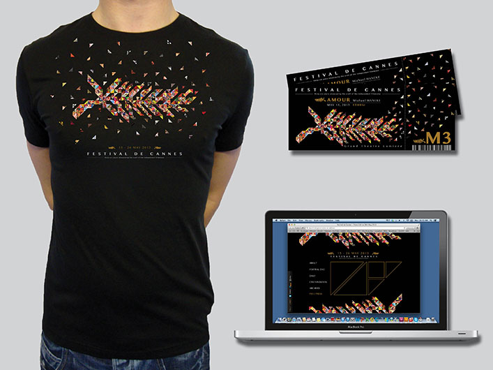
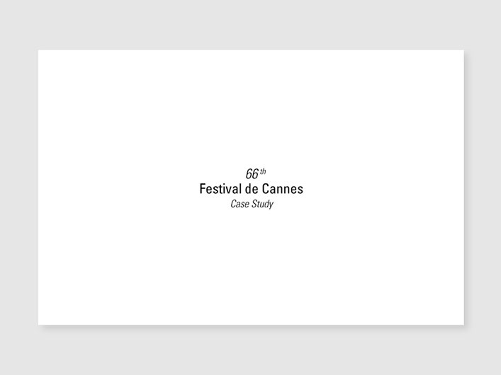
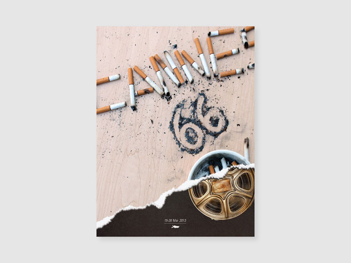
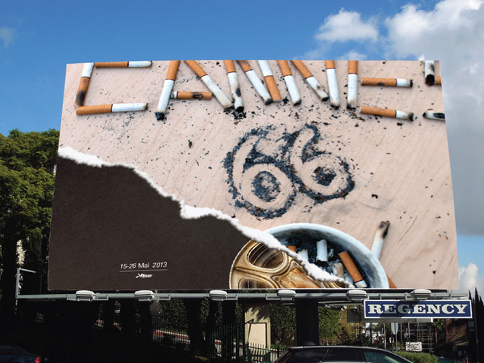
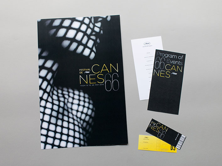
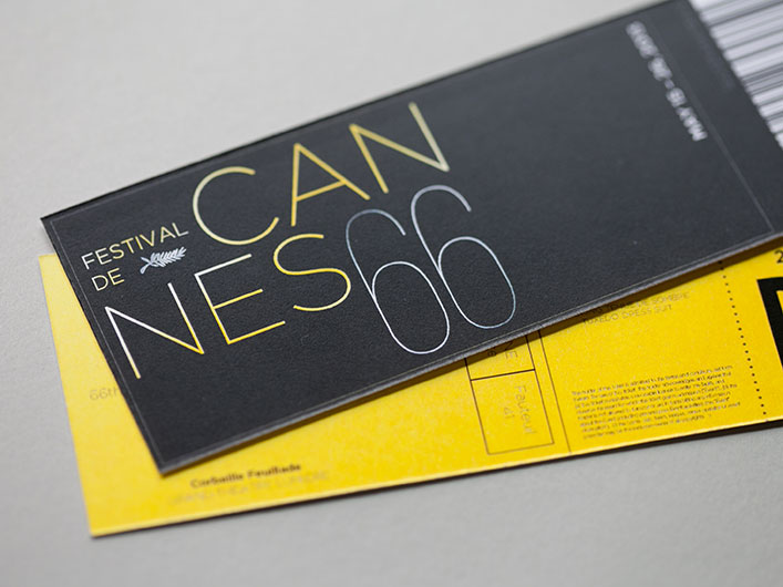
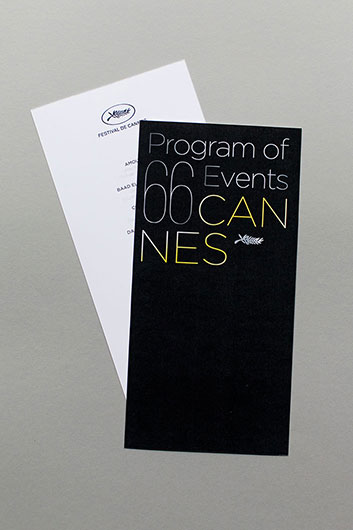
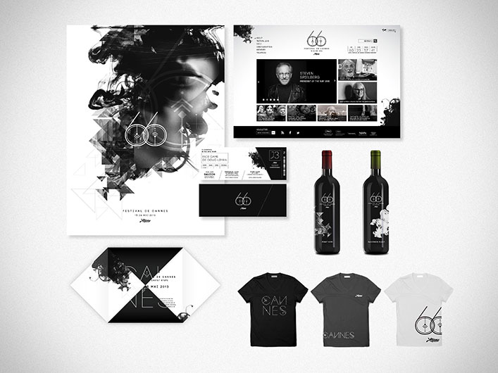
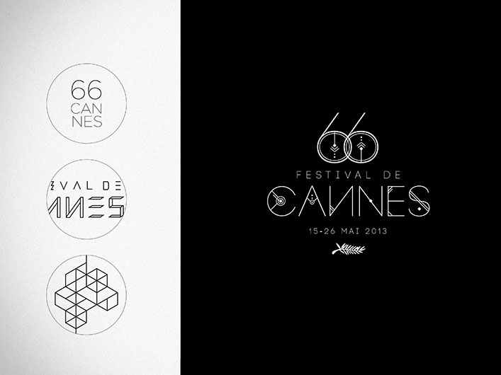
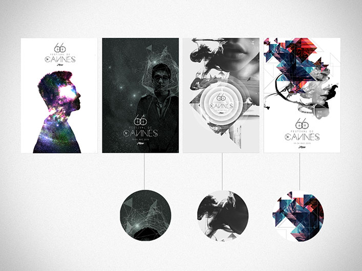
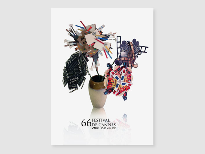
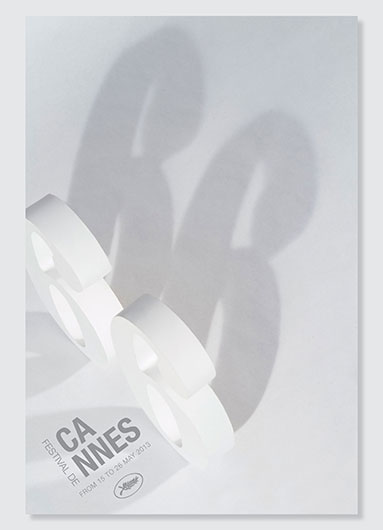
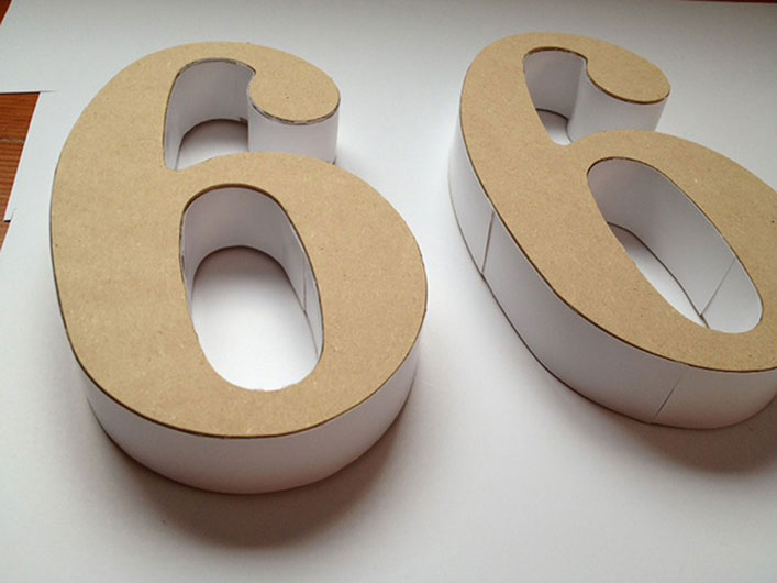
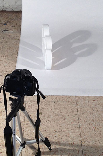
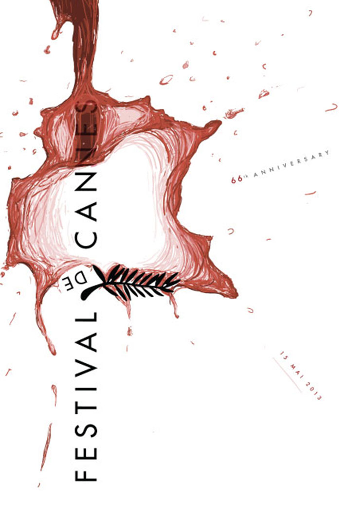
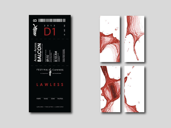
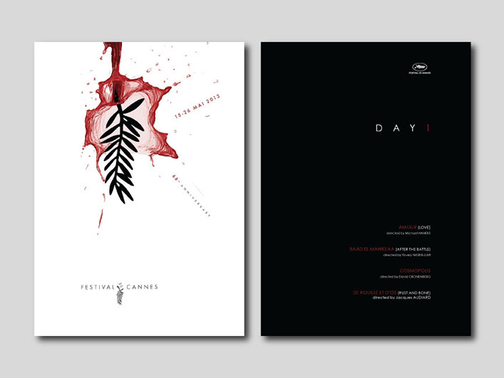
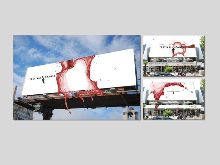
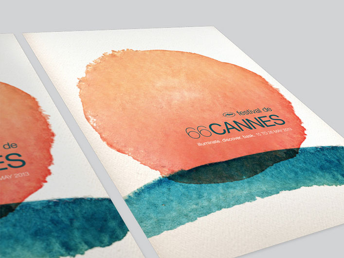
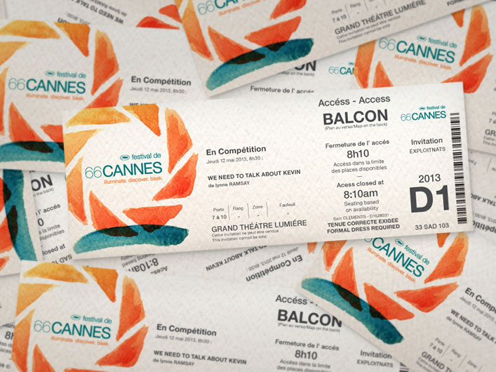
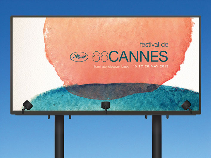
Festival De Cannes Case Study | This is a campaign created for the 66th annual Cannes Film Festival in France. The campaign is designed to honor the clean, sophistication of the event while showcasing the craft and creativity it celebrates. See more from Chris

Cannes | Cannes is an international film festival filled with imagination, creativity and passion. Cannes is about exposure. It catches a unique eye to understand the definition of each film created so that they can grasp the exposure, independence and spontaneous world of film. See more from Claudia

Festival de Cannes | The intention was to create a branding system that incorporated all of those involved in this international film festival. With their hands and their minds, filmmakers, actors and actresses alike collaborate and create beautiful films. See more from Dorothy

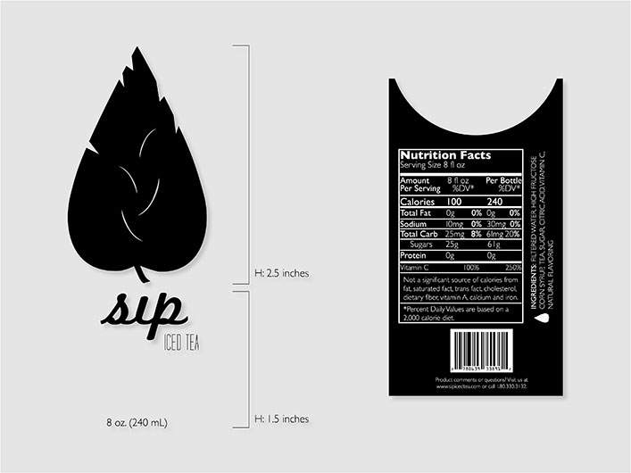
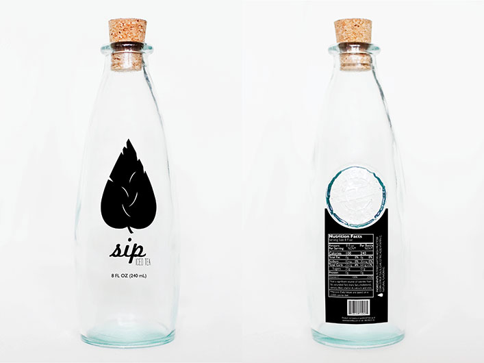
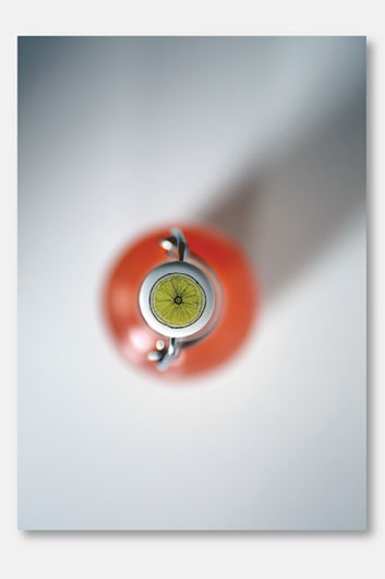
SIP Iced Tea | This iced tea drink promotes healthy choices and using sustainable materials. The leaf logo promotes "green" living and the familiar water drop we associate it with points us to the natural elements. The bottles would be made from recyclable glass and the labels would be etched on. See more from Dorothy


Festival de Cannes | Inspired by the concept that the Cannes Film Festival is a framework for inspiration, I created a simple and elegant branding system that would evoke inspiration in the viewer and appeal to its prestigious audience of filmmakers and enthusiasts. See more from Eleni

Festival de Cannes | This visual branding for Le Festival de Cannes focuses on the kinetic and time-based nature of film as a medium and invites the viewer to not look away. See more from Hailey


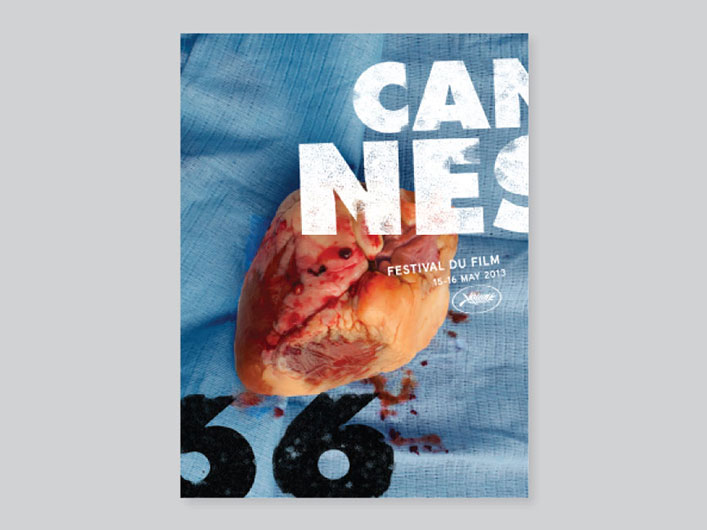
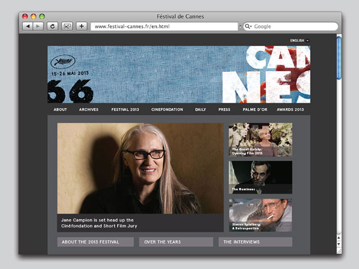
Cannes | Because of the Cannes Film Festival’s history of trailblazing, innovative creatives (including Tarantino), there is loud, brash imagery and type among this branding project, including a pun on ‘putting your heart into it.’ No humans were harmed in the making of this project. See more from Haley

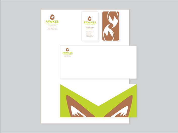
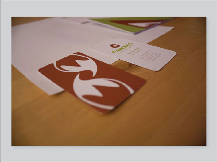
Logo | Fawkes is a (fictitious) creative agency working in both print and web, primarily branding, packaging, and marketing strategy. The mark and palette represent Fawkes' approachability and sense of humor, while bolstering its goal of creating quality, distinctive design that's not afraid to have a little fun. See more from Haley

Cannes Film Festival | For this case study, I created some brand awareness posters that I feel represents the core values of this event. The theme I gave the event was the search for innovation and it tells a visual story of how the mind goes through layers of refining a ‘good idea’ in order to find an innovative one. See more from Henry

Festival de Cannes | Festival de Cannes is an international film festival celebrating the collaboration of artists and filmmakers. This re-brand of the 2013 Festival de Cannes is the exploration of the art of film. See more from Honnah

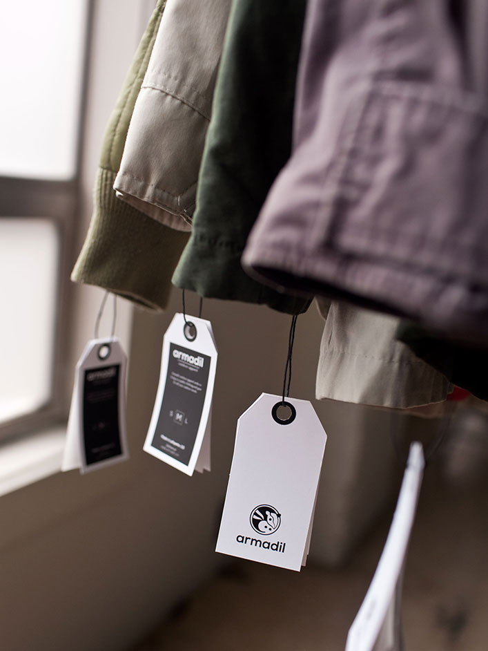
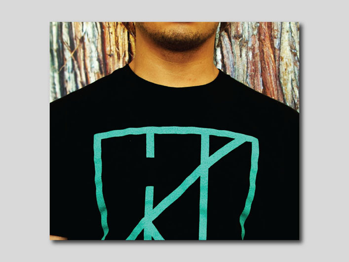
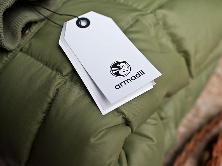
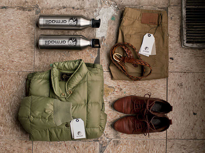
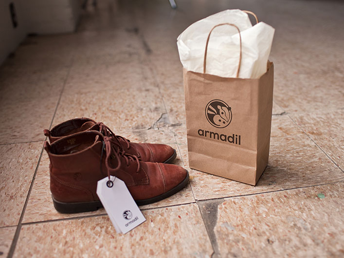
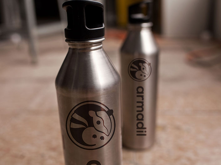
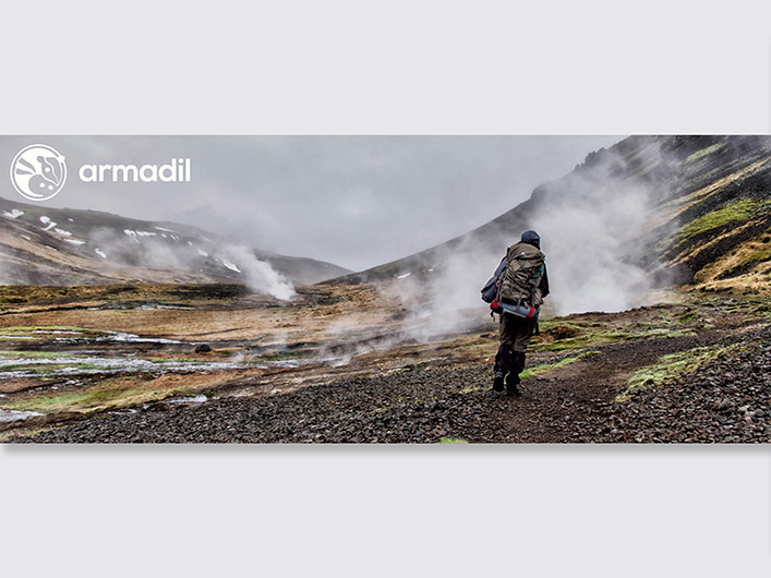
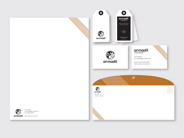
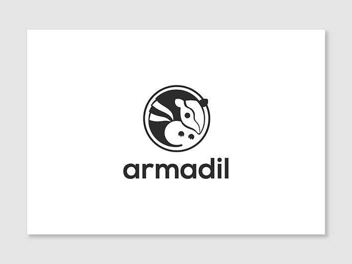
Armadil Clothing Company | This is an identity system created for a fictional outdoor clothing company, Armadil. See more from Honnah

Festival de Cannes | Imagining oneself fully immersed in a film, either as a filmmaker, actor/actress, or audience, it almost as seems they are in another world. It is when their fantasies turn to life. See more from Jessica

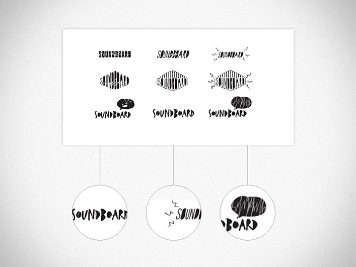
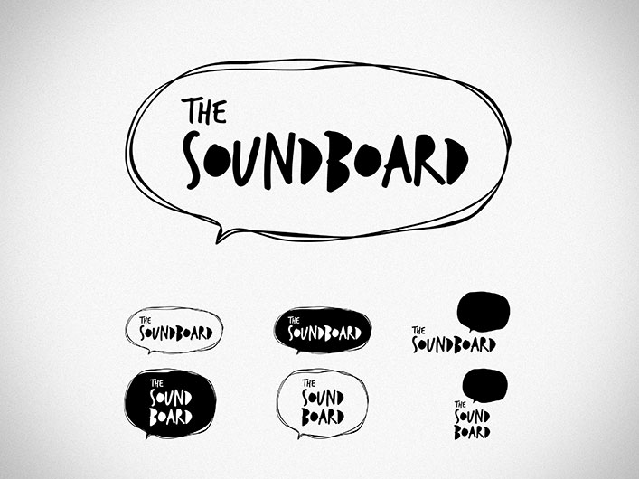
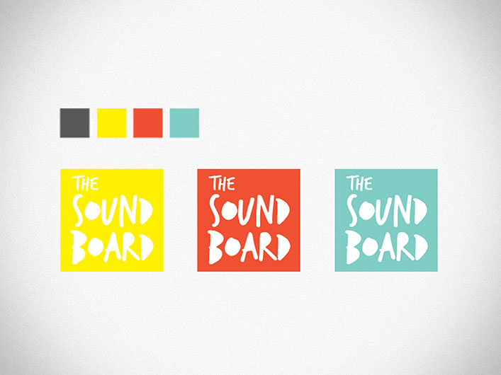
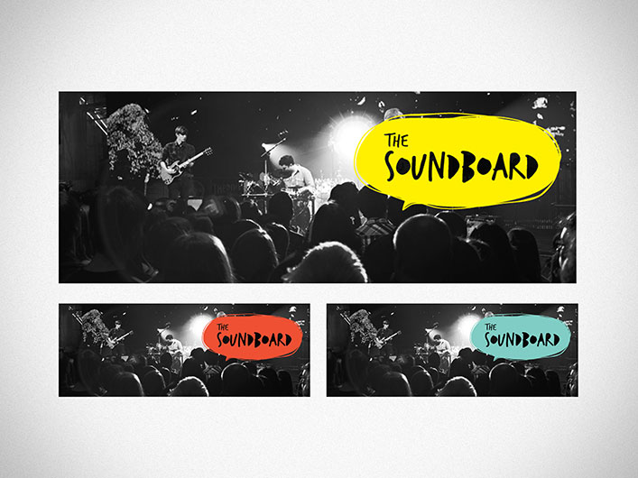
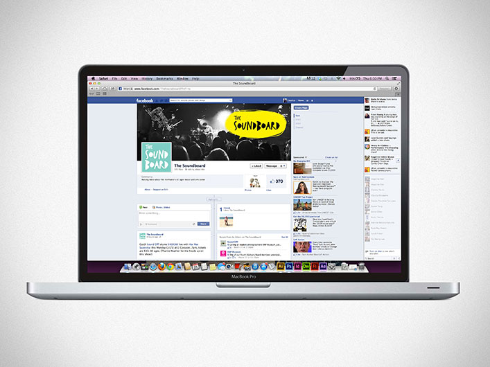
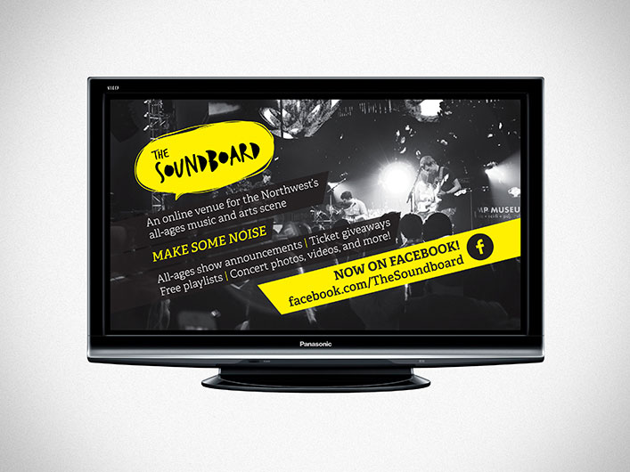
The Soundboard | The Soundboard's logo is renewed to match the modern and newer generation. The font itself is handwritten with an edgy and youthful appearance. The illustrated speech bubble also supports that idea, as well as the idea of free speech and discussion on music and arts in the Northwest area. See more from Jessica

Cannes Film Festival | Cannes Film Festival is a forum of GROWTH...Growth as a Filmmaker...Growth as a creative...Growth as a Director...Growth as a viewer... See more from Jiyoon

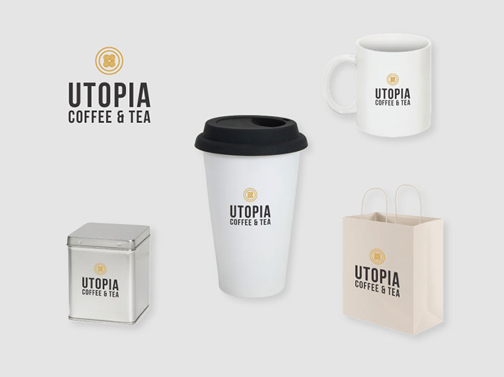
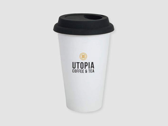
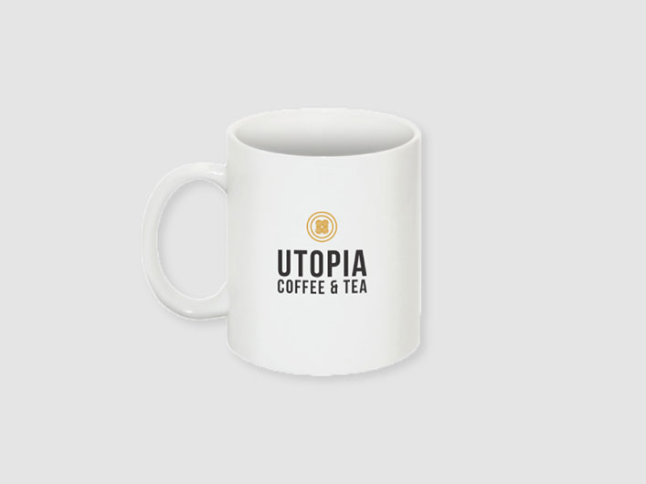
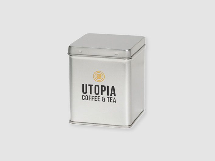
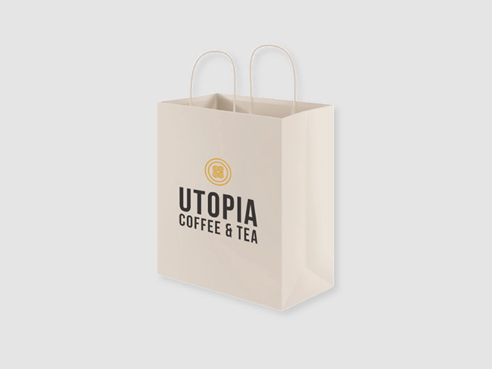
Utopia Coffee & Tea | Building a coffee shop where people could experience the true coffee beans all around Africa. Logo symbolizes “strength” in Africa. See more from Jiyoon

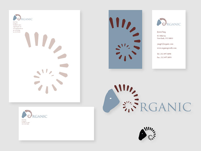
Organic Branding | This logo represents a sheep. They are known for innocent, soft, pure, etc. But in the other hand, they are known for strong, organic, natural, etc. This company is a sheep farm where they are organically grown. See more from Jiyoon

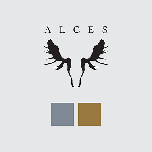
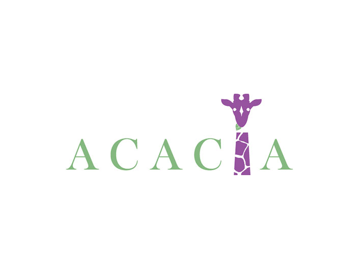
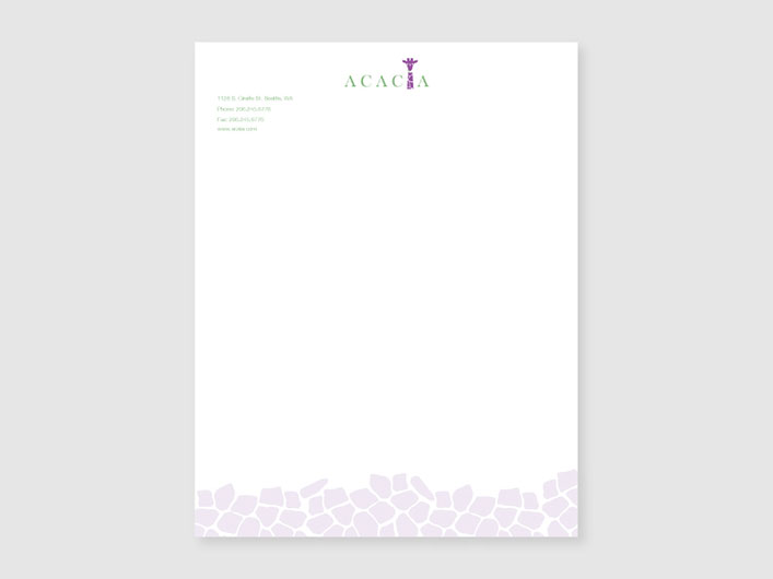
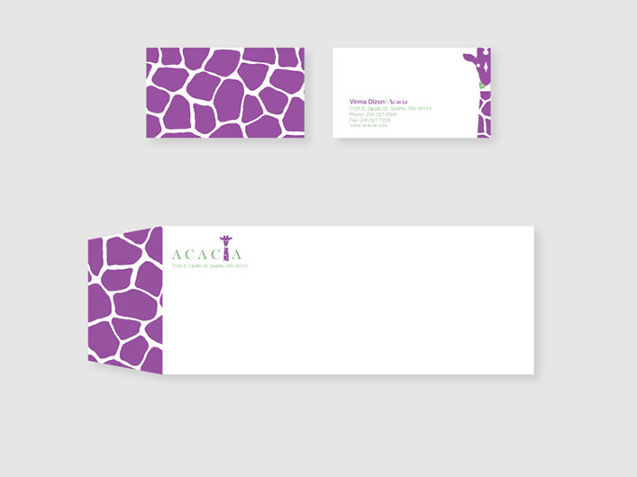
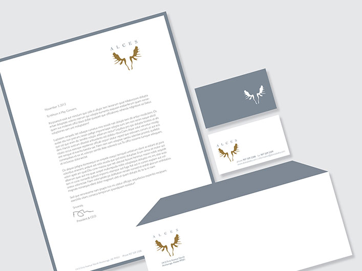
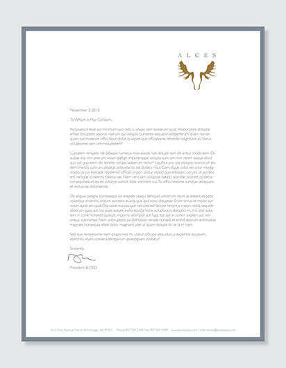
Alces Identity | The goal of this project was to choose an animal and create a logo mark around it using a geometric shape—a moose and triangle. Then transfer that logo into business collateral. The form of the animal was abstracted down to just the simplified elements that make the animal identifiable. See more from Megan


Festival de Cannes Rebrand | The rebrand of the Festival de Cannes was centered on the concept of perception. The essence of film being light, shadow and perception, the design was aimed at achieving the same three principles. This theme was carried through as a branding system for the different collateral materials. See more from Megan


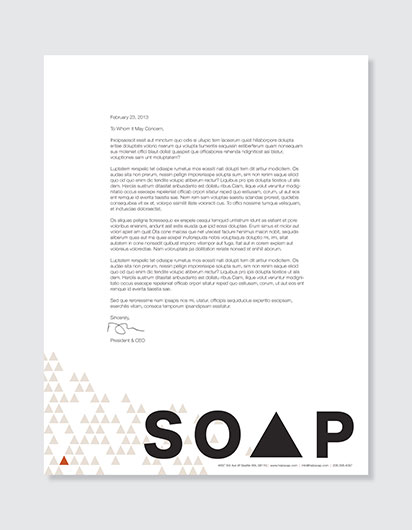
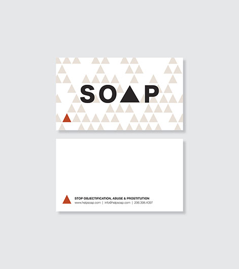
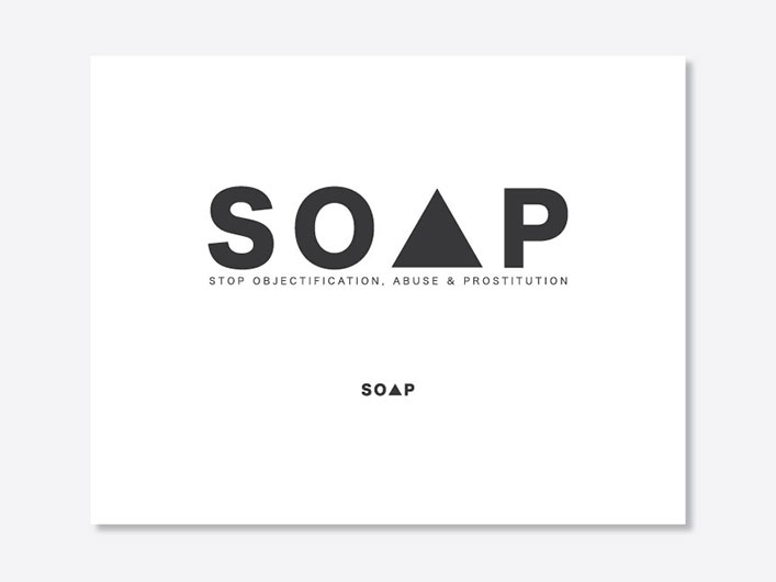
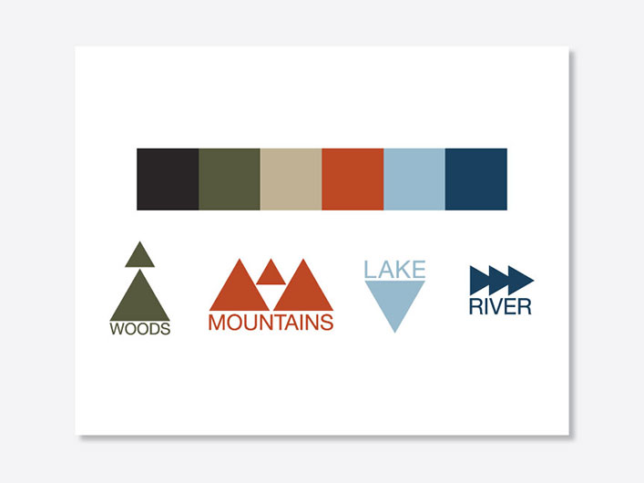
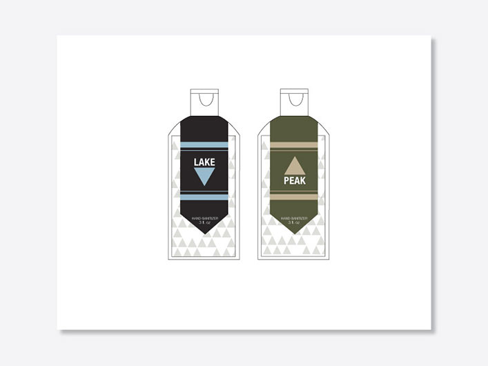
Soap Identity | The system created for the SOAP hand sanitizer company was a collaborative project. Designers worked with the business to create an identity that spoke to the target audience about human trafficking and sexual exploitation. See more from Megan

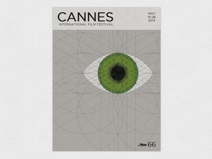
Cannes Film Festival | Cannes is a place where people from all different creative and cultural backgrounds gather and are inspired and influenced by one another. This redesign used a matrix of lines coming together to form an eye, representing inspiration, vision, and a changed world-view. See more from Nora

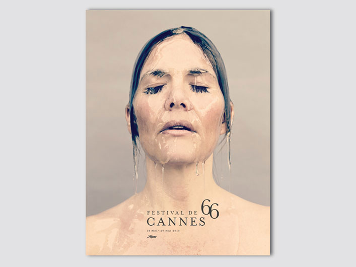
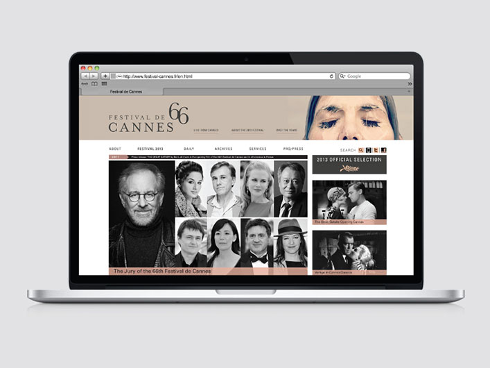
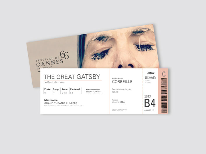
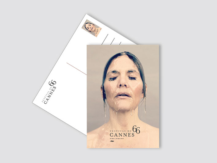
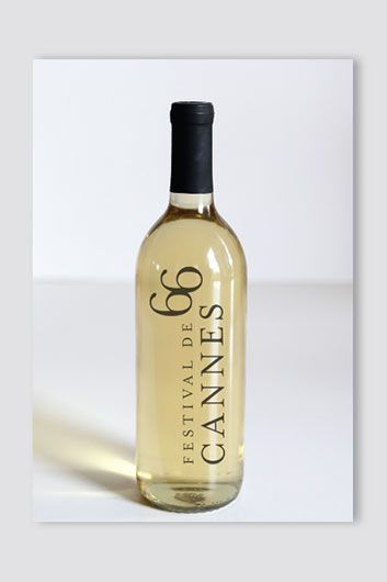
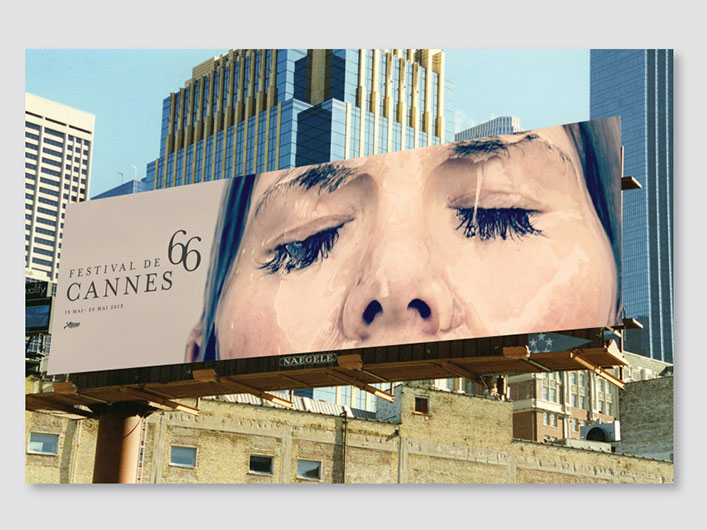
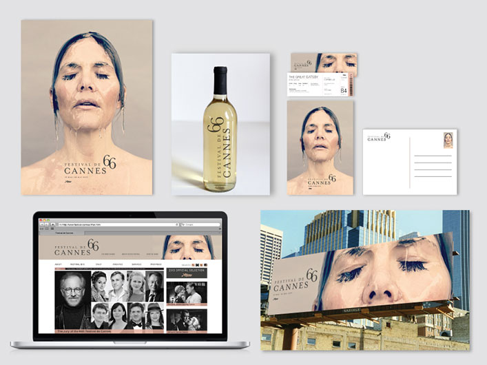
Cannes Film Festival | Festival de Cannes is portrayed as a dream, the Hollywood everyone hopes for rather than the Hollywood that is. The image of a beautiful woman with liquid running over her face depicts the many layers of the festival itself—while Cannes is full of beauty, often that beauty is used to portray a surreal world. See more from Rachel

Festival De Cannes | A case study structured project to recreate a branding system for the Festival De Cannes, film festival. See more from Ron


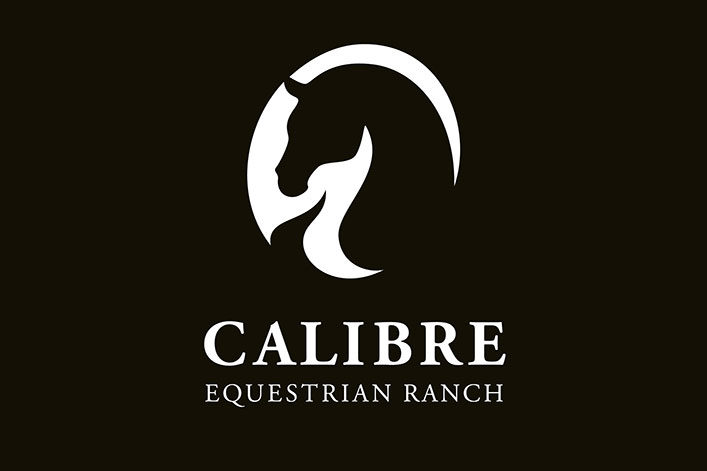
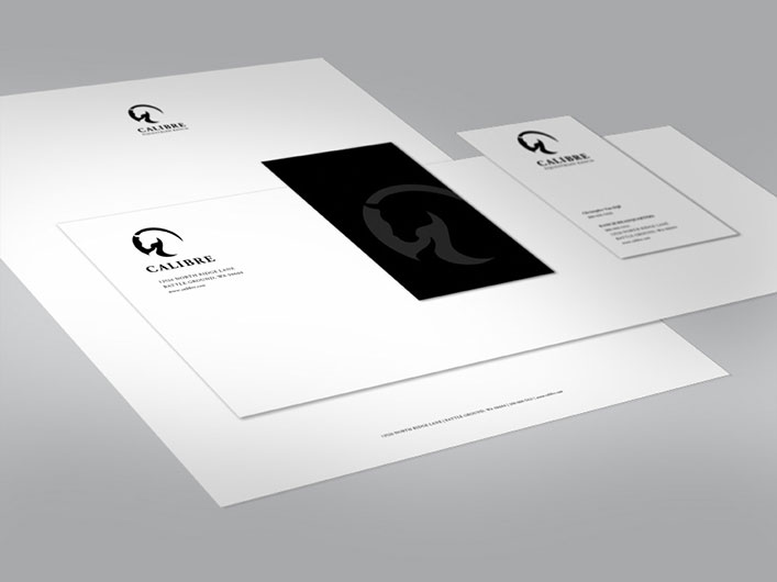
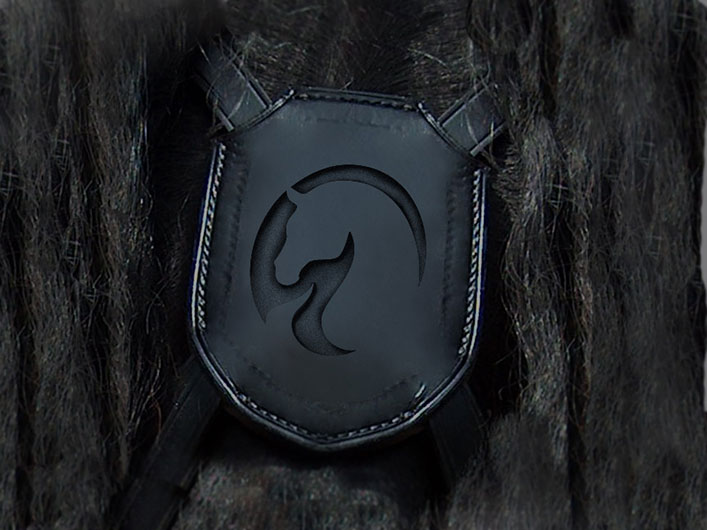
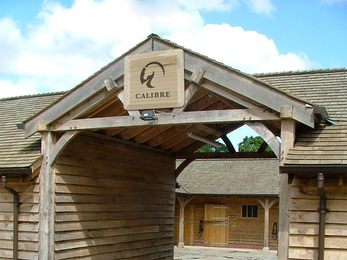
Calibre | Calibre is an equestrian ranch which breeds and sells Friesians. My goal to communicate power, quality, reliability, and prestige was achieved through the mark, contrast, type, whitespace, and name. See more from Shelley

Festival De Cannes | The sun is the symbol of choice for this event; the sun illuminates, is glorious, significant, and enables discovery as the festival does. See more from Shelley

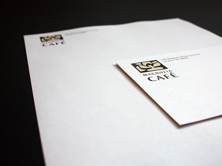
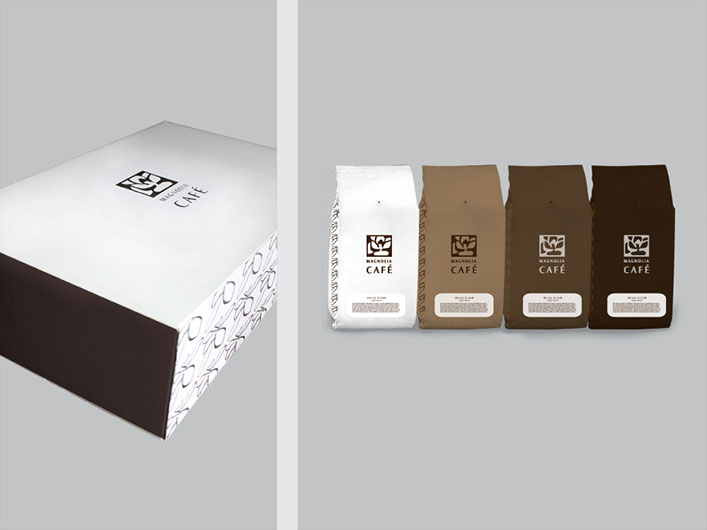
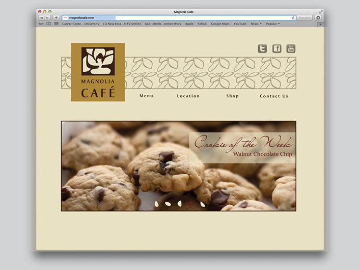
Magnolia Cafe | Magnolia Café is a small high-end cafe located on Magnolia Boulevard near Seattle, Washington. The clean, simple, elegant organic logo mark and type convey both the coziness and classiness of the café; the warm dark brown, ivory, and white amplify the message. See more from Shelley

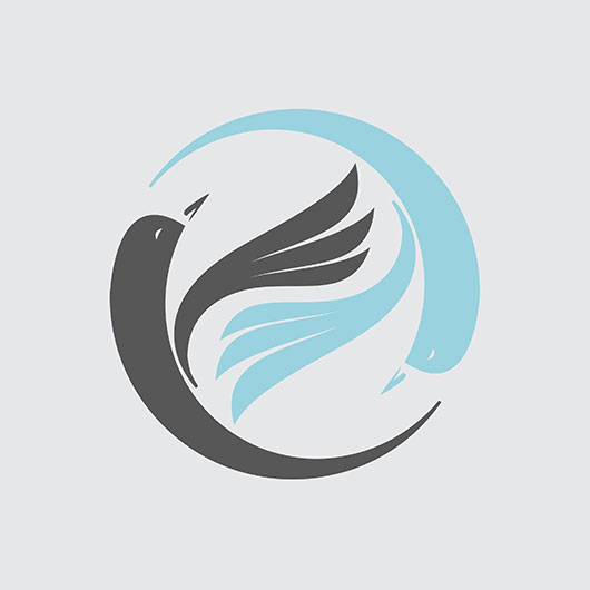
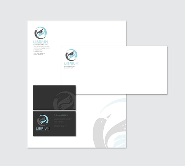
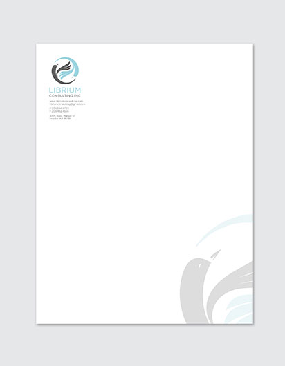
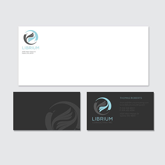
Librium Identity | Logo and collateral created for a fictitious consulting agency. The end result experiments with form and negative space. See more from Thomas

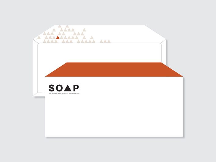
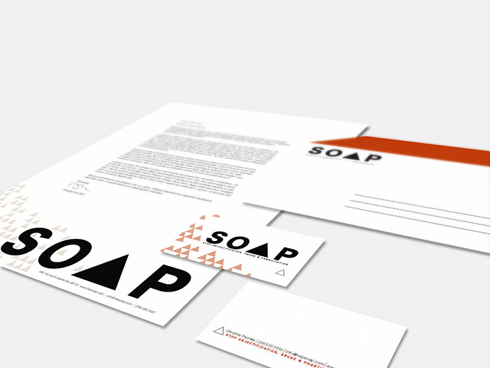
Branded | This project was a collaborative effort between designers and business people. In the end we created a complete brand for their company called S.O.A.P. See more from Ryan

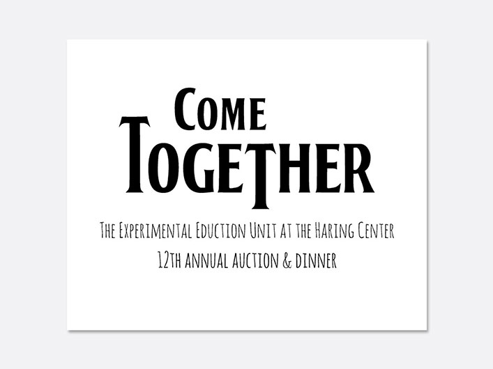
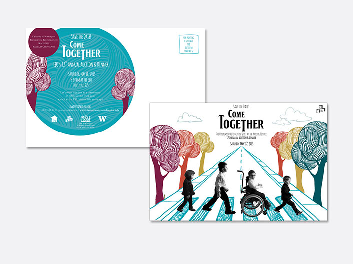
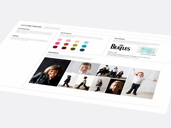
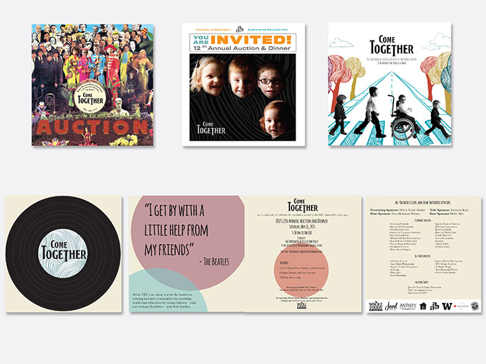
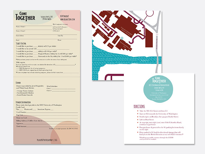
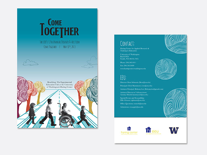
EEU Auction | I have been working with the Haring Center at the University of Washington over the past 6 months to create the visual identity for their auction. See more from Ryan

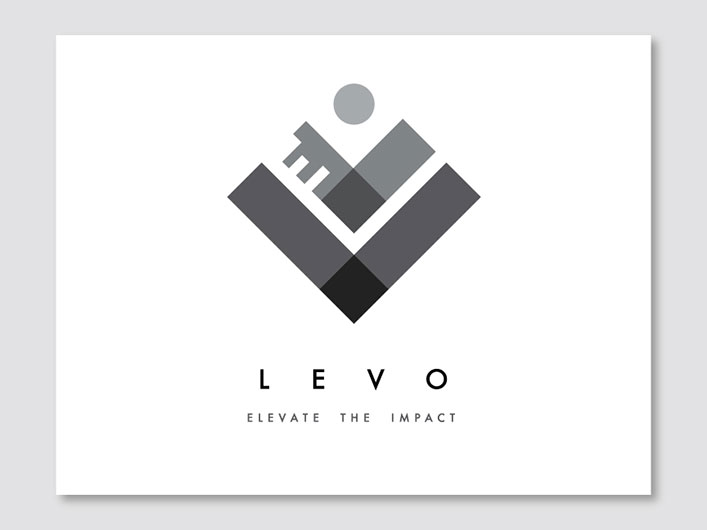
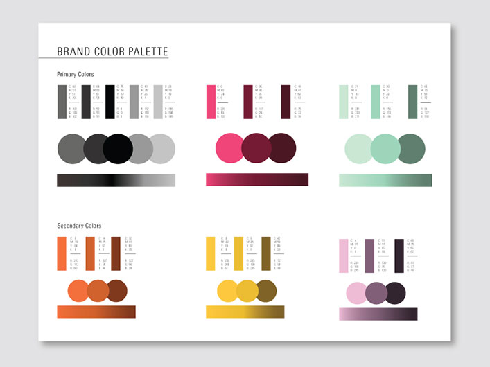
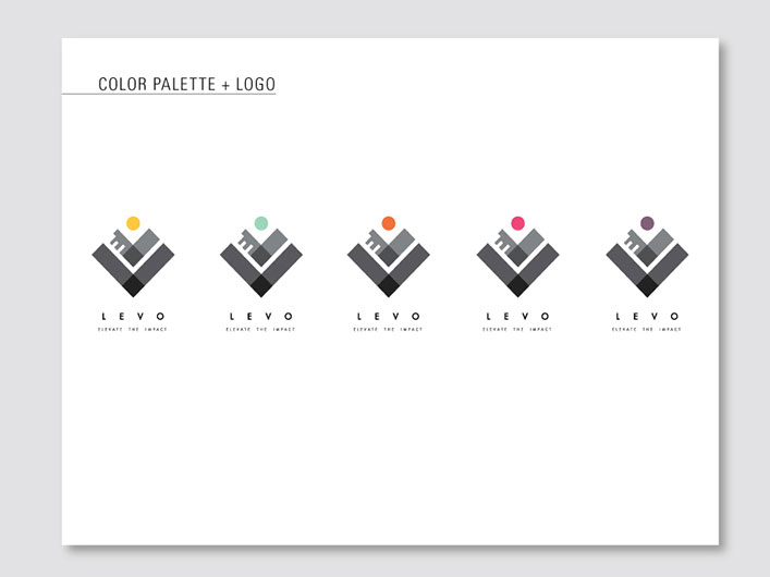
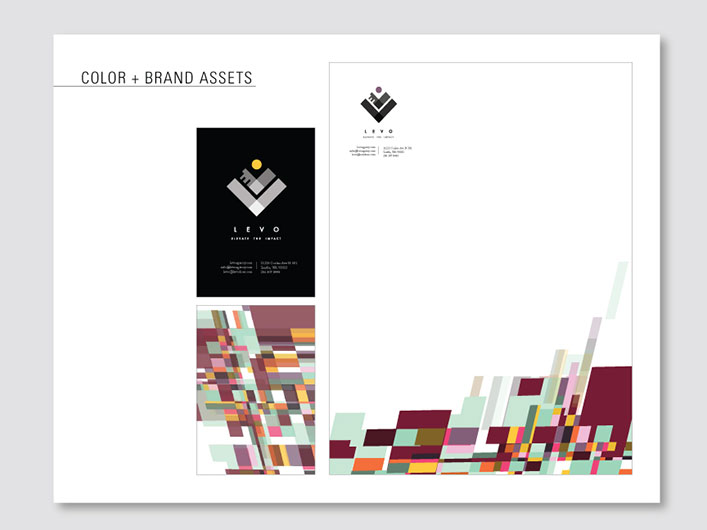
LEVO Brand Identity | I was a part of a collaborative group of designers who created the LEVO brand identity. I worked on the color palette as well as the brand guidelines. See more from Rachel

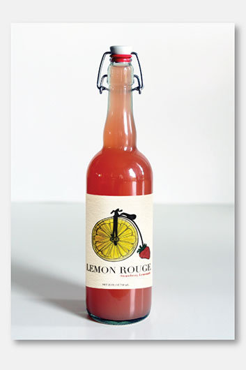
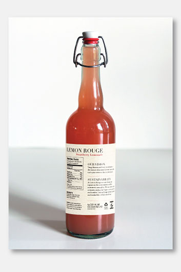
Lemon Rouge Packaging | Lemon Rouge is a packaging design I created for a fictitious French Strawberry Lemonade, inspired by the season of summer and all that it evokes. See more from Rachel
 OTHER
OTHER
-

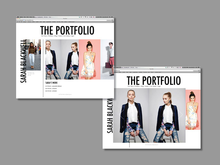
The Portfolio Non-Profit | A non-profit dedicated to exposing high schoolers to the intricate world of fashion through mediums of art. Through our website component, they can connect with mentors, get critique on projects, and showcase a portfolio. See more from Asia

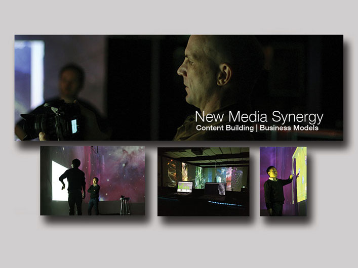
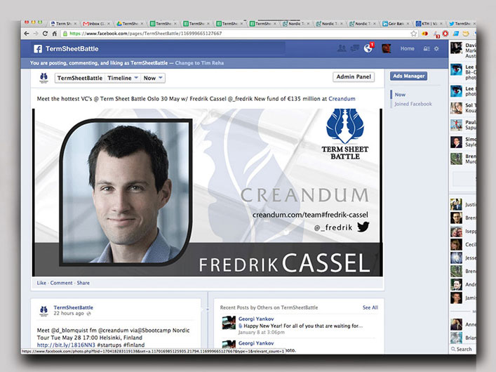
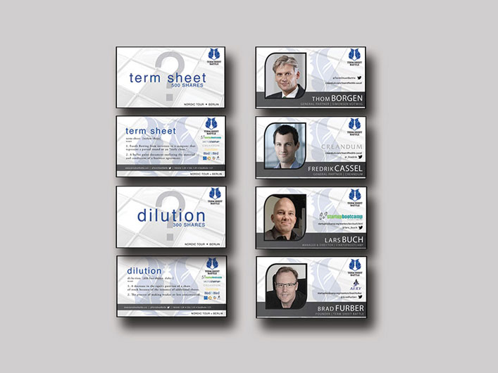
New Media Synergy | Applied new technology to an expansion branch of New Media Synergy, involving film, photography, real-time events, and social media outputs. Additionally, produced content for tweets for an event called Termsheet Battle in Norway, and a media content pitch to Strideline. See more from Ben

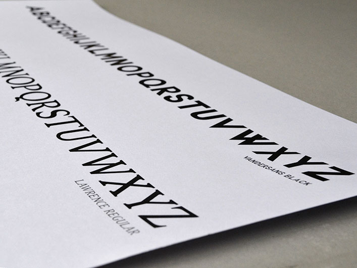
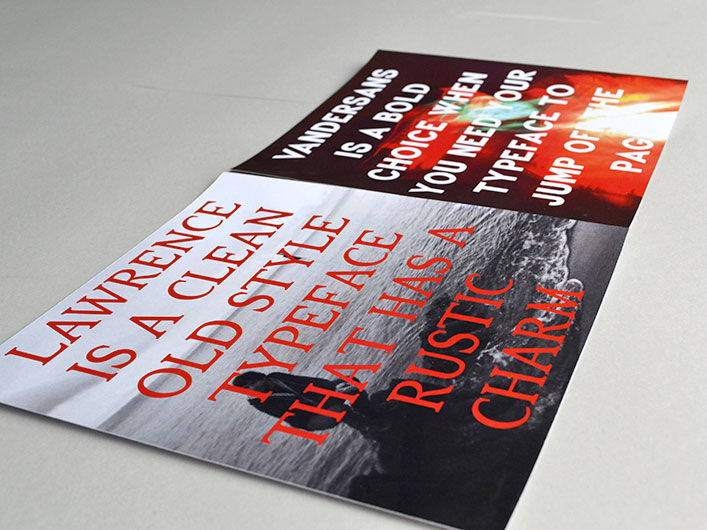
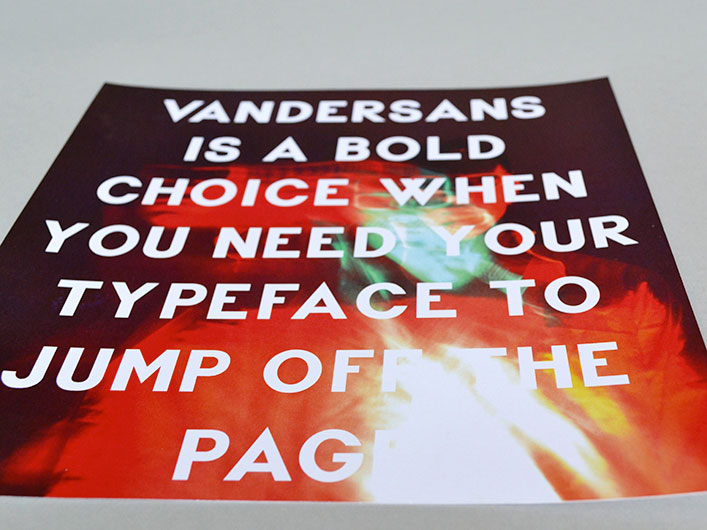
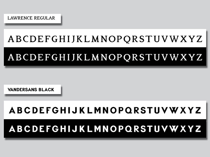
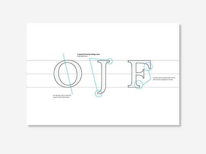
Type Design | These two display fonts are hand designed, based off observation and research. Lawrence is designed to be a clean, sophisticated old-style serif typeface, while VanderSans is a quirky, bold sans serif font.
See more from Chris

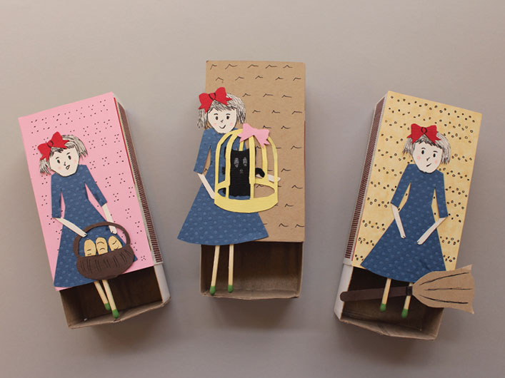
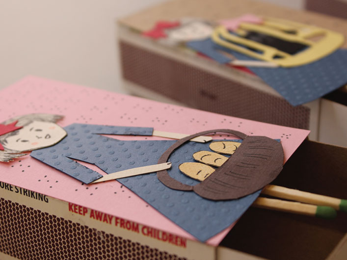
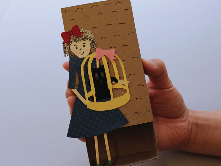
Matchbox Girls | Kiki’s Delivery Service illustration class project. I used my own illustration style to represent three different points of the story using a 3D method. See more from Claudia

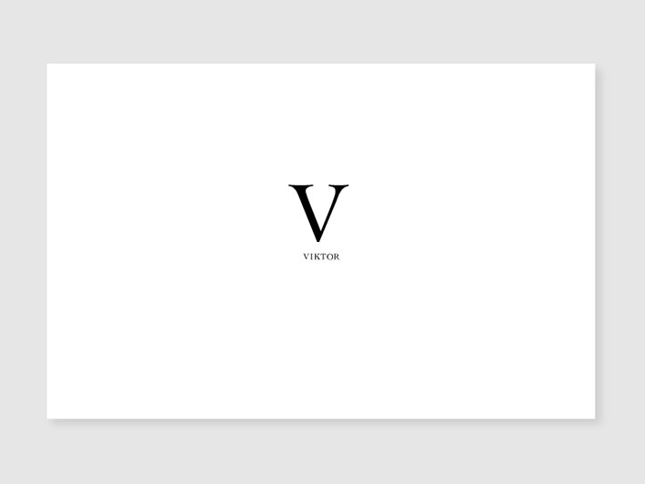
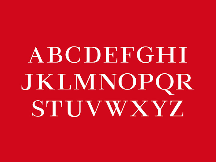
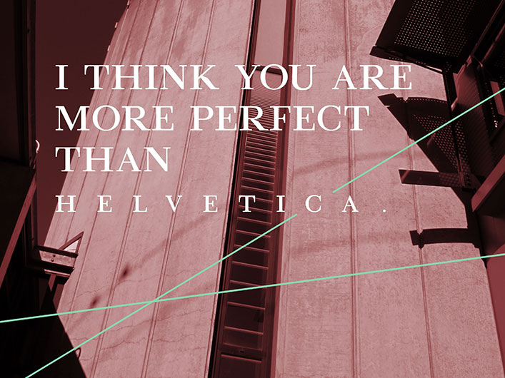
Viktor | Viktor is a typeface I created based on an existing typeface on a building in the Queen Anne area.
See more from Claudia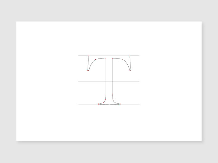
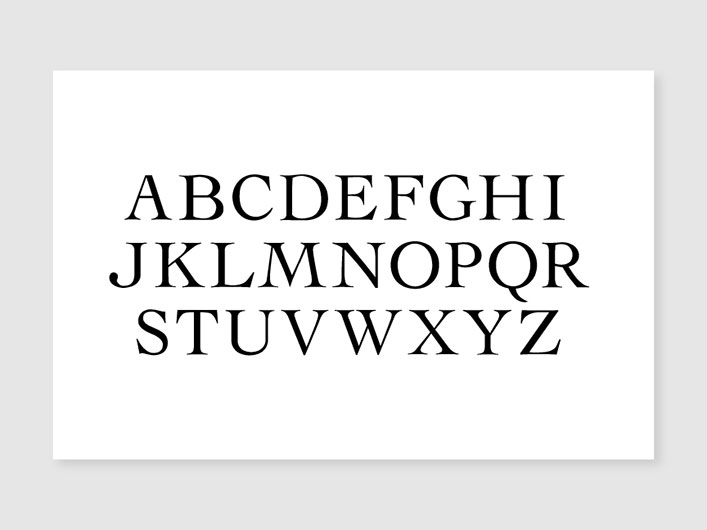
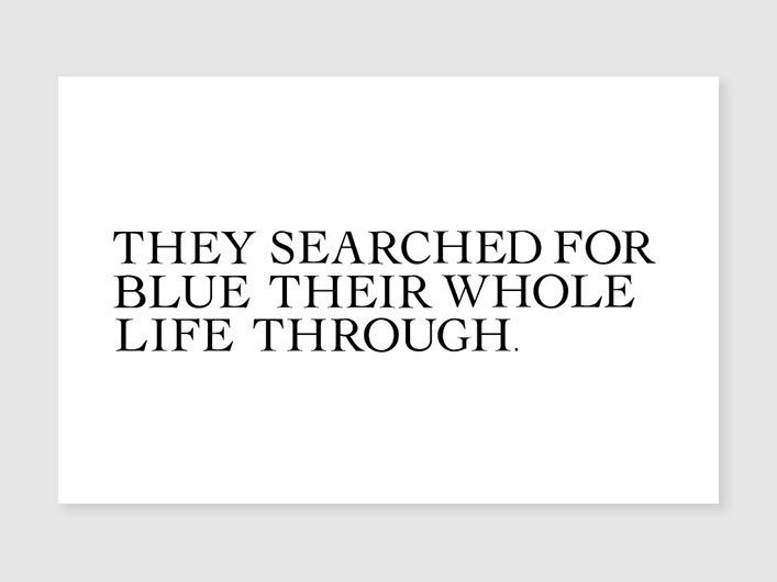

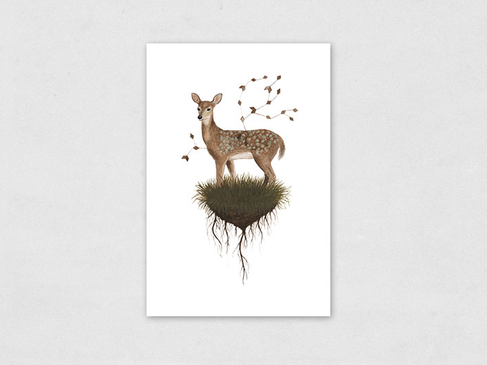
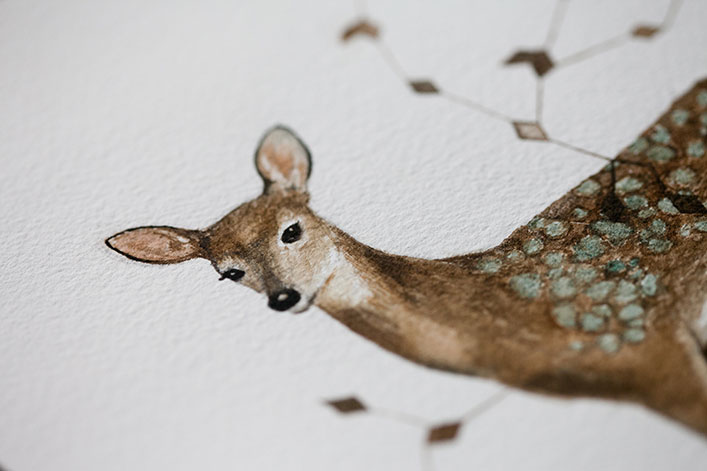
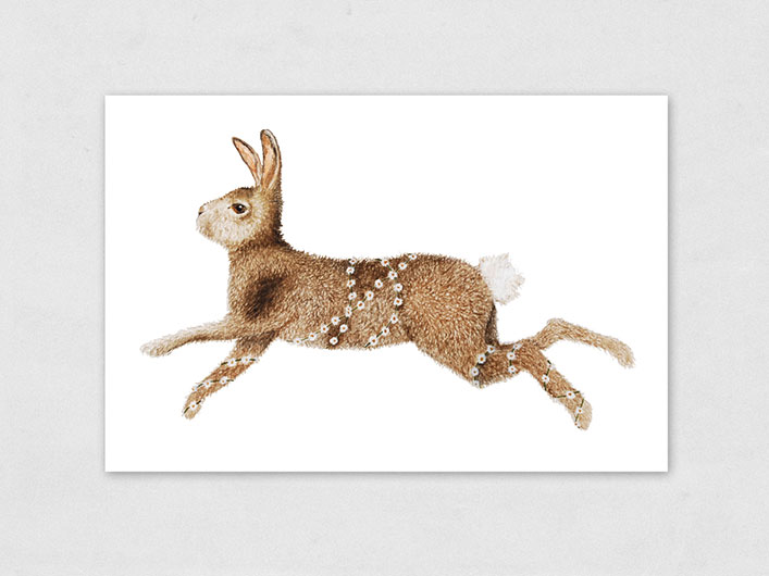
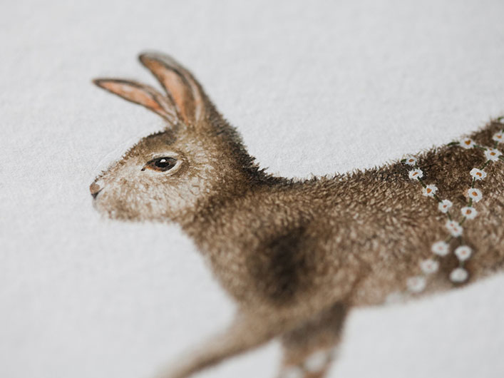
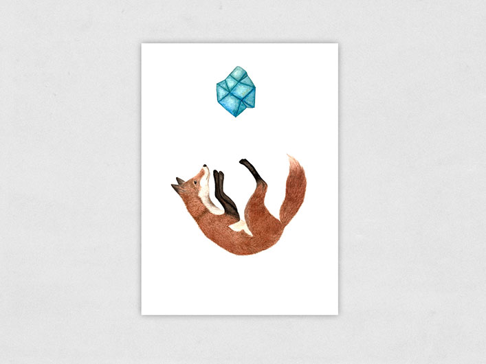
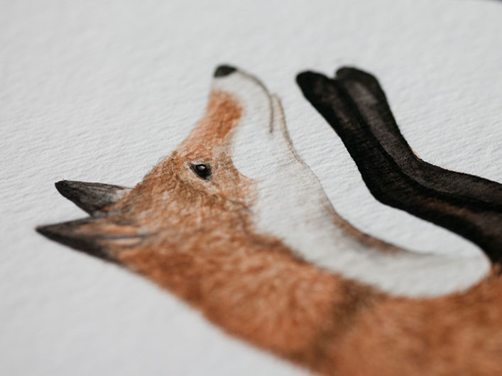
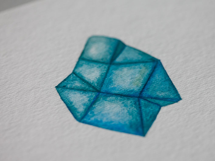
Illustration | These are a few illustrations using water-based media. I enjoy exploring a different side of story telling through my illustrations and enjoy incorporating them into my designs. See more from Eleni

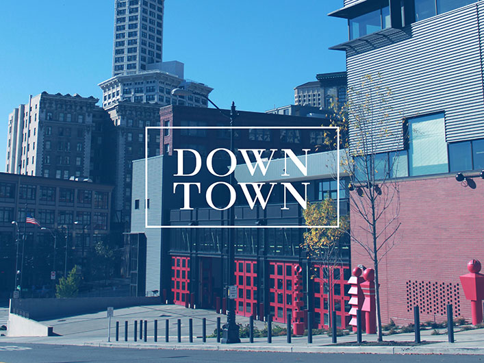
Downtown Font | Inspired by architectural and urban design in Seattle area, Downtown is a modern font with dye-cut feel on the letter's legs. See more from Jessica

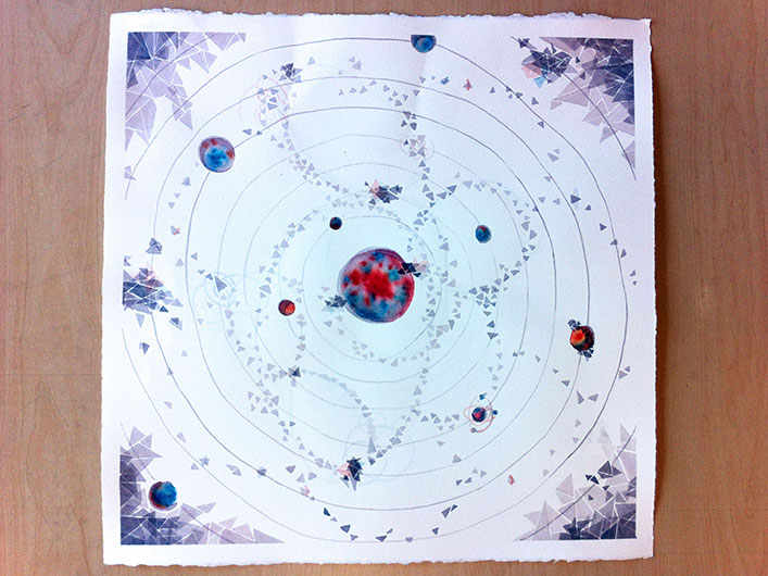
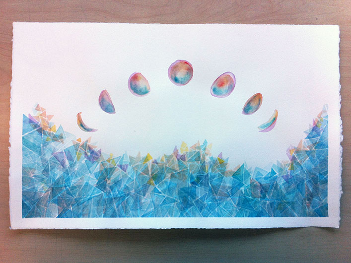
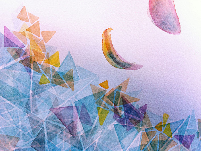
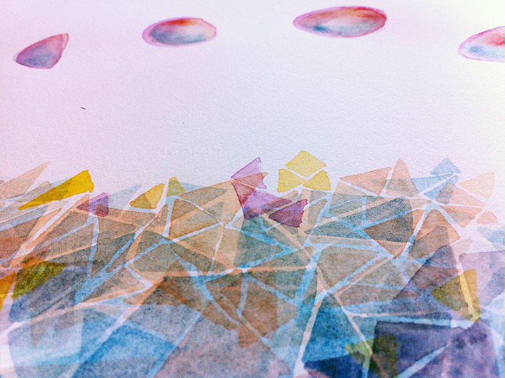
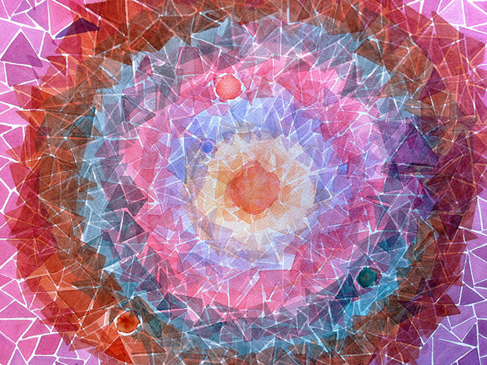
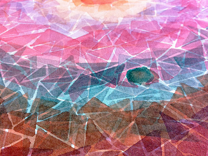
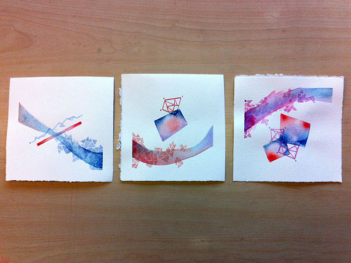
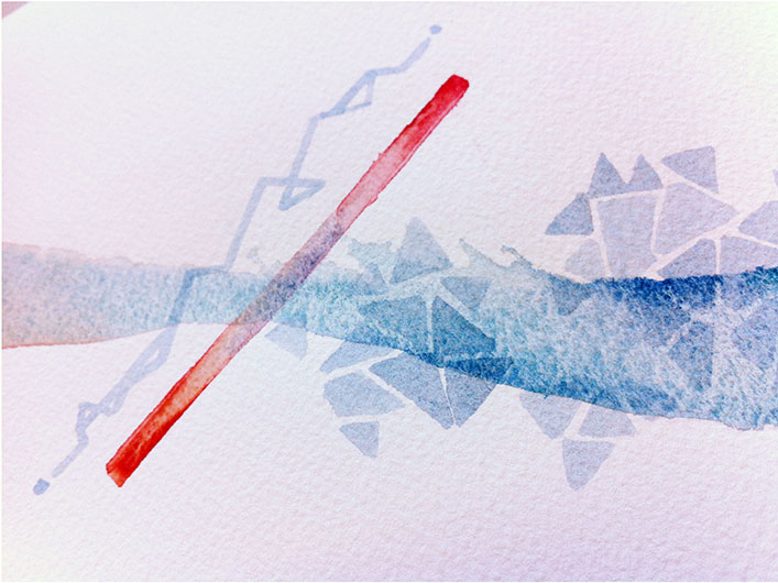
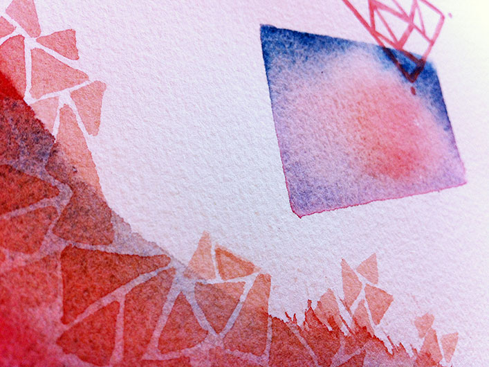
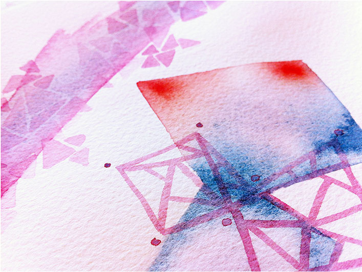
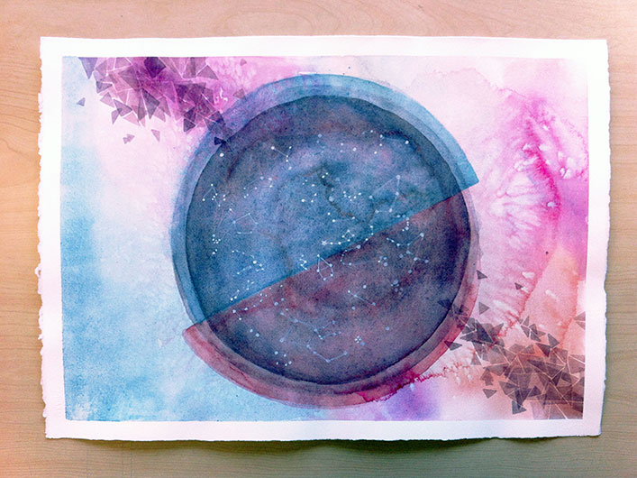
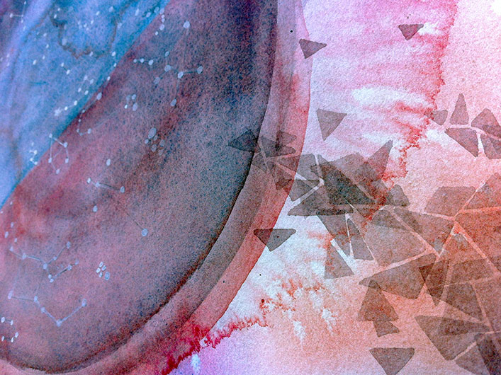
Outerspace Wonder | I am so much in awe of the discovered and yet the undiscovered, the world
and space outside of our bounds. I want to build my rocket ship, or maybe a time machine, and travel to
the unknown. Material: Watercolor on Cold Press Watercolor paper. See more from Jessica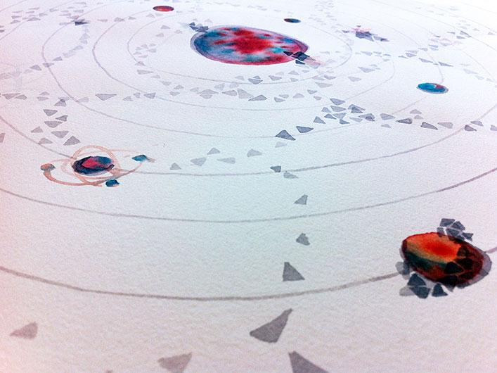

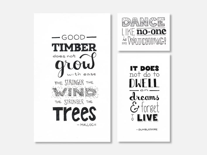
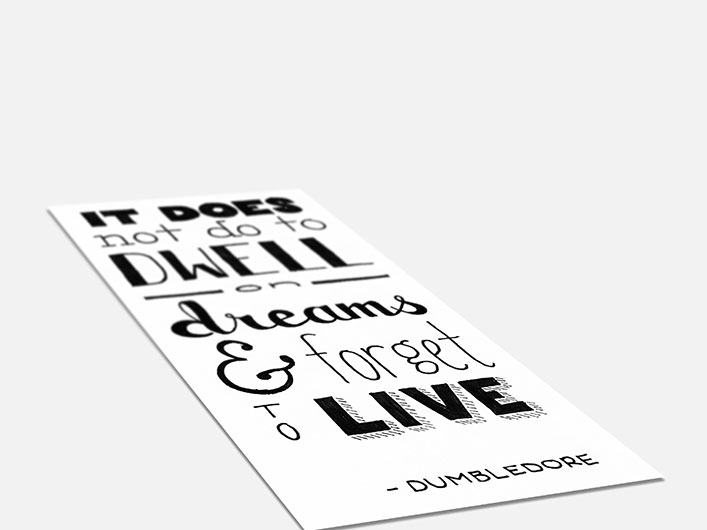
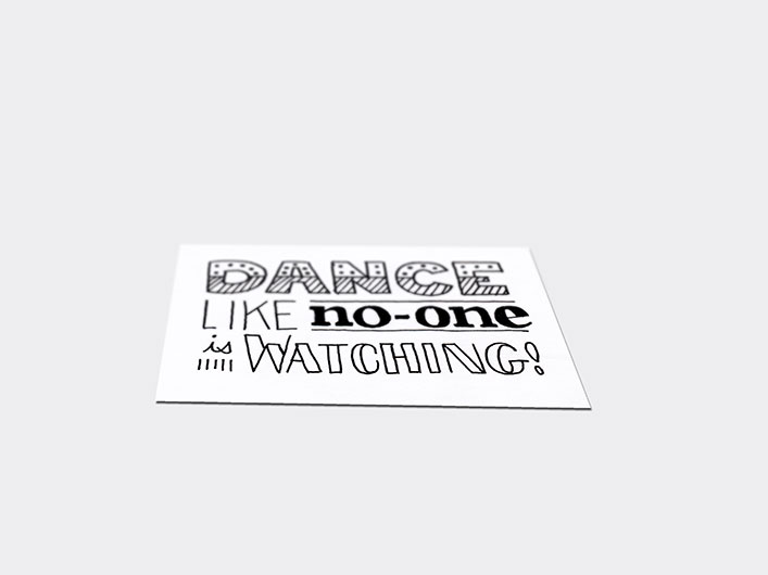
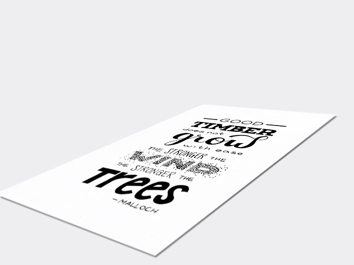
Hand Lettering | I enjoy drawing type, so over the past couple weeks I have been lettering quotes and sayings that I find inspirational and uplifting. See more from Ryan

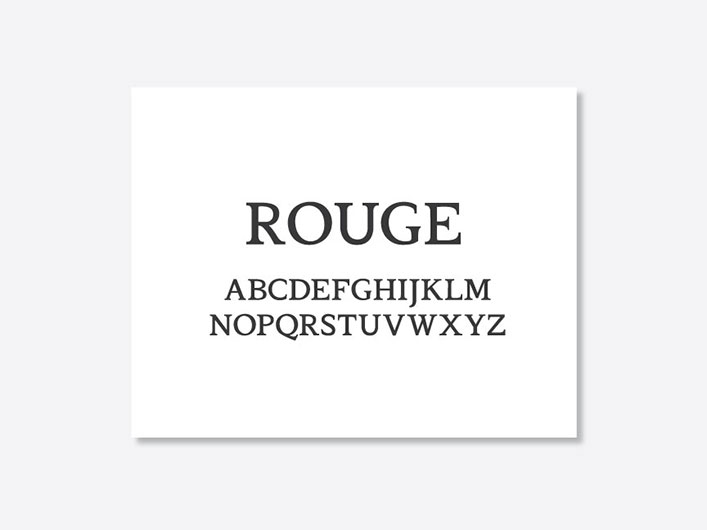
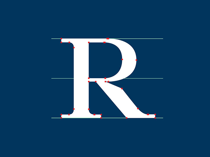
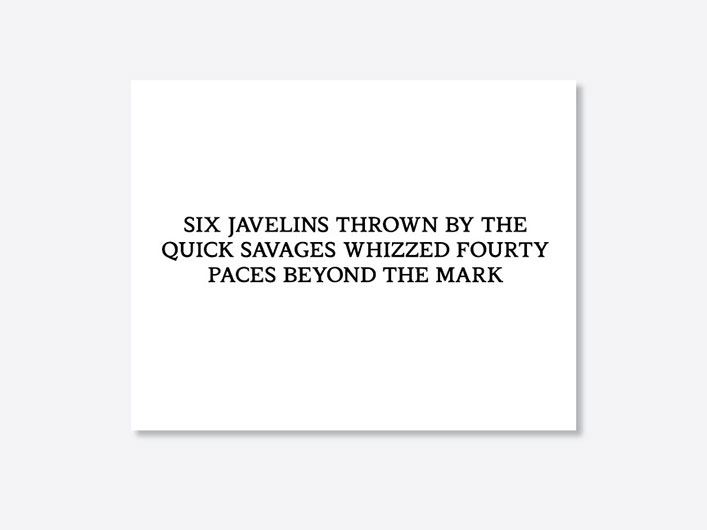
Typeface Design | I created this uppercase alphabet after being inspired by seeing type on the side of an older building in Seattle. See more from Ryan

SEATTLE PACIFIC UNIVERSITY | 3 West Cremona Seattle, WA 98119 | 206-281-2079