
Benjamin Harthun
From the Midwest to the Northwest, I’ve grown up being taught to accommodate people wherever I am. Creating something out of nothing, and moving it through multiple environments is what really drives my interest in graphic design. When I’m not obsessing over the use of the alignment tool, I often find myself eating something made out of potato and/or googling the word Corgi.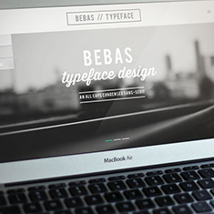


me@benharthun.com |
206.335.4548 |
Bebas Webpage
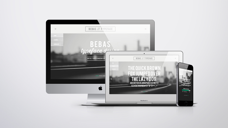

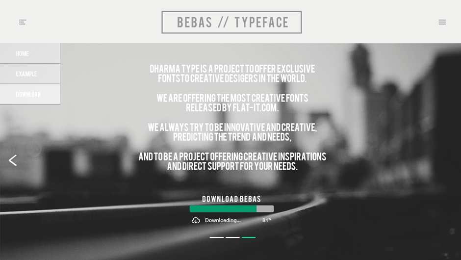
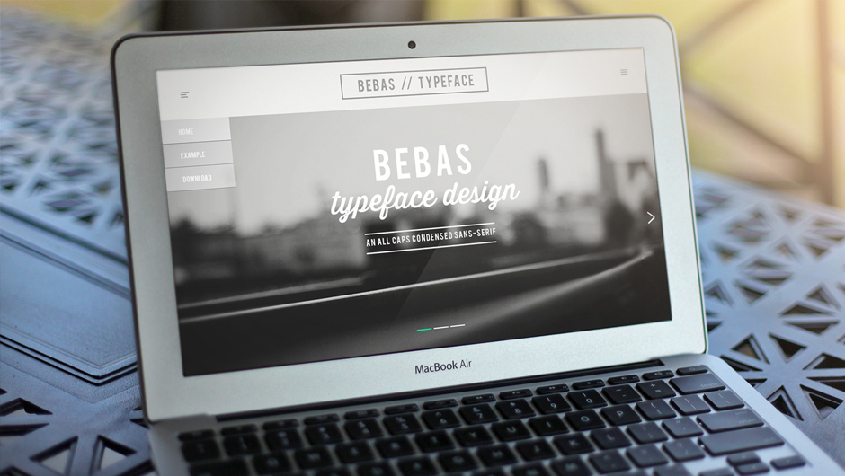
I created the Bebas webpage to introduce more designers and creative artists to a typeface that is not only free, but really elegant and powerful. The site is a simple, 3-page horizontal, with parallax scrolling. On the final page, you can find out more about the company, and a link to directly download the .ttf.
back to top
back to top
Display of webpage on multiple platforms
Digital Illustration: King Bear


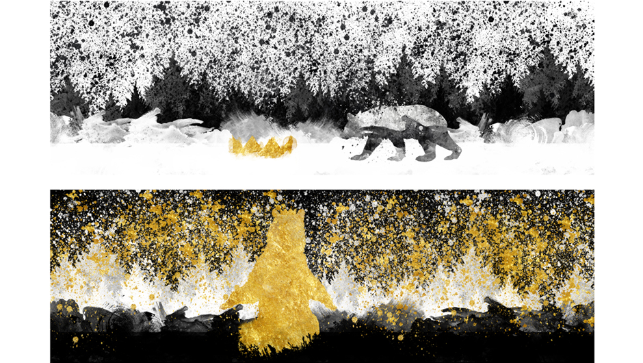

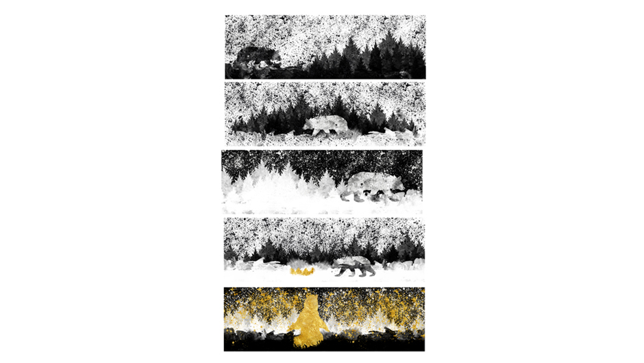
King Bear was a combination of two seemingly contrast elements; my love for graffiti art, and my love of Eric Carle. I wanted to create something that could be appreciated by children, yet could also be appreciated in the graffiti community or parents whom are artists themselves. King Bear is a 5-pannel, 10-page book, digitally illustrated within Photoshop CS6
back to top
back to top
Cover of book/back cover
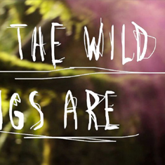
Where the Wild Things Are
This video/title sequence was created for the movie Where the Wild Things Are by Spike Jonze, an adaptation of the 1963 childrens publication by Maurice Sendak. In the video, I wanted to explore nature through a first-person view, touching on ideas of exploration and the grandeur of finding places you’ve never found before.
back to top
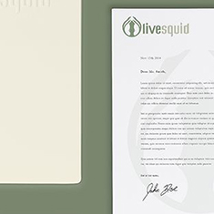
Branding – Olive Squid
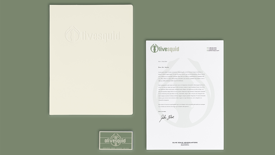
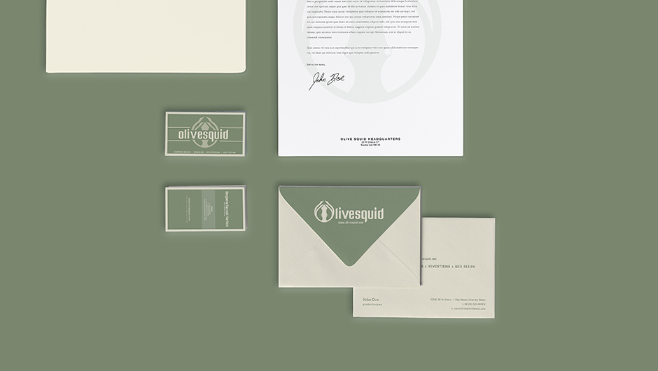
This project was designed around the idea of an animal, in the early weeks of Visual Communications One. Implementing color, logo and overall branding to the design company was created over the course of the following weeks.
back to top
back to top
Letter head, folder, and business card
Type Magazine – Behind the Mask

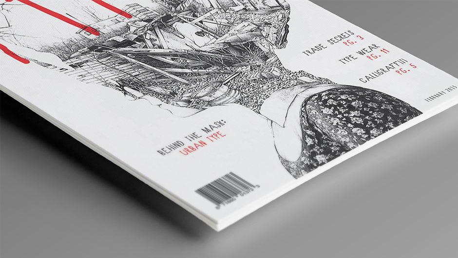

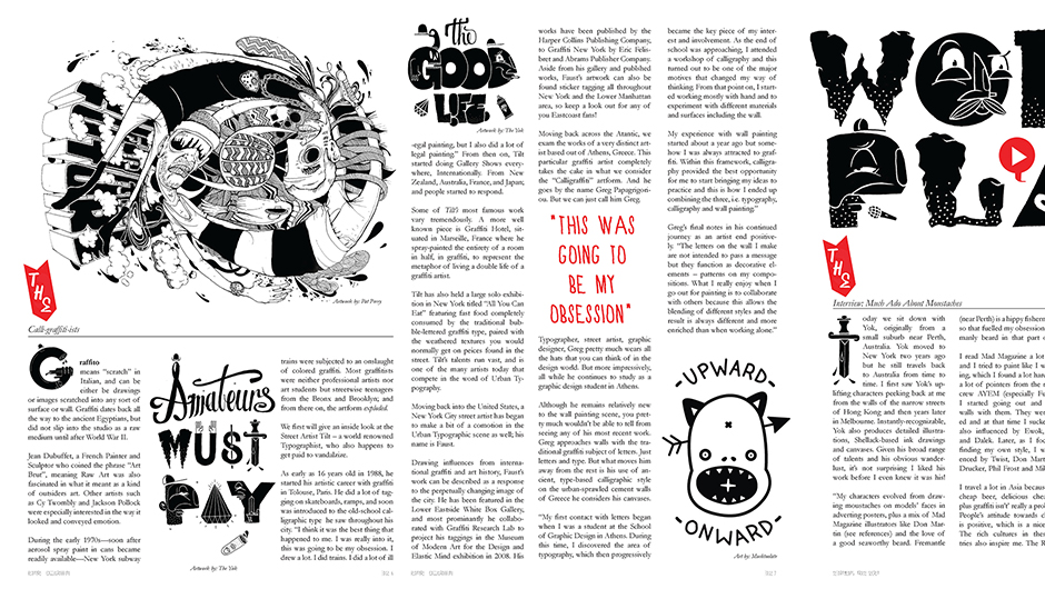
Behind the mask was a publication development looking into the lives of graffiti artists, illustrating their use in the design world, and how their work can be presented clean and tactfully.
back to top
back to top
Front design of the publication
Typeface Design – Pseudo Black
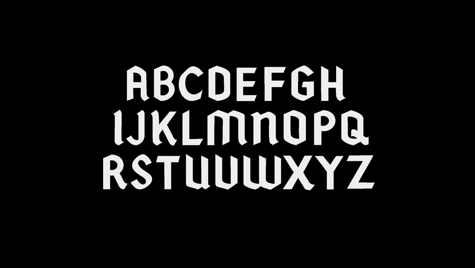
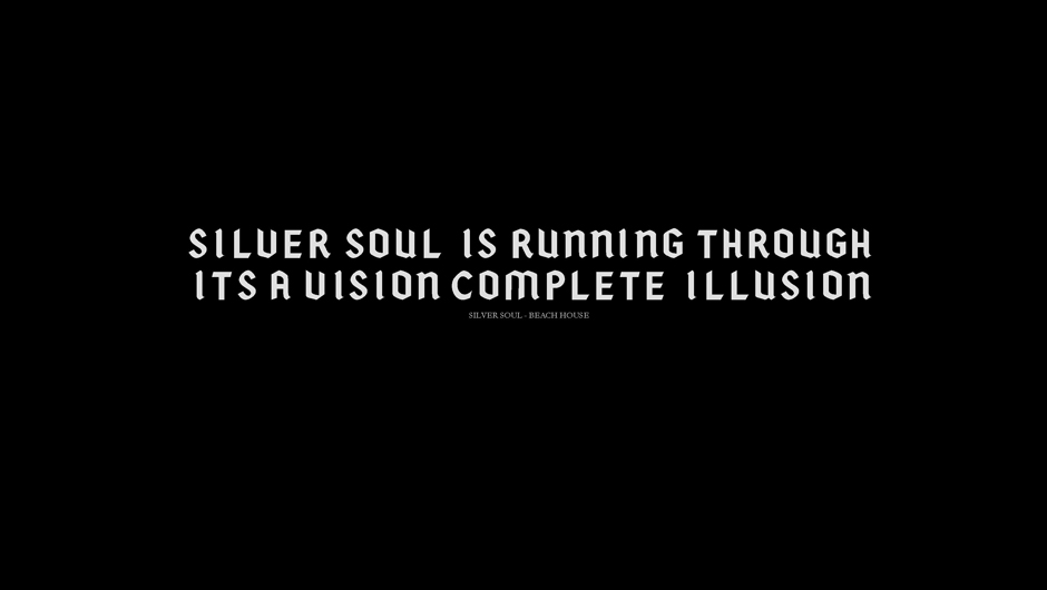
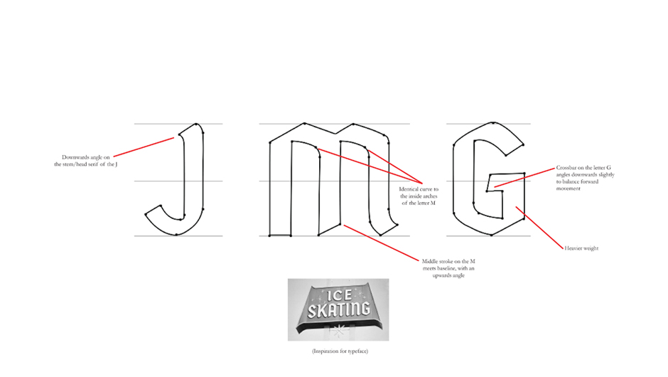
Pseudo Black was based of an old 1960’s Ice Skating sign that I came across that featured a semi-modern version of the old Blackletter/Gothic script dating back to the early 12th century. It’s interesting angles in the serif and stems of the letters initially drew me into the typeface.
back to top
back to top
Look at entire alphabet