Hayley McNeil
I aspire to find beauty in everything: each place I visit and each person I meet. It’s that beauty that inspires me, gives me hope, and pushes me to live a better life. I believe that I can use design as a tool of inspiration—to help others see the beauty where it is not as obvious.mcneilh@spu.edu |
206.948.4206 |
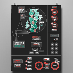
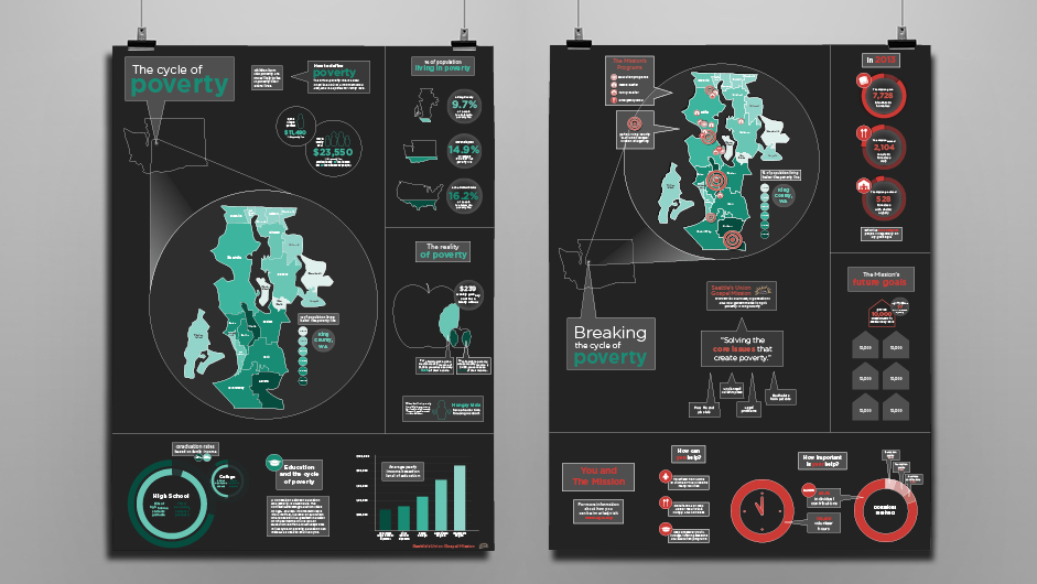
The Cycle of Poverty
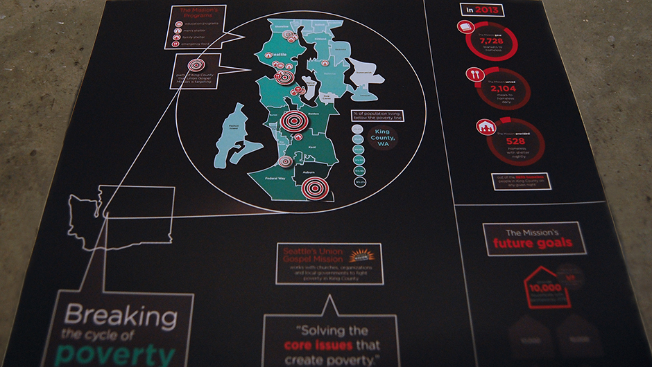
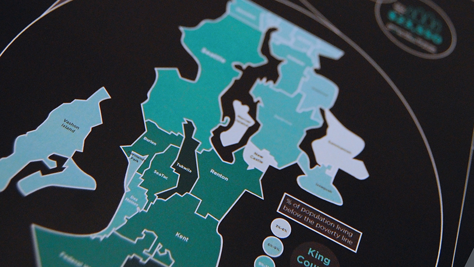
These posters were created with Seattle’s Union Gospel Mission, using information graphics to communicate facts about the cycle of poverty and what The Mission is doing to stop those trends.
back to top
back to top
These two posters communicate the problems of poverty and what Seattle’s Union Gospel Mission is doing to combat that poverty.
Rwandan Greeting Cards
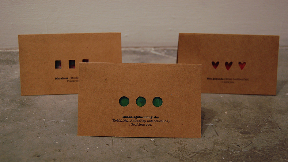
This project is a series of greeting cards that use Rwandan orphan’s artwork in a simple, beautiful way. The intention is that sales of these cards would be a fundraiser for the orphans.
back to top
back to top
The three cards feature Rwandan phrases and a cutout to reveal the children’s painting.
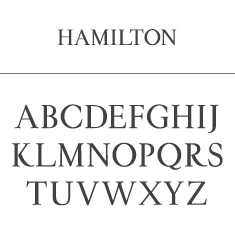
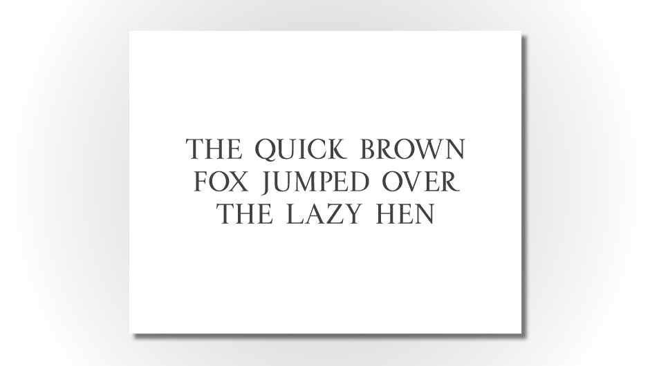
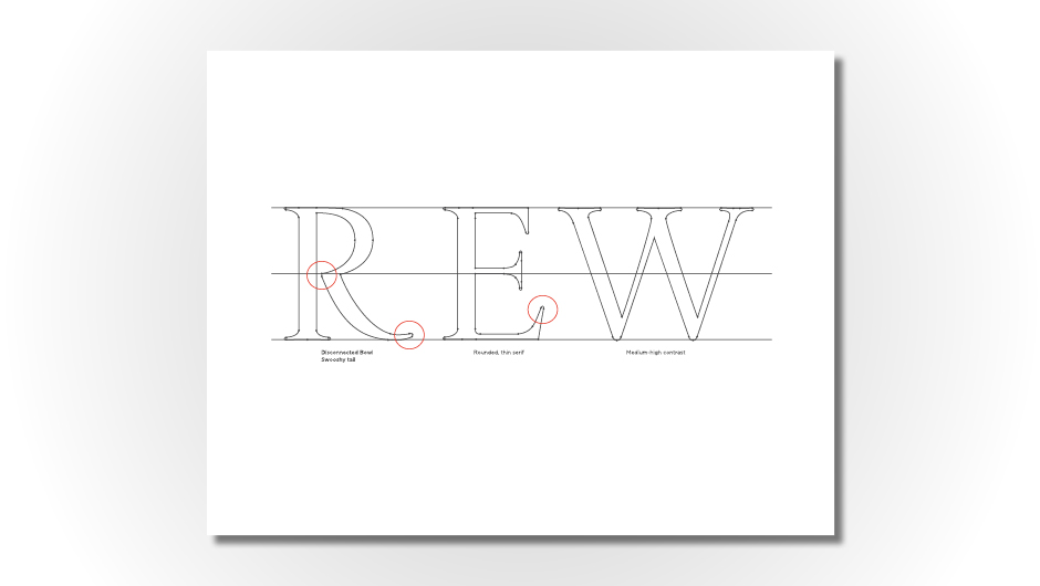
Hamilton Typeface
I created this uppercase serif typeface using TypeTool. The letterforms were inspired by the lettering of the Alexander Hamilton School sign.
back to top
back to top
The complete alphabet in uppercase Hamilton.
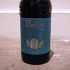
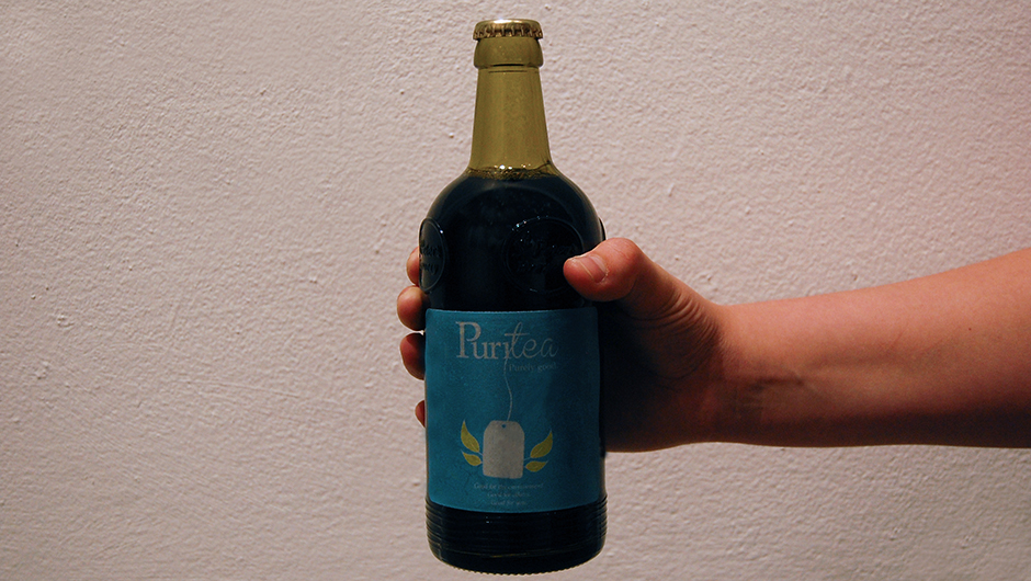
Puritea
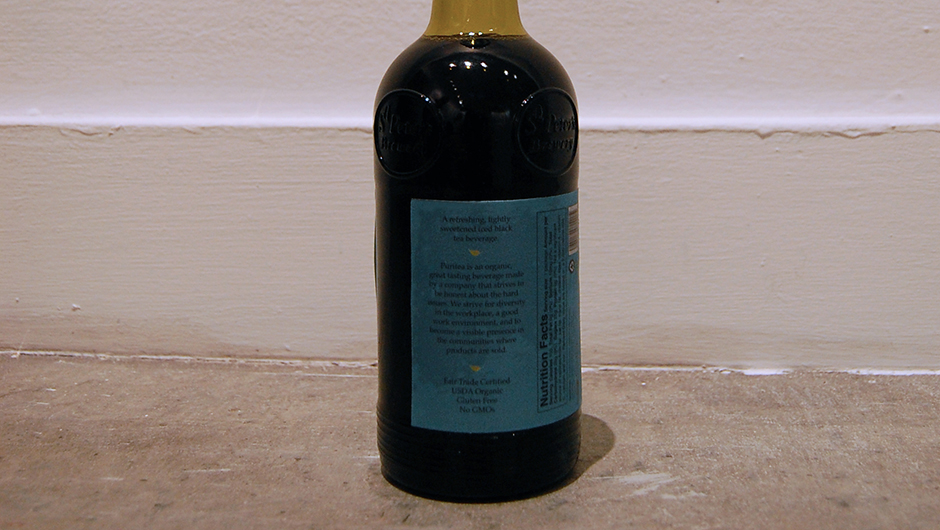
This was a rebrand of packaging of a bottled sweet black tea. I wanted to use brighter, simpler colors, that communicate an organic and fun feel. My intention was to design a package that was simple, but something that would stand out on a shelf of bottled teas.
back to top
back to top
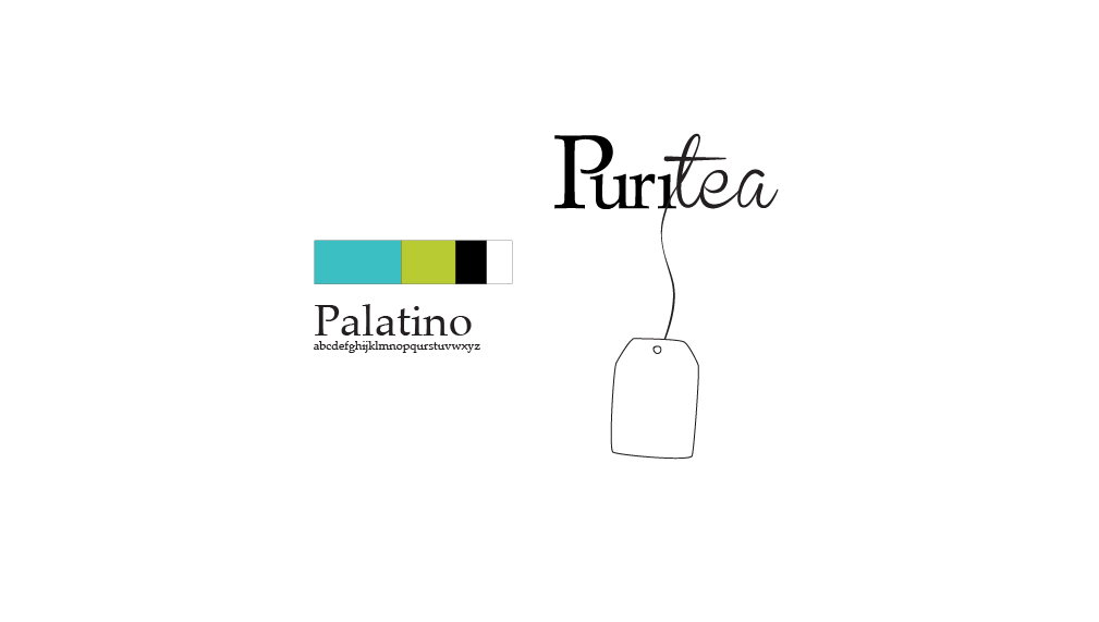
The color scheme includes bright teal, lime green with white and black accents. Palatino is the main typeface used.
Collins Chiropractic
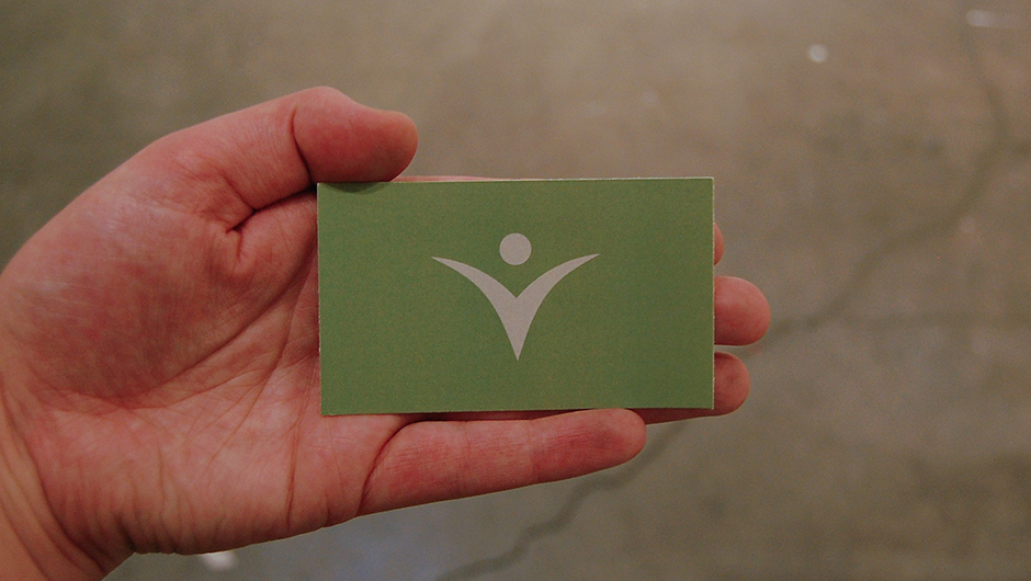
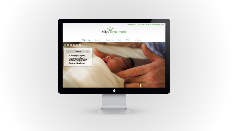
This is a rebrand for Collin’s Chiropractic. The intention is that the new brand gives Collin’s Chiropractic a more friendly, inviting feel compared to many of the other chiropractic brands which tend to feel very serious.
back to top
back to top
The design has movement and vibrancy, but remains clean and simple.
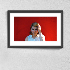
Portrait Series
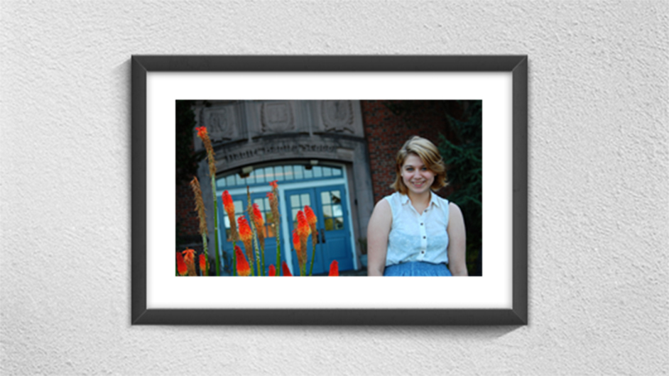
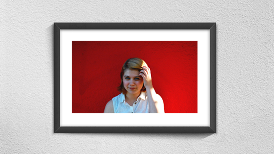
This is a portrait series I photographed and edited as a personal project. Experimenting with natural lights and vibrant colors, I wanted to develop simple compositions that portray beautiful and pleasant portraits.
back to top
back to top
Portrait series experimenting with natural lights and vibrant colors.
