
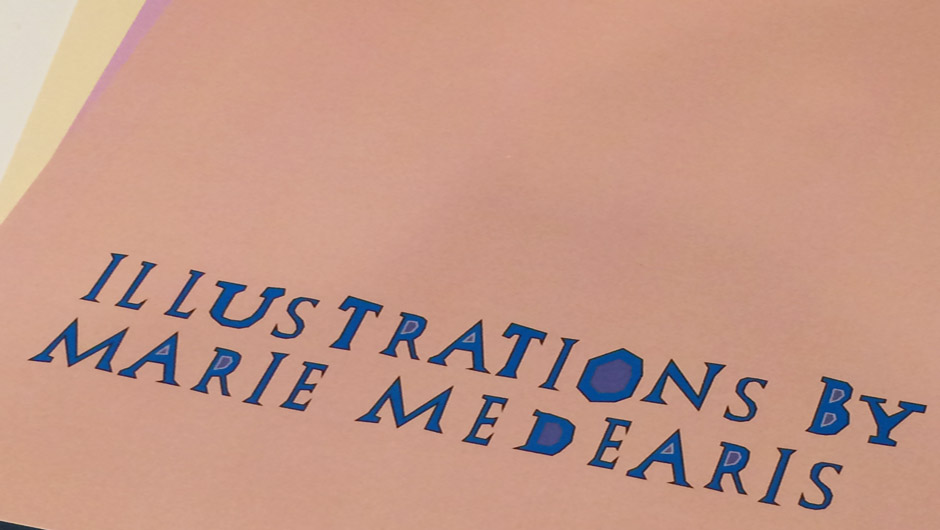
Marie Medearis
The Visual Communications major has been quite a journey as I have developed my unique artistic style. I fell in love with art while growing up in Lebanon for twelve years. I want to use my knowledge of visual arts to communicate the importance of being aware of the world outside of their own.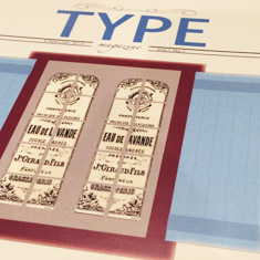
mariemedearis@msn.com |
303.590.4862 |
TYPE Magazine, Publication Design
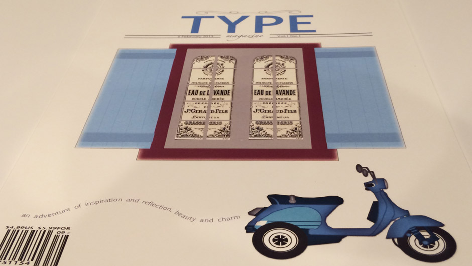
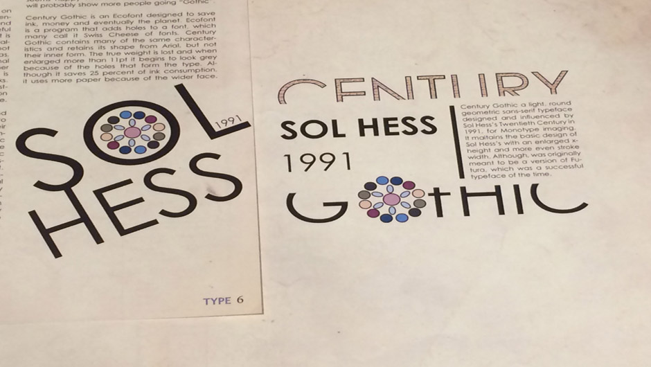
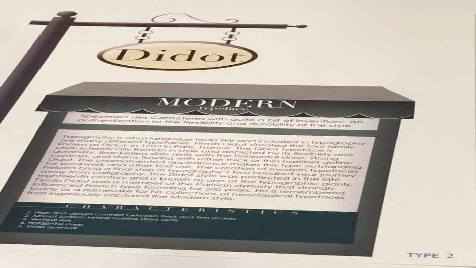
The theme of this project was about typography hence the class-wide title of the magazine. This allowed for exploration within publication design through typography, layout and photography or illustrations. I went with the illustration route with French aesthetics and imagery and a French typeface, Didot.
back to top
back to top
Magazine Cover: After creating a mood board with color pallet, style and typefaces, the title, TYPE, was created as a masthead. This was a long creative process that required many revisions in order to bring the magazine together within one style to stay consistent and appealing to the intended audience.
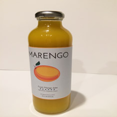
Marengo: Fresh Mango Juice, Sustainable Product Design
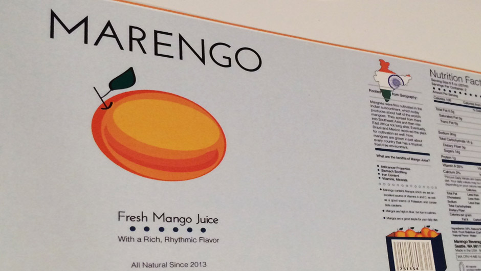
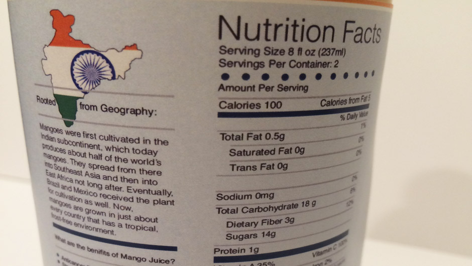
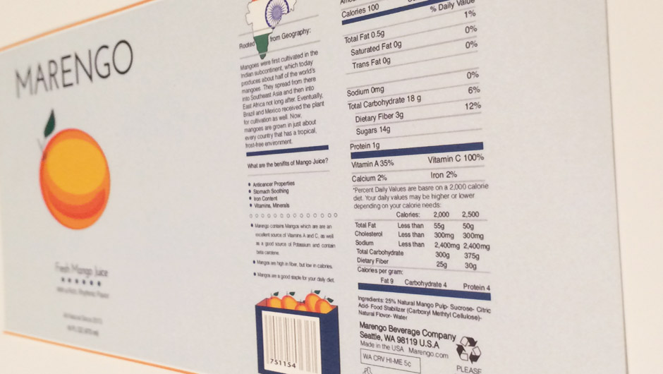

The goal of this project is to understand the processes that go into developing and designing product design while identifying the purpose and user. Another key component of this project was investigating sustainable design options. My drink product gives a background history of the fruit. This Fresh Mango Juice contains high nutritional benefits.
back to top
back to top
Logo: The importance of research is to guide my product intentionally with purpose and function. That speaks to an audience, the competition and sustainability. The front side of the bottle is the first impression, purchase side of the product, therefore I used a simple yet elegant and bright-colored illustration.
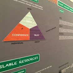
Awareness Poster: Homelessness, Information Design
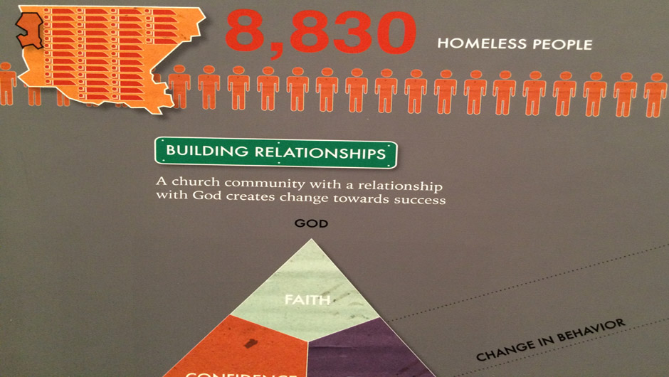
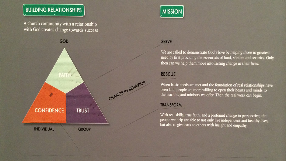
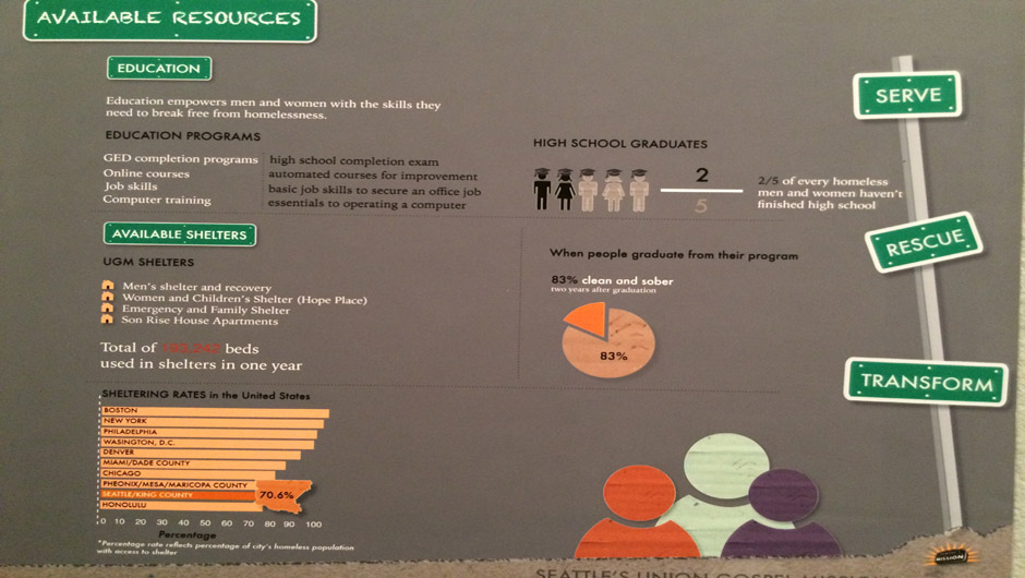
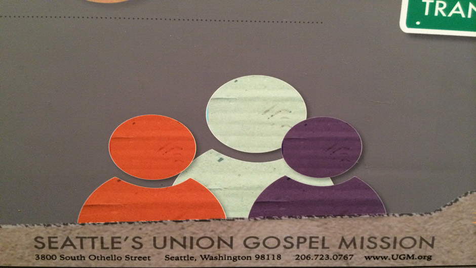
The goal of this poster was to create info-graphics that tell the story of one of the five key areas of service that the Union Gospel Mission of Seattle provides; my focus was Homelessness in King County. This poster focuses on the change and impact UGM has had on the issue.
back to top
back to top
Population Comparison: I wanted to break down data into an interesting narrative that would educate, inform or persuade the audience about the subject. The icons and call out maps of the comparing number of homeless people.
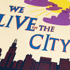
We Live in the City, Children’s Book
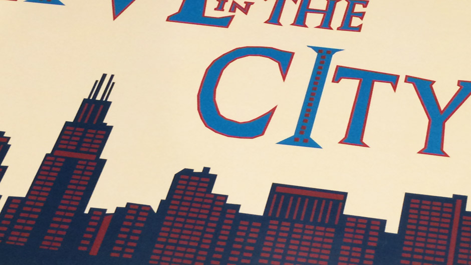
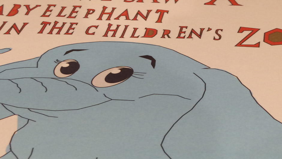
The combination of vector illustrations and whimsical, unique typeface with bold and bright colors draws in a younger age range. The short book is an existing children’s book; that was portrayed with my personal illustrations.
back to top
back to top
Find an Existing Children’s Book: This only includes a few key parts or pages of the book with the same content but recreated through my own eyes and illustration style.
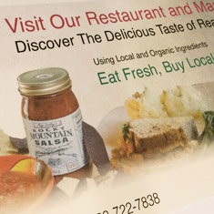
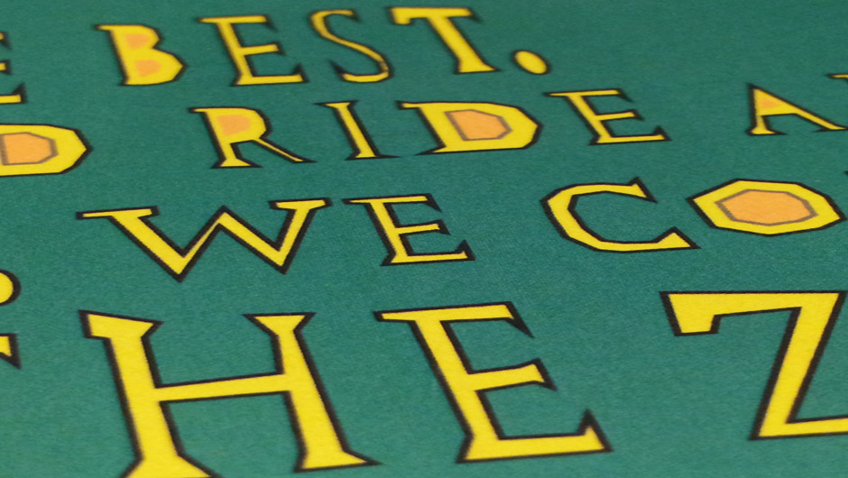
Corner Store Sign, Large Print Banner Design
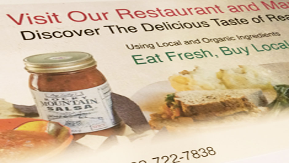
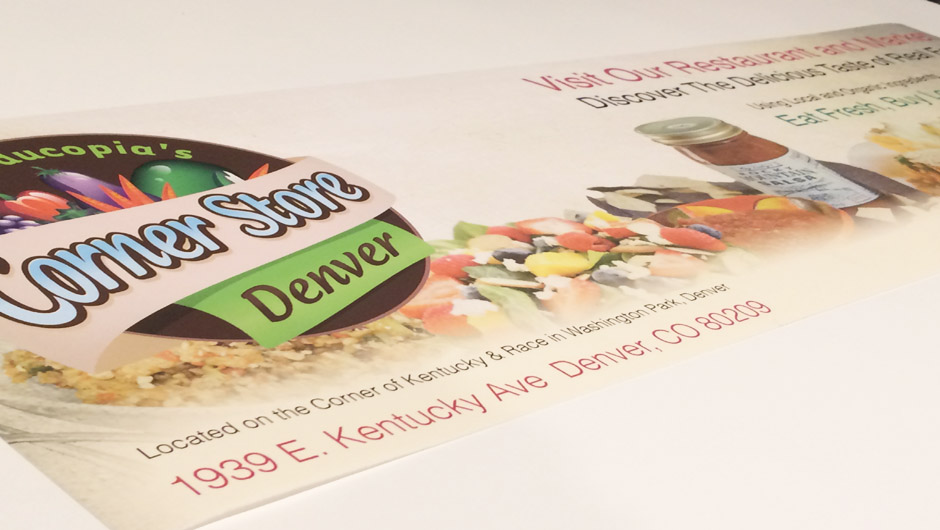
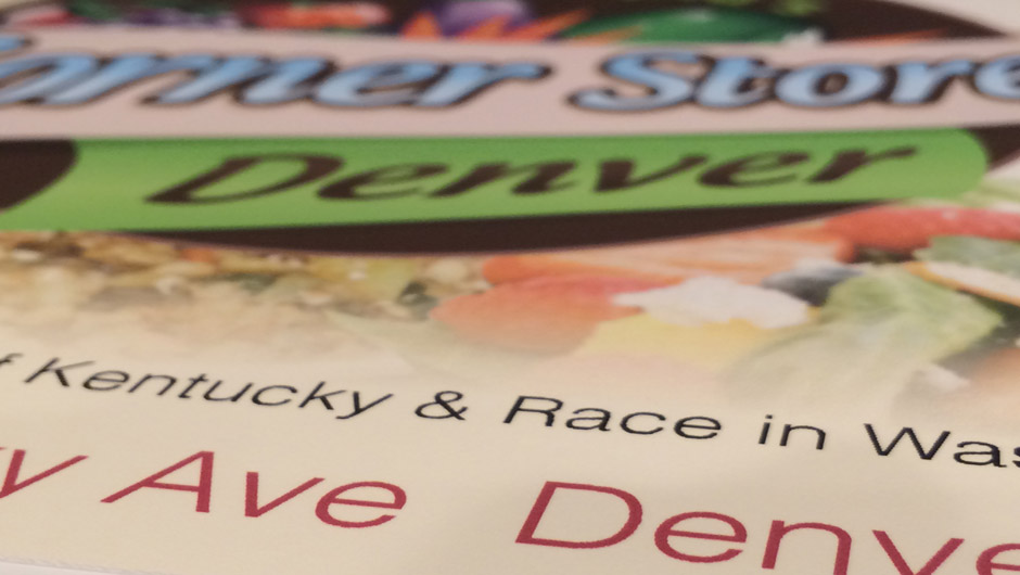
The 2 feet high by 6 feet wide banner was created for a Restaurant and Market that uses local and organic ingredients. They wanted a sign to advertise their cafe. The client wanted soft edges to create a warm an welcoming feeling, therefore not boxy 90-degree angles. This included the use of images of fresh food that is sold at the Corner Store. It is an old school, yet cool and intriguing way of portraying the food.
back to top
back to top
Collecting Images: Choosing intentionally to create a broad range of available food at the restaurant and market.
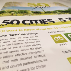
Global European Mission: 50 in 5, Postcard and Small Takeaway
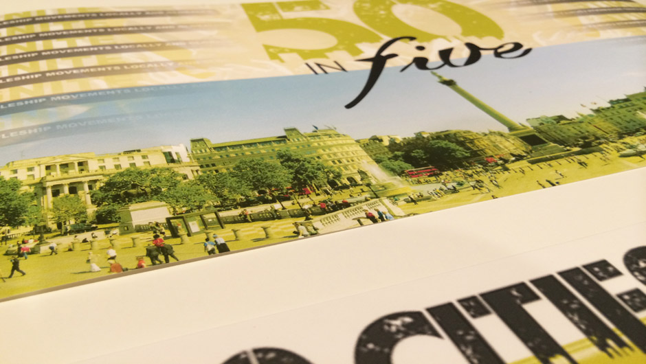

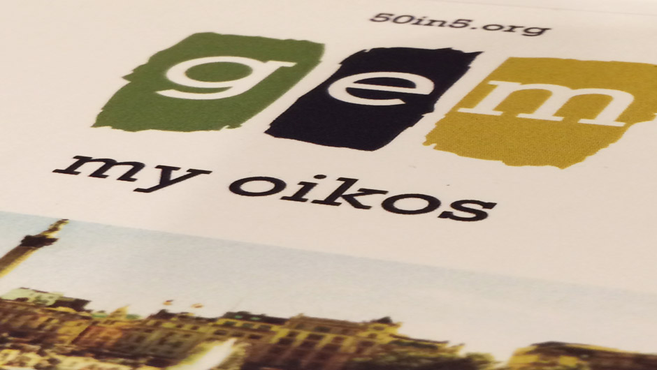
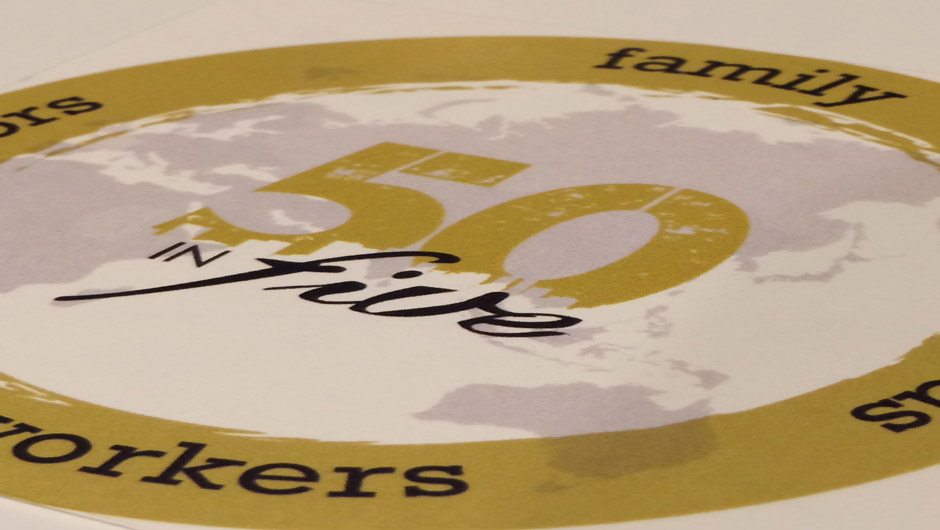
The front and back of the postcard describes the key elements that make up GEM. GEM is working to ignite discipleship movements in 50 cities over the next 5 years by reproducing disciples of Jesus who make other disciples. The urban centers of Europe are growing in population as Europeans and immigrants seek employment and a better lifestyle. As these centers grow, so too their global influence.
back to top
back to top