Kelly Dunagan
Fashion enthusiast and pursuer of the minimal, I believe in the impact of intention, the power of purposefulness, and the boldness of simplicity. I am zealous about communicating visually, giving my passions a voice, and evoking thoughtfulness in others.dunagank@spu.edu |
719.464.3311 |
Native Element Web Design
Website design for Native Element that parallels the aesthetic of a fashion consignment business I started this year. Resting on utilitarian purists, the site’s minimal approach showcases the merchandise. User friendliness was pursued as well as an enhanced online shopping experience throughout the construction of the site.
back to top
back to top
Each look is styled intentionally, giving the user the option to purchase the look in its entirety, or a single item.
Native Element
Native Element is an online fashion consignment business I started this year as an outlet for my love of fashion and styling, as well as to deny the pursuit of fashion trends and foster the concept of purposeful and unassuming fashion.
back to top
back to top
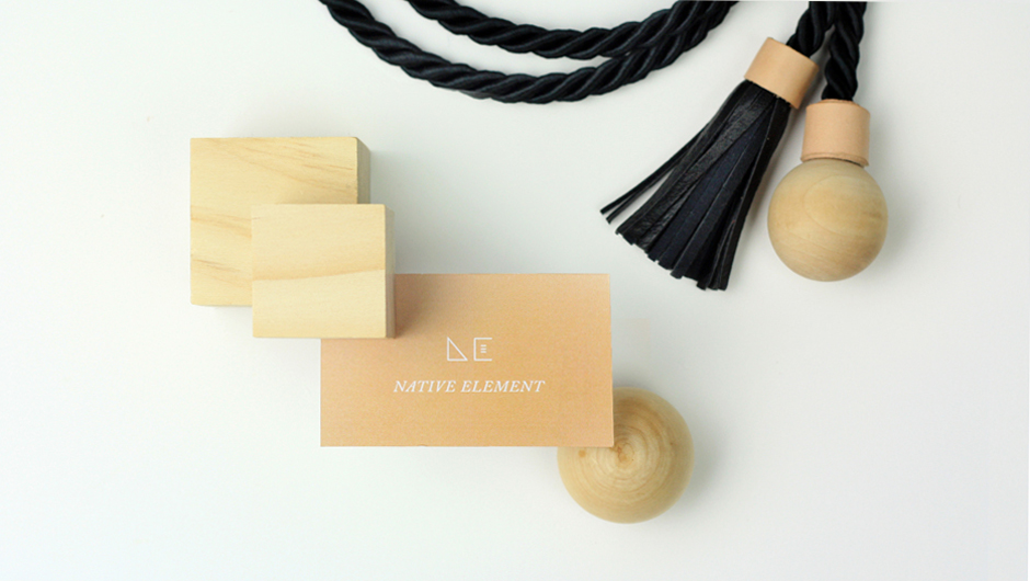
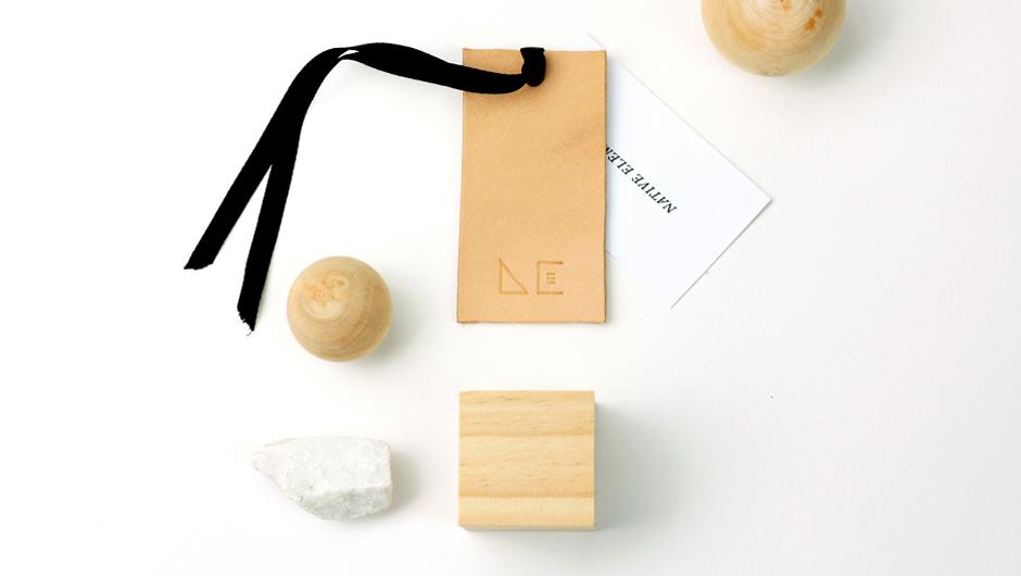
With the intent of magnifying the detail and editing out excess, a branding system for Native element speaks to its unique and distinctive aesthetic.
Native Element Look Book
The cover of the look book nods to the brand Native Element’s literary meaning. The distinctiveness of the cover mirrors that of the fashion brand.
Waterloo
Waterloo is a sparkling water beverage. Its packaging design is as dapper and sophisticated as its consumer. Inspired by old-time London and vintage bottle labels, Waterloo is the embodiment of class and debonair charm. Cheers.
back to top
back to top
Naming the brand “Waterloo” propelled the dapper aesthetic it embodies. A distressed label presents a vintage feel, while the serial number and stamp of authenticity aid in its elite and sophisticated edge.
Childhood for Sale Information Graphic
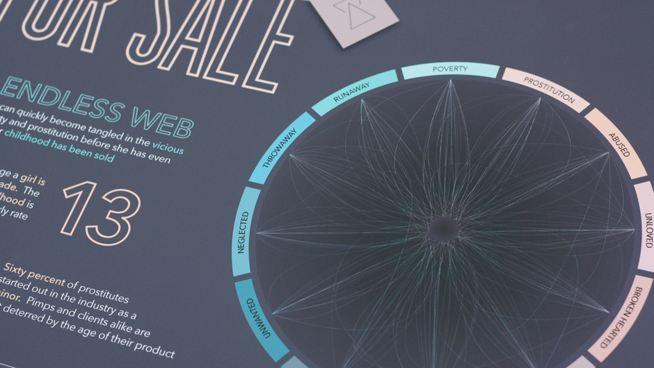
Partnering with Seattle’s Union Gospel Mission, a non-profit organization that serve the hurting and homeless, an information graphic was created to raise awareness of the correlation between sex trafficking and poverty in King County. The first poster serves to raise awareness, the second to promote a call to action and UGM’s involvement in the issues.
back to top
back to top
A female icon in a tag represents a childhood bought a price, and a girl who is now a product of the sex slave industry
Type Magazine
Custom masthead, photography, and spreads created for a magazine publication addressing the relationship between geometric form and typographic design.
back to top
back to top
Original photography and masthead set the aesthetic of the magazine


